Investors,
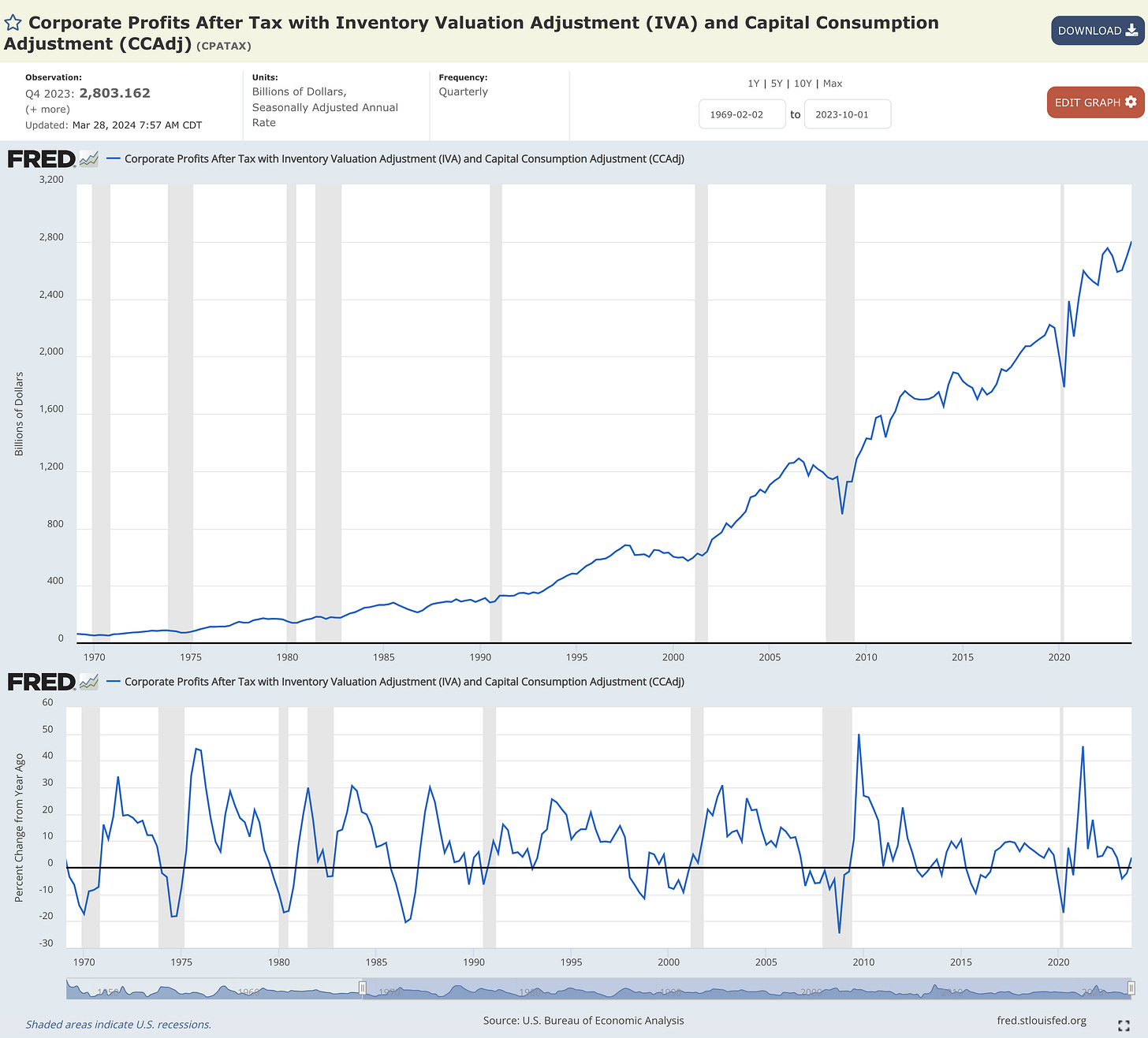
Corporate profits are at an all-time high and the YoY growth rate is accelerating.
But that’s not all…
Consumer spending is at an all-time high, even after adjusting for inflation. 12-month forward earnings for S&P 500 corporations are at an all-time high. Household net worth is at an all-time high. The stock market itself is at an all-time high. Residential real estate prices are at an all-time high. Construction spending is at an all-time high. Labor productivity is at an all-time high. Real personal income excluding transfer receipts (government income programs) is at an all-time high.
These are the facts, despite persistent & ongoing warnings that a recession is coming.
The macro Doomers and the stock market bears have become akin to the boy who cried wolf, losing their credibility in real-time as newer investors begin to see through their facade of fancy language, a focus on niche topics, and a flawed negative bias.
Eventually, Doomers will have their moment in the sun.
However, those moments are typically short-lived & never effective over the long-run.
So if their success is rare & long-term inefficient, why would I ascribe to their views?
That was a hard lesson that I learned in 2016/17 after being a staunch believer in the viewpoints expressed by Peter Schiff, Jim Rickards, Danielle DiMartino Booth, and others who endlessly predict the collapse of the U.S. economy (which has yet to come).
I’m so passionate about highlighting the intellectual dishonesty of Doomers & combatting their perspectives with facts because it’s a message that I wish I heard earlier in my own investing journey.
Thankfully, I escaped that prison of a mental framework many years ago and I’m glad to know that Cubic Analytics has helped many investors to do the same.
In this report, I’ll be sharing new information & analysis pertaining to:
Inflation data continuing to cool down.
The stock market making more ATHs.
Bitcoin ETFs and the strength of the trend.
To share my research and help spread the word about Cubic Analytics, consider sending this report to your colleagues using the link below:
Macroeconomics:
The Federal Reserve’s preferred measure for inflation continues to decelerate.
At worst, we can say it’s stabilizing.
Specifically, I’m talking about the Personal Consumption Expenditures (PCE) inflation rate on a YoY basis, which was just released on Friday for February 2024:
Headline PCE = +2.45% YoY vs. estimates of +2.5% and prior +2.43%
Core PCE = +2.78% YoY vs. estimates of +2.8% and prior +2.88%
In plain English, YoY inflation in February was in-line with estimates and either reflected a modest deceleration or a stabilization at prior levels.
Looking at YoY PCE inflation data over the past 30 years, we can see that the current readings are above average, but back within the historically normal range and continuing to trend back towards the mid-point of that range.
Prices are still rising (which the Fed intentionally targets), but they are rising at a slower pace and trending towards a rate of inflation that is consistent with the Federal Reserve’s +2% YoY inflation target.
The current rate is too high, but progress is being made, as far as the Fed is concerned.
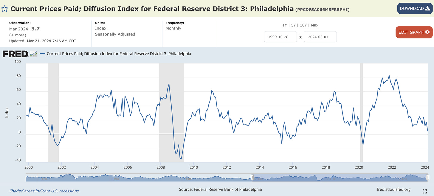
On March 21, the Federal Reserve Bank of Philadelphia published the Manufacturing Business Outlook Survey, which contained an important datapoint that I’ve relied on as a forward-looking indicator to predict inflation trends: the Current Prices Paid Diffusion Index.
Per the March 2024 data, the prices paid component of the survey plummeted to the lowest levels since May 2020:
Why am I so focused on this data, particularly after a multi-month period of a choppy re-acceleration?
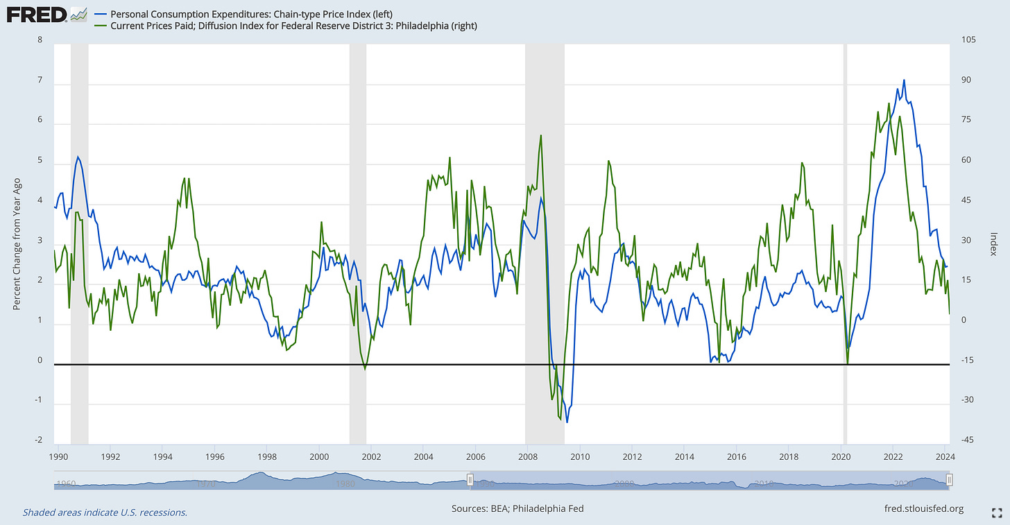
Because it has a clear correlation with YoY inflation dynamics, with a consistent historical relationship! Specifically, the chart below compares:
🔵 Headline PCE inflation YoY
🟢 Current Prices Paid Diffusion Index Philadelphia
Based on this relationship, the persistent downtrend and the new multi-year lows in the Prices Paid Diffusion Index is telling us that the likely path forward for PCE inflation is more disinflation on a YoY basis.
Based on my understanding of the Federal Reserve’s reaction function and Powell’s recent messaging that Fed officials are simply looking for more time-based proof of disinflation, this latest round of PCE data is a win in the eyes of the Fed.
With labor market indicators (quits rate, total hours worked, unemployment, average hourly earnings growth), China inflation dynamics, and other leading inflation indicators continuing to trend in the right direction, I reiterate my belief that we’re inching closer to a Fed rate cut, no sooner than Q3 2024.
Stock Market:
On Thursday, the S&P 500 had its highest daily close of all-time.
It also had it’s highest weekly close of all-time, it’s highest monthly close of all-time, and it’s highest quarterly close of all-time.
The same can be said for the equal-weight version of the S&P 500 ($RSP).
Both the Dow Jones and the Nasdaq also had their highest 1-month and 1-quarter close of all-time, continuing to reaffirm the strength of U.S. equities.
None of this probably happens in a bear market or a recession.
So I decided to check… specifically focused on the Dow Jones with quarterly candles:
I highlighted all of the cases where the Dow Jones made a new all-time high quarterly close after the index had not made new all-time highs for at least 2 years since 1920.
I found 8 prior cases where the Dow Jones made a new ATH quarterly close after not making a new ATH for at least 2 years. In 6 of those 8 cases, the index continued to climb higher and make new all-time highs going forward.
There were two cases that failed:
Q4 1972: In this case, the rapid acceleration of inflation dynamics pushed the U.S. into a recession, amidst other structural issues at the time. From a technical analysis standpoint, one could argue that the quarterly breakout was unconfirmed in the subsequent quarter, because the Dow Jones immediately reversed lower following the initial breakout thrust. This is a very different dynamic than the present market environment, where the Dow Jones has now confirmed the breakout with two consecutive quarterly closes at new all-time highs.
Q3 2006: In this case, the Dow Jones continued to climb to new all-time highs for 5 more quarters before the onset of the Financial Crisis and the Great Recession. During the 13-month period after the initial breakout move, the Dow Jones went on to gain a total of +22% until the peak in October 2007. Even in this failed case, history tells us that our bias should be to the upside over the coming quarters.
Given that the Dow Jones had it’s highest quarterly close of all-time in Q4’23 and was just confirmed by the Q1’24 quarterly close, it’s clear that the odds favor more upside.
The inherent nature of the long-term uptrend tells us that making new all-time highs on a quarterly basis is not bearish, as the market generally continues to climb higher over time within periods of strong uptrends.
These breakouts objectively tell us that we are in an uptrend, and a strong one at that!
These breakouts also tell us that it’s irresponsible to fight uptrends.
But hey, it’s only 100 years of data. Fight it if you want.
Bitcoin:
For the past 11 trading days, starting on March 14th, the Grayscale Bitcoin ETF $GBTC has experienced daily outflows of at least $160 million. During these 11 trading days, average daily outflows from GBTC are roughly $328M per day.
In total, that’s more than $3.6Bn in outflows from Grayscale.
Yet during that same period, net inflows into all spot Bitcoin ETFs are $594M.
Therefore, the non-Grayscale ETFs have exhibited a sufficient ability to absorb the outflows from Grayscale and to attract enough new capital to produce net inflows.
In layman terms: there’s a lot of demand for spot Bitcoin ETFs.
In total, that demand is 831,500 BTC, equal to $58.3Bn at today’s valuation.
To track this data on your own, you can visit this link.
Looking at price dynamics, I’m focused on the fact that Bitcoin is about to have the highest weekly close of all-time, currently trading above $70.2k at the time of writing.
I’m also keen to see that the weekly Heikin Ashi candles continue to be bullish as well, confirming that momentum is to the upside and that we remain in a strong trend.
Assuming that this weekly Heikin Ashi candle closes green (which we’ll find out on Sunday evening), this would mark the 9th weekly green candle & the 26th in 28 weeks.
There’s nothing bearish about that.
Best,
Caleb Franzen
DISCLAIMER:
This report expresses the views of the author as of the date it was published, and are subject to change without notice. The author believes that the information, data, and charts contained within this report are accurate, but cannot guarantee the accuracy of such information.
The investment thesis, security analysis, risk appetite, and time frames expressed above are strictly those of the author and are not intended to be interpreted as financial advice. As such, market views covered in this publication are not to be considered investment advice and should be regarded as information only. The mention, discussion, and/or analysis of individual securities is not a solicitation or recommendation to buy, sell, or hold said security.
Each investor is responsible to conduct their own due diligence and to understand the risks associated with any information that is reviewed. The information contained herein does not constitute and shouldn’t be construed as a solicitation of advisory services. Consult a registered financial advisor and/or certified financial planner before making any investment decisions.


بسیارعالی
"In total, that’s more than $3.6Bn in outflows from Grayscale. Yet during that same period, net inflows into all spot Bitcoin ETFs are $594M." Does this mean that inflows are $594M per day into all Bitcoin ETF's? Or in total for that 11-day period?