Investors,
The Dow Jones, S&P 500, and Nasdaq-100 all closed at all-time highs relative to U.S. Treasuries on Friday, an ongoing development that highlights two things:
U.S. stocks are (and have been) performing well.
U.S. Treasuries are (and have been) getting massacred.
It takes two to tango, which is why I love relative performance analysis!
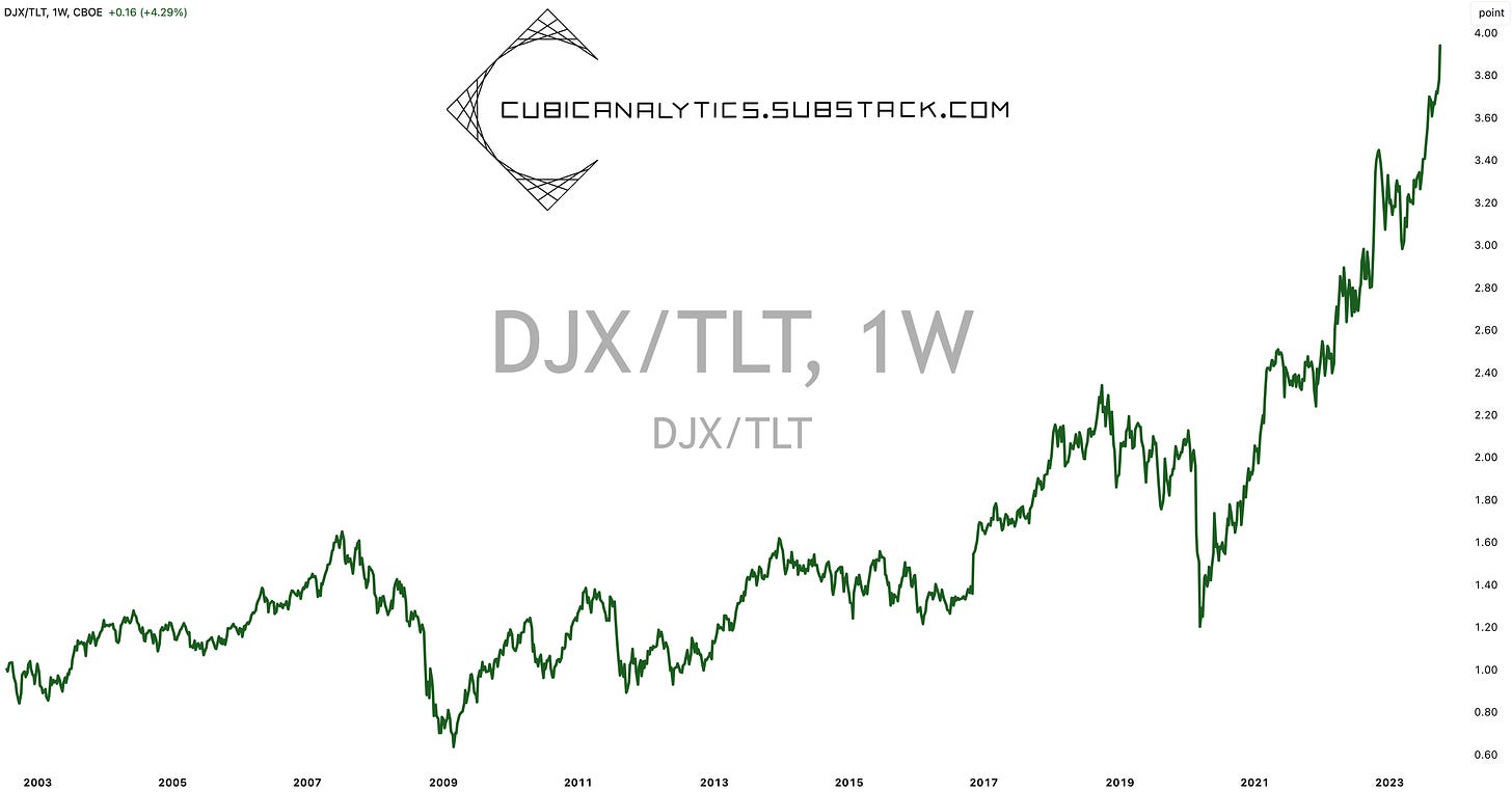
Take the Dow Jones for example, viewed as the most defensive & value-oriented index:
I’ve shared this chart several times over the past 15 months, even in my mid-September piece “Equities Are Outperforming”. Since then, the Dow Jones has gained another +6.5% vs. U.S. Treasuries.
Think about that and read it one more time… in less than one month, the Dow Jones has gained +6.5% vs. its cross asset alternative, the 20+ year U.S. Treasury.
People scolded me when I highlighted this ongoing development in September 2023.
They also scolded me when I highlighted the breakout to ATH’s in August 2022!
However, it’s continued to work and the trend has continued to develop. All I did was acknowledge it, accept it, and align with it.
Why is it important to acknowledge this development? Because this trend takes place when times are good! When equities outperform Treasuries, it shows us that we’re in a normal/good/strong economic period. When we go through bad or tumultuous economic periods, like the 2007-2009 Great Recession, the 2018 rate tantrum, or the COVID Crash, we see the relationship of DJX/TLT decline.
Therefore, if we acknowledge and accept this ongoing uptrend, we must also accept that we’re in a normal/good/strong economic environment! It’s not perfect. There are areas of weakness & concern (as with any period in history), but it’s not bad. So while we may disagree about which of the three buckets we’re in (normal/good/strong), we must unequivocally accept that we are in one of them, based purely on objective data.
That isn’t to say that deterioration can’t happen in the near future or in the coming quarters; however, I want to remind investors of the adage “the trend is your friend”.
Yes, this trend might weaken; but it’s telling us right now that things are okay.
It’s been telling us that for 3+ years.
Maybe, just maybe, things will be okay.
Before diving into the full report of Cubic Analytics, I’d like to thank the team at MicroSectors for their ongoing support. In addition to providing stellar investment products via their direct/inverse and leveraged/un-leveraged ETN’s, they post great market data on Twitter/X that will definitely add value to your news feed.
Make sure to give them a follow!
Macroeconomics:
Labor market data was the focus for the week, providing key insights about the health of the U.S. workforce. Once again, the data reaffirms that the U.S. labor market is resilient & dynamics, two adjectives that you’ve heard me say for the past 18 months.
While macro doomers & permabears have predicted the demise of the labor market since Q1 2022 (and before), I’ve remained cautiously optimistic about the U.S. workforce, continuously referring to it as being resilient & dynamic.
The latest round of labor market data reaffirms this state of affairs.
First of all, job openings increased from 8.92M at the end of July 2023 to 9.61M at the end of August 2023. The layoffs rate remained at 1.1%, near historically low levels. The quits rate also remained at 2.3%, though it’s been declining for the past 18 months. Across the board, the JOLTS data for August 2023 was much stronger than expected. However, while analysts were apparently far too pessimistic about job openings (estimates were calling for 8.8M vs. results 9.6M), it seems that the stock market has properly forecasted a recovery in openings.
This correlation is something that I’ve shared several times in the past, but it’s always worth highlighting again, showing the Nasdaq-100 vs. Job Openings:
While job openings have been declining throughout 2023, the Nasdaq-100 has been increasing. As such, the divergence between these two variables has forced analysts to question which is correct — the stock market or the economy? Perhaps we’re seeing job openings finally re-accelerate to catch up with the stock market; however, one report is far too premature to say with any concrete grasp.
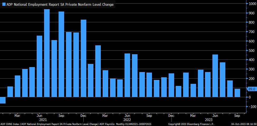
While ADP private payrolls for September came in significantly below estimates (result was +89k vs. estimates of +150k and prior results of +180k), this was the only “soft” data. The silver-lining here is that private payrolls are still increasing. Still, this was the smallest increase in ADP data since Q1 2021.
Labor market doomers were reinvigorated by the Wednesday release of the ADP data, saying that it was a precursor for weak nonfarm payrolls (NFP) data on Friday…
They were wrong.
NFP increased by +336,000 vs. estimates of +170k, while the unemployment rate and labor force participation rate (LFPR) remained at 3.8% and 62.8%, respectively. While the LFPR is still below its pre-COVID level of 63.3%, the prime-age LFPR (for those aged 25-54) has fully recovered above its pre-COVID levels & continues to stabilize in the mid-83% range:
The biggest complaint that bears raised about the NFP data was that 123k of the 366k jobs created were for positions held by people classified as multiple jobholders.
The focus on this datapoint is logical, given that it’s probably not a good sign if people need to work multiple jobs in order to pay for bills and support themselves. With 1/3rd of jobs created going to this cohort, bears screamed that the increase is a sign of economic weakness. They’re right… but they’re also wrong. My retort is simply that we need to measure multiple jobholders on a relative basis in order to properly diagnose the “stress” on the American consumer.
Thankfully, we have data to analyze this perspective:
The fact of the matter is, multiple jobholders as a percent of the employed is currently 5%, which is historically low and below the pre-COVID levels. Additionally, this variable has largely been on the decline for the past few decades! The point is, it’s natural for any economy & workforce to have multiple jobholders. As the economy & workforce grows, meaning that more people are employed, it’s naturally going to be the case that multiple jobholders will also rise! We can’t focus on multiple jobholders without contextualizing them against the entire workforce.
As such, I find this first complaint to be an issue of ignorance and laziness, rather than being a valid weakness of the labor market / U.S. consumer.
Taking all three reports into consideration, as well as the low levels of weekly initial jobless claims, it’s clear that the labor market continues to be resilient & dynamic. While the reports are far from perfect, we remain in a historically tight labor market which has been flexing its muscles month after month for the past several quarters. While we can nitpick about certain individual aspects of weakness or the non-ideal nature of the types of jobs being created, the data is good enough to support broader economic activity and growth. At the end of the day, that’s what’s important.
Regarding the repercussions for inflation going forward, the latest round of labor market data reaffirms my outlook for disinflation. This is largely for two reasons:
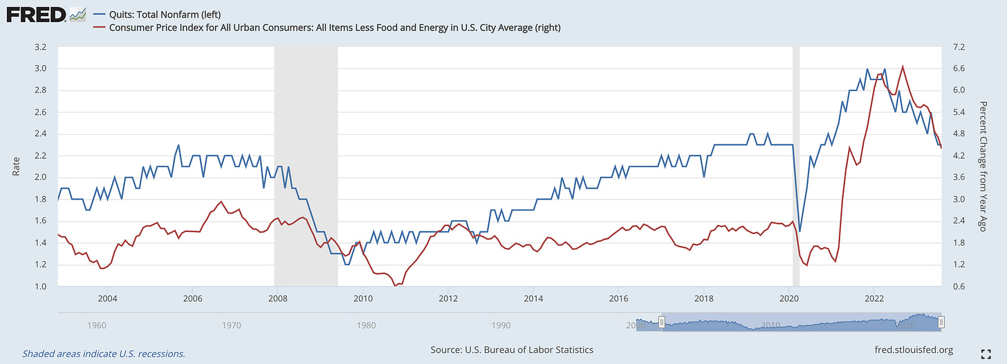
1a. Stabilizing quits will continue to choke inflation:
1b. Stabilizing number of hours worked will continue to choke inflation:
2. The deceleration in nominal wage growth will continue to choke inflation:
Wage growth measured on a YoY basis peaked in March 2022 at +5.9%, which then began to decelerate at a steady pace. CPI inflation measured on a YoY basis peaked just three months later and has also continued to decelerate at a steady pace.
All in all, the immaculate disinflation story is still intact amidst a resilient & dynamic labor market. As I acknowledged in November 2022, it just might be possible that the soft-landing is on track.
It’s important to stay diligent with respect to incoming data, but things continue to move in the right direction, which we should celebrate.
Stock Market:
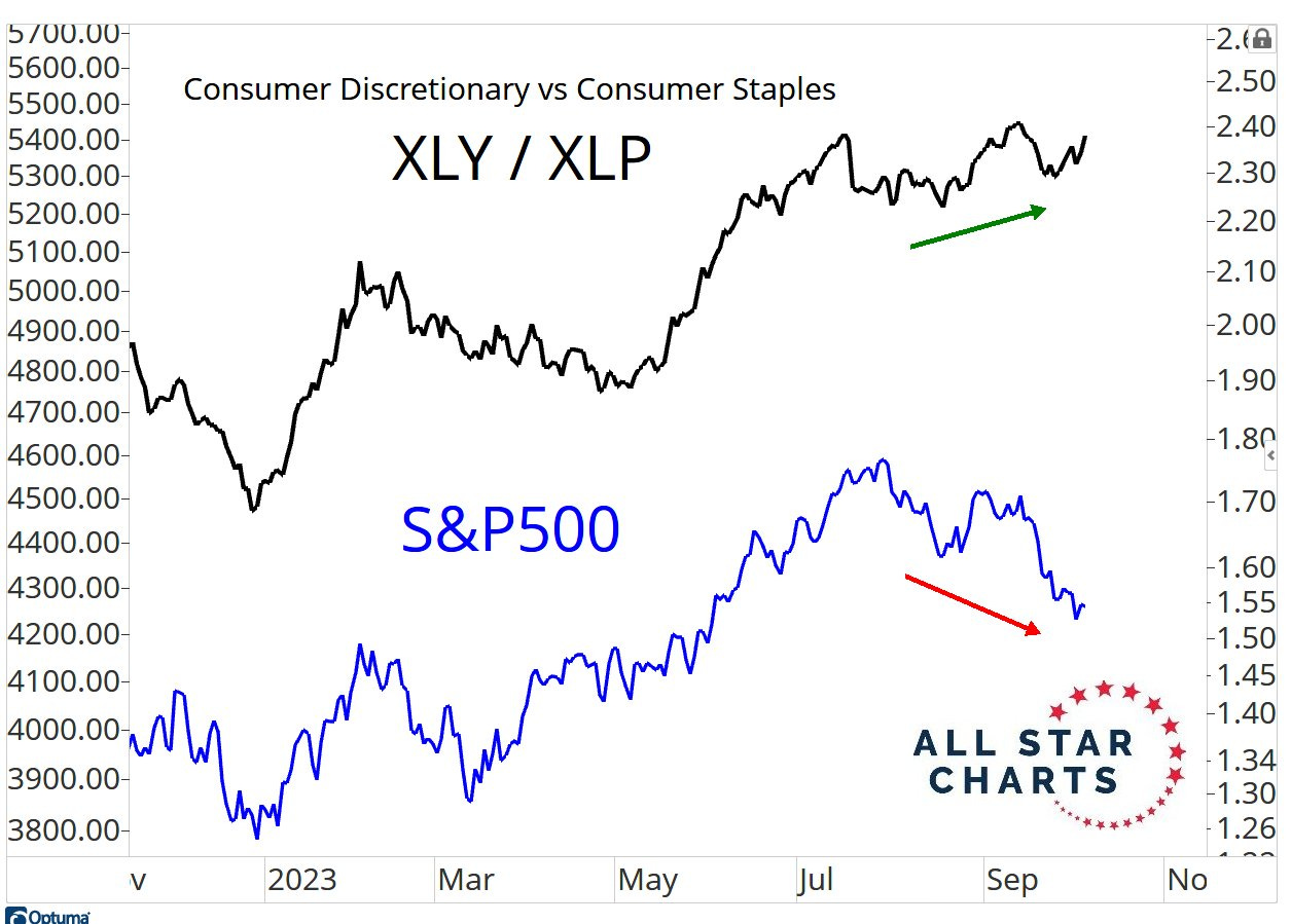
One of the best charts that I saw during a mixed week of stock performance was from J.C. Parets of All Star Charts, showing the relative performance of consumer discretionary stocks vs. consumer staples stocks & the correlation with the S&P 500:
Typically, we see discretionary outperform staples during uptrends for the stock market because it’s a representation of offensive vs. defensive stocks.
The rule of thumb is simple:
During uptrends, offense wins.
During downtrends, defense wins.
Therefore, the recent & ongoing divergence is a bit of a head-scratcher…
Is the blueprint invalidated? Which variable is correct? How will this divergence be reconciled? I wish I could tell you, but my crystal ball is still in the shop…
Friday was an extremely encouraging reversal day for the markets, in which the S&P 500 gained +2.1% from the intraday lows and closed at +1.18% for the session. Still, I continue to see defensive, if not outright bearish, internal data for the index. As such, I don’t want to rush to call a local bottom or say that the market will decisively accelerate from here. Friday was a win, but we’ll need more than one day to provide a potential reversal signal. I’ll be providing significant market analysis in tomorrow’s premium report, so I’d strongly recommend keeping an eye out for that newsletter.
Bitcoin:
The apex digital asset continues to be boring, in the best possible way. A few weeks ago, my “analysis” in the Bitcoin section of my report was simply the following:
“Meh, there’s nothing to say about Bitcoin right now so I won’t try to pull a rabbit out of a hat or waste your time.”
I think the same is true today, but I wanted to recycle a comment that I made during Friday’s trading session on Twitter/X:
With ~200 days until the Bitcoin halving event, I think boring price action is exactly what long-term bulls are happy to see.
Best,
Caleb Franzen
SPONSOR:
This edition was made possible by the support of MicroSectors, a financial services and investment company that creates an array of unique investment products and ETN’s. Their NYSE FANG+ products are the only one of their kind, allowing investors to gain exposure, leveraged/un-leveraged & direct/inverse, to the NYSE FANG+ Index.
DISCLAIMER:
This report expresses the views of the author as of the date it was published, and are subject to change without notice. The author believes that the information, data, and charts contained within this report are accurate, but cannot guarantee the accuracy of such information.
The investment thesis, security analysis, risk appetite, & timeframes expressed above are strictly those of the author and are not intended to be interpreted as financial advice. As such, market views covered in this publication are not to be considered investment advice and should be regarded as information only. The mention, discussion, and/or analysis of individual securities is not a solicitation or recommendation to buy, sell, or hold said security.
Each investor is responsible to conduct their own due diligence and to understand the risks associated with any information that is reviewed. The information contained herein does not constitute and shouldn’t be construed as a solicitation of advisory services. Consult a registered financial advisor and/or certified financial planner before making any investment decisions.
Please be advised that this report contains a third party paid advertisement and links to third party websites. These advertisements do not constitute endorsements. The advertisement contained herein did not influence the market views, analysis, or commentary expressed above and Cubic Analytics maintains its independence and full control over all ideas, thoughts, and expressions above. The mention, discussion, and/or analysis of individual securities is not a solicitation or recommendation to buy, sell, or hold said security. All investments carry risks and past performance is not necessarily indicative of future results/returns.


