Investors,
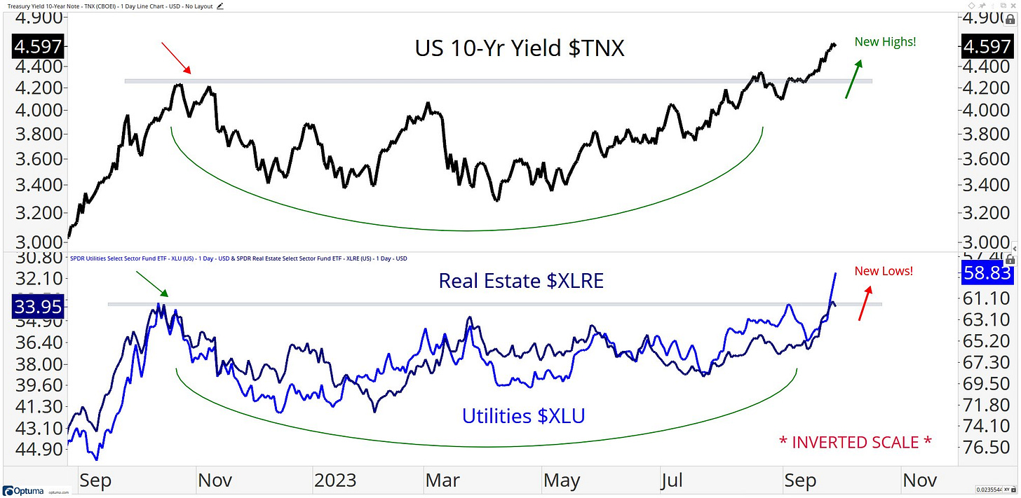
One of the best charts I saw this past week was shared on X by Steven Strazza, the Director of Research at Allstar Charts, showing the (inverse) correlation between the 10Y Treasury yield and two rate sensitive sectors of the stock market:
Specifically, utilities and real estate stocks appear to be the most correlated with yields and have therefore been getting punished with the recent acceleration in yields.
The YTD performance of both groups are the worst of any sector in the stock market in 2023, further proving how hurtful the rising interest rate environment has been on these two sectors.
Why is this so important? Depending on your outlook on rates, understanding this relationship will help you position yourself with respect to these two sectors:
If you think yields fall from here, then buy XLRE & XLU.
If you think yields rise from here, don’t buy XLRE & XLU, or actively short them.
I think this will be an effective strategy going forward, based on how consistent it’s been in the past; however, you will need to make your own judgement call on the directional trend you want to take advantage of.
In the remainder of this premium member post, I’ll cover:
S&P 500 under-the-hood metrics to evaluate the movement of the market and diagnose the nature of market behavior.
An updated view on the energy trade, relying on intermarket relationships to evaluate price structure and potential trends going forward. Energy remains the top sector in the market and I continue to believe this is where alpha will be generated, as I’ve been sharing for a few months.
More data on positioning within the equity markets and a discussion on fund flows through different asset classes.
See you on the inside!


