
Should You Short Silver?
This Signal Has Only Flashed 4 Other Times!

Investors,
We just witnessed history.
After a monumental rise, silver just did something it’s never done before.
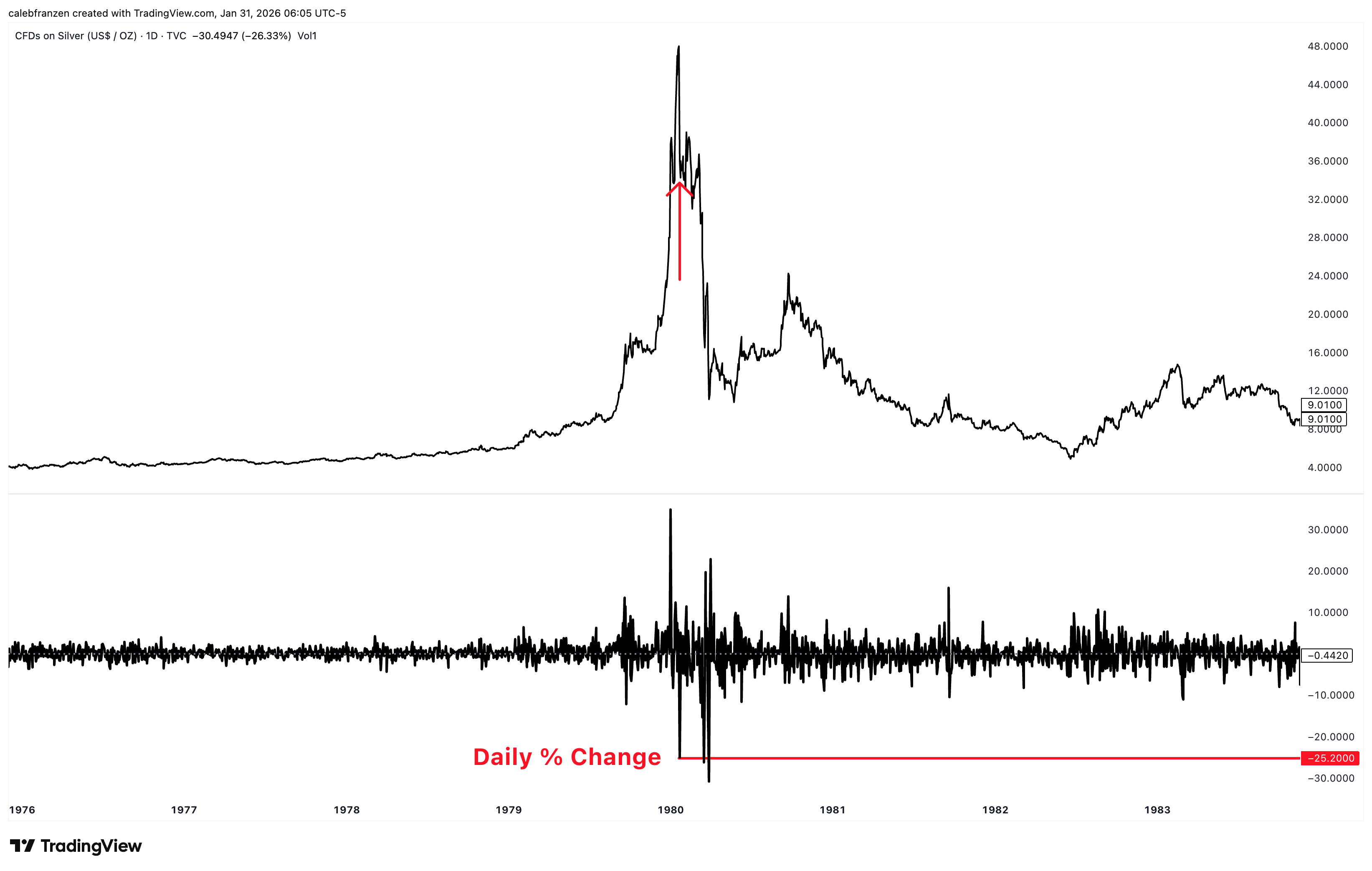
The precious metal closed down -26.33% in a single trading session, but was down more than -35% at one point during Friday’s session.
While I was watching the price action in real-time, I figured it had to be a rare occurrence to see gold’s little brother falling this much in a single day, so I decided to look at the data…
Then I got really surprised.
Post WW2, silver has only fallen more than -20% in one day on 5 separate occasions:
January 22, 1980: silver fell -25.2%
March 17, 1980: silver fell -26.3%
March 27, 1980: silver fell -30.0%
April 28, 1987: silver fell -21.1%
January 30, 2026: silver fell -26.33%
That’s it.
That’s the entire list of days where silver has fallen -20% or more.
As I’m about to show you, all of these events were after an exponential rally and opened the gate for a new downtrend to take hold of the market.
First of all, it’s fun to live through historic events!
This is one of those things were going to talk about in 3, 5, 10+ years, similar to how we reference the craziness of crude oil futures trade at a negative price in 2020.
Secondly, given the historic nature of event, wouldn’t it be informative to know how silver performed after prior similar occurrences in order to ascertain how it could perform going forward?
That’s where I get really excited as a data-backed investor.
“Cool, something historic just happened, but what does it actually mean going forward?”
That’s what I want to answer today.
This report is entirely free, with no sponsors, advertisers, or affiliate links.
Cubic Analytics is supported by investors and readers just like you, so feel free to share it with anyone who values objective & data-backed insights, and even consider upgrading to a premium membership to unlock more research and benefits.
The Implications of -20% Drawdowns:
I want to start as niche as possible, given the historic nature of these events.
Why did Friday’s price action occur?
Was it related to options expirations? I don’t know.
Was it related to over-leveraged longs getting taken out. I don’t know.
Was it related to [insert your choice of justification]? Similarly, I don’t know.
The fact of the matter is, I don’t care why it happened.
I only care that it did happen.
Similarly, due to the extremely rare nature of such an occurrence, we have to recognize the inherent flaw of statistical analysis, being that the small sample size creates a notable asterisk.
Is the data that I’m about to show you accurate? Yes, 100%.
Is the data that I’m about to show you going to repeat itself identically? No.
But the data is the data and we’ll go through a meticulous process together to make it more statistically relevant.
So let’s begin.
I want to start by tracking the returns of silver after it had fallen -20% or more in a single day, focusing on the first signal within a “cluster” of other signals.
For example, there were 3 signals that flashed in Q1 1980, so the data is going to overlap on top of each other and distort the results and therefore the implications.
So I’m only going to focus on two signals for which we have historical data:
January 22, 1980
April 28, 1987
This is what each of those charts looked like, in the years leading up to the signal and the years after the signal occurred:
January 22, 1980: Silver had been rising at an exponential pace, likely due to the 2nd wave of inflation in the late 1970’s and the recession fears that ensued after Paul Volker’s nomination as Fed Chair, in which he embarked on a historic rate hike cycle. Seeking a safe-haven away from stagflation, investors flocked into silver… or at least, that’s my guess based on the fundamental dynamics that I know at my fingertips.
Then, after gaining roughly +665% in a single year, silver fell by -25.2% in a day.
What happened next?
The chart is pretty self explanatory, but here are the details:
1 month after silver’s -25.2% decline, silver fell an additional -14%
3 months after silver’s -25.2% decline, silver fell an additional -60.9%
6 months after silver’s -25.2% decline, silver fell an additional -56.9%
1 year after silver’s -25.2% decline, silver fell an additional -57.5%
2 years after silver’s -25.2% decline, silver fell an additional -78.1%
3 years after silver’s -25.2% decline, silver fell an additional -64.7%
5 years after silver’s -25.2% decline, silver fell an additional -82.8%
After the signal flashed, silver would go on to fall -86.5% over the next 2.5 years.
Additionally, after silver peaked at $48/ounce in January 1980, it wouldn’t trade at those prices again until April 2011, more than 31 years later.
Don’t believe me?
Look for yourself…
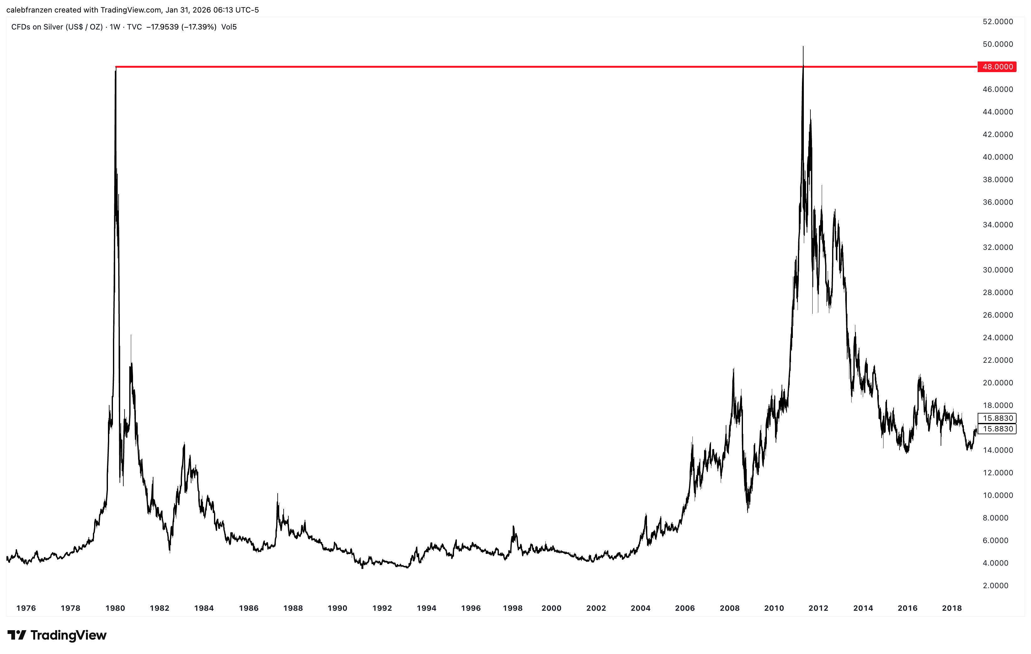
The irony is, once price got back to that same level, it immediately got rejected and proceeded to enter another multi-year downtrend once again! It’s almost like technical analysis works and the market has price memory…
April 28, 1987: Silver also experienced an exponential pop in 1986/87, though it was much shorter (and shallower) compared to the price action in leading up to the peak in 1980. Nonetheless, market historians don’t have a direct explanation for why silver was rallying in that environment, but justifications vary from the U.S. introducing a Silver Eagle 1oz coin, to industrial demand revitalization after the historic crash, and monetary policy stability. Either way, regardless of these “catalysts”, whether they’re true or not, silver fell -21.1% in a single day at the red arrow in the chart below:
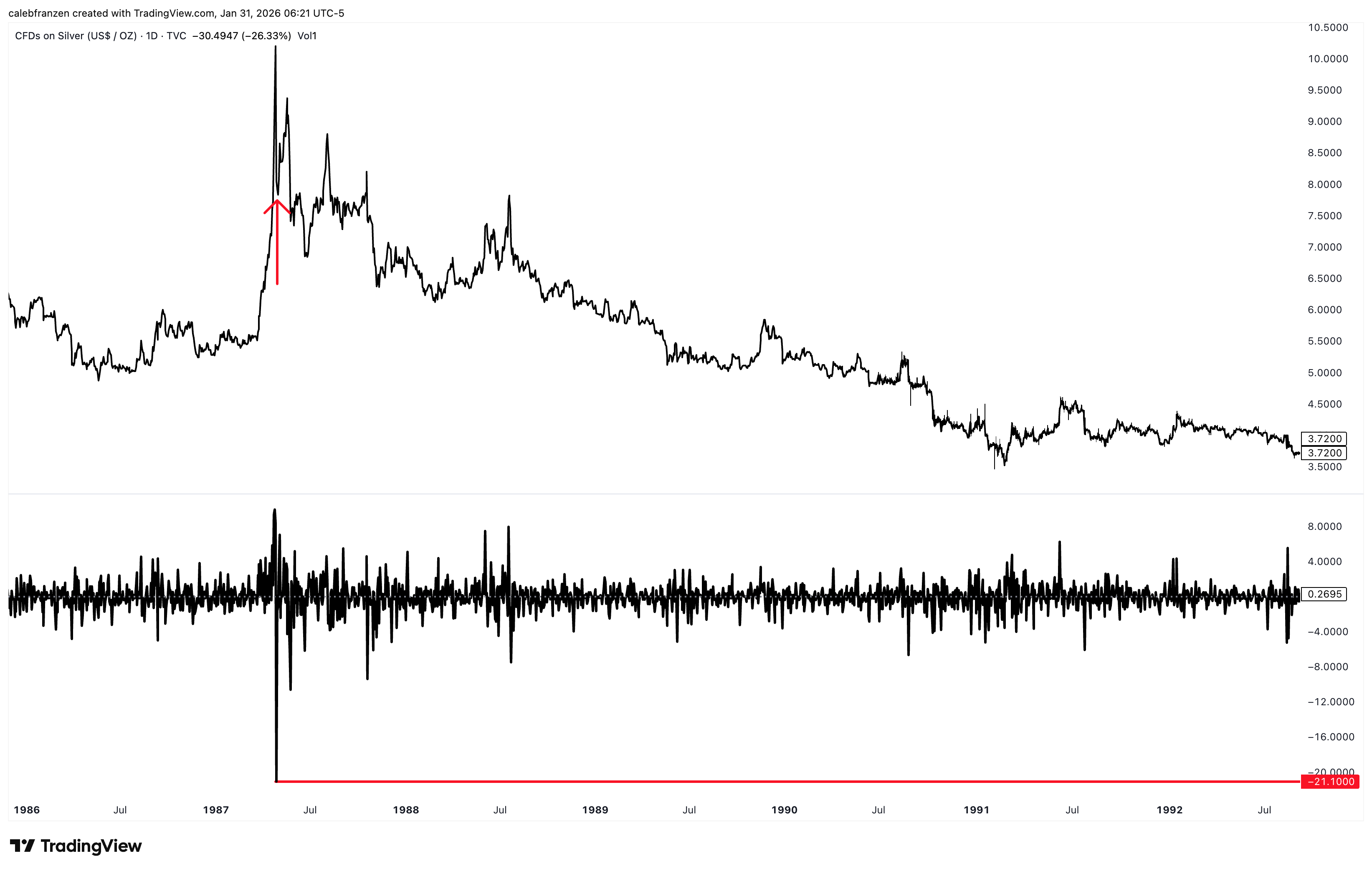
Once again, similar to the January 1980 signal, this daily decline marked a major local peak for silver and prices went on to suffer a severe and extended bear market.
1 month after silver’s -21.1% decline, silver fell an additional -6.4%
3 months after silver’s -21.1% decline, silver fell an additional -4.1%
6 months after silver’s -21.1% decline, silver fell an additional -2.7%
1 year after silver’s -21.1% decline, silver fell an additional -19.4%
2 years after silver’s -21.1% decline, silver fell an additional -30.2%
3 years after silver’s -21.1% decline, silver fell an additional -38.5%
5 years after silver’s -21.1% decline, silver fell an additional -50.9%
In total, silver endured a maximum drawdown of -57% over the next 3 years and 10 months, AFTER falling -21.1% in that single day on April 28th, 1987.
That day marked the peak for silver, exactly as it did in 1980, at $10.20/ounce and investors wouldn’t see those prices again until 2006… nearly 20 years later.
Those are the only two historical cases, with the third case now flashing on Friday.
Like I said, we’re living through history.
Recognizing the flaws of statistical implications with a sample size of two, I still think that it’s vital to share this data with you in order to contextualize the significance of Friday’s events.
Yes, Friday was an anomaly and extremely rare.
But the implications are also historic in their own right.
Irrespective of the narratives that had taken hold on bullish investors at the time, the price action that ensued was clearly bearish, foreshadowed by a single day of down -20% or more.
So let’s look at the current chart of silver…
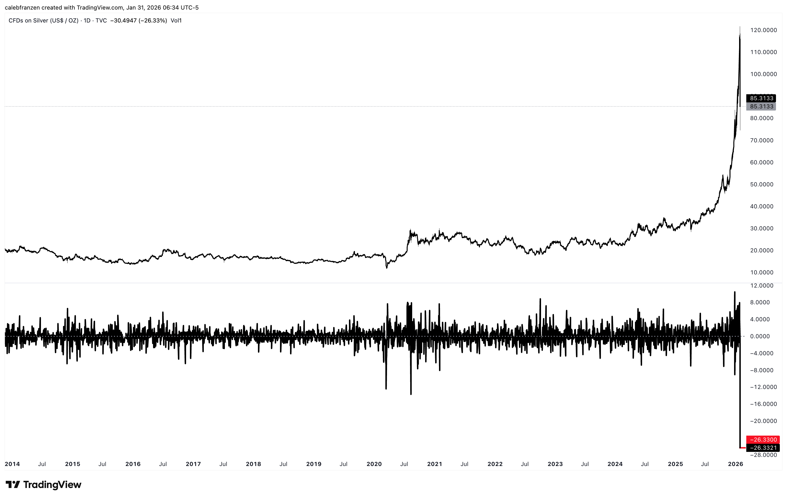
Sideways for a decade, then an exponential rally that started in Q4 2023.
Before Friday’s historic selloff, silver had produced massive gains:
1-month gains: +53.9%
3-month gains: +158.4%
6-month gains: +220.5%
1-year gains: +300.0%
Gains since the September 2022 bear market lows: +592%
If that isn’t a rally of historic magnitudes, then I don’t know what is.
In that time, silver became the world’s second most valuable asset, only behind gold, at a market cap of roughly $6Tn. Even after yesterday’s historic decline, this is the market cap ranking of individual global assets:
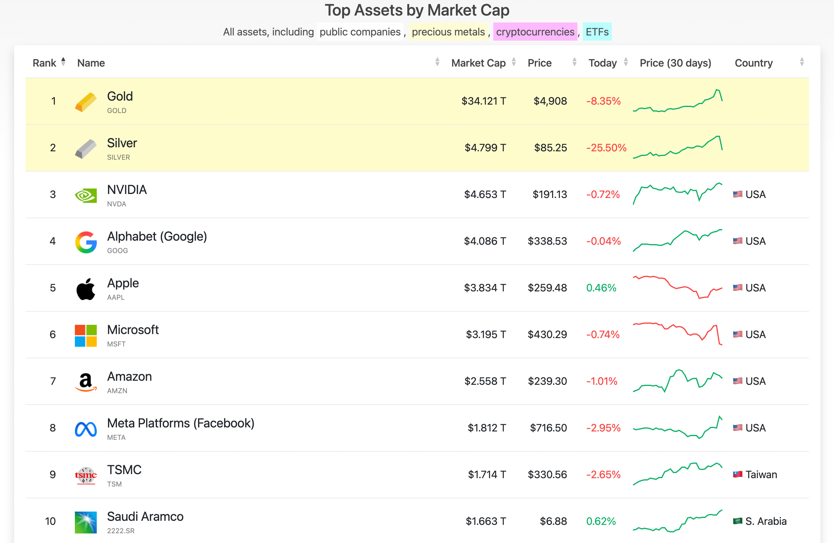
In other words, despite falling -26.3% in one day, it’s still more valuable than NVDA.
Based on the (albeit limited) data that I shared above, it’s probably about to fall down this list quite a bit…
Expanding The Sample Size:
We know that drawdowns of -20% or more are historic.
We have that data and just saw the implications — they’re not pretty.
But maybe it would be beneficial to make those return implications more statistically sound by expanding the sample with other declines of slightly smaller magnitude.
At first, I thought finding -15% declines or more would be sufficient… but those instances were also super rare and I only found 5 total cases, in which 2 were the -20% or more declines that we analyzed above.
So that doesn’t really help us.
Then I thought -10% declines would expand the sample size enough, but the problem is that these signals have occurred a variety of times, but at a vastly different phases of market structure.
So the question is, how similar is a -10% decline in an existing bear market vs. the current -26.3% decline after massive gains and is it appropriate to use those instances to analyze the implications for the current signal?
The answer is probably not…
But then I thought about adding extra criteria to these -10% declines…
Must have a positive 3-month return before falling -10% or more in a single day
Only focus on the first signal within a 3-month period, excluding the following signals that had other -10% (or more) drawdowns in a ±3-month period.
This created 12 individual cases since 1945, with the 12th just flashing on Friday.
Based on the 11 prior occurrences, this is how silver performed after those cases:
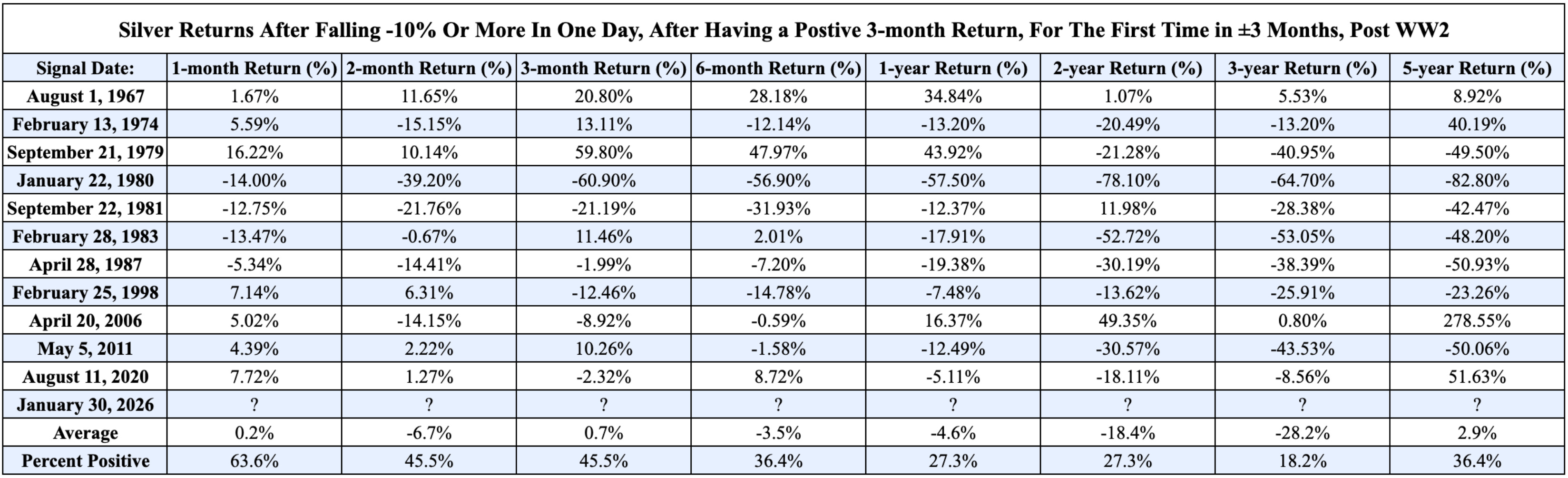
Yes, I know it’s a lot of data.
Feel free to look at each instances and the subsequent returns, but I think the average data and the percent positivity rates are the critically important things to analyze here.
These are my rapid-fire conclusions:
Returns over the next 1, 2, and 3 months are incredibly mixed, with some big positive returns and some big negative returns. All in all, there’s roughly a 50% chance of generating a positive return, but those average returns are incredibly weak and not worthy of the risk, in my opinion. You want to take a 45.5% chance of generating a positive return, with average returns of -6.7%? Be my guest. But that isn’t my idea of a good opportunity.
While consistently big returns are still possible over the next year, like in 1967 and 1979, these are the exceptions to the rule. Those are the only 2 mid-cycle signals that occurred that didn’t mark a bull market peak. All other 9 signals produced significant local peaks or topping processes. But even the 1967 case reached a bull market peak within a year of flashing, erasing all of the gains that it was able to generate in the first ~10 months after the signal.
Average returns on each of the timeframes I measured are negative in 5 of the 8 timeframes, with 2 of those positive timeframes (1-month and 3-month generating negligible returns of +0.2% and +0.7%). In other words, the only timeframe with “real” positive returns is the 5-year signal, which has a total return of +2.9% That’s what I’m supposed to get excited about as a potential opportunity in silver? +2.9% in 5 years? No thanks.
The variance of returns is extremely wide on all timeframes, highlighting how this signal produces significant volatility across time, in both directions.
1-month return range: [-14.0%, +16.22%]
2-month return range: [-39.2%, +11.65%]
3-month return range: [-60.9%, +59.8%]
6-month return range: [-56.9%, +47.97%]
1-year return range: [-57.5%, +43.92%]
In other words, you either capture a max gain of +59.8% in 3 months or a max loss of -60.9% in that same 3-month window. Again, that doesn’t sound like a ride that I want to get on. Feel free to look at the max/min figures for the remaining timeframes, but I just wanted to highlight what investors can expect in terms of variance over each timeframe in the first year.
Closing Thoughts:
So listen… that’s the data.
Is it perfect? No.
Is it super robust? No.
Is it statistically significant? No.
But it’s the only data that we have to match the current environment, as closely and as intellectually honest as I possibly could.
If we want to use data to our advantage, we should do everything we can to understand the data, understand the implications, understand it’s potential flaws, and to recognize that rare events are rare for a reason.
Given the immense amount of interest in silver (and gold) in the current environment and the historical rallies that they’ve both experienced, I think this data is critical to understand.
It tells us, statistically, that silver has likely peaked or is in the process of peaking soon. It tells us that silver, statistically, is on track to generate significant negative returns across various timeframes over the next several years.
It also tells us that our attention as investors is better served looking for opportunities in other areas of the market…
If we consider that the S&P 500 has generated an average calendar year return of roughly +9% post WW2, we can compound that 5 times to generate an average 5-year return of +54% for the S&P 500 compared to only +2.9% for silver in this study.
Again, we have a choice as investors…
Do we want to seek opportunities that generate an average 5-year return of +2.9% with only a 36.4% chance of generating positive returns, or do we want to seek opportunities that can generate more than that?
Personally, that simple question gives us the solution.
Maybe we don’t want to buy silver here.
Maybe we don’t want to short silver here.
But maybe it’s best to just ignore it entirely, especially given the volatility & variance.
At least, that’s what history tells us.
Best,
Caleb Franzen,
Founder of Cubic Analytics
This was a free edition of Cubic Analytics, a publication that I write independently and send out to 14,500+ investors every Saturday. Feel free to share this post!
To support my work as an independent analyst and access even more exclusive & in-depth research on the markets, consider upgrading to a premium membership with either a monthly or annual plan using the link below:
There are currently 1,150+ investors who are on a premium plan, accessing the exclusive alpha and benefits that I share with them regarding the stock market, Bitcoin, and my own personal portfolio.
DISCLAIMER:
This report expresses the views of the author as of the date it was published, and are subject to change without notice. The author believes that the information, data, and charts contained within this report are accurate, but cannot guarantee the accuracy of such information.
The investment thesis, security analysis, risk appetite, and time frames expressed above are strictly those of the author and are not intended to be interpreted as financial advice. As such, market views covered in this publication are not to be considered investment advice and should be regarded as information only. The mention, discussion, and/or analysis of individual securities is not a solicitation or recommendation to buy, sell, or hold said security.
Each investor is responsible to conduct their own due diligence and to understand the risks associated with any information that is reviewed. The information contained herein does not constitute and shouldn’t be construed as a solicitation of advisory services. Consult a registered financial advisor and/or certified financial planner before making any investment decisions.
Each investor is responsible to understand the investment risks of the market & individual securities, which is subjective and will also vary in terms of magnitude and duration.
Nice analysis, and matches with my personal memory of what happened in 1980. Back then my Mom sold her silver tea set. During this peak, my wife sold the silver tea she inherited. Silver acted like an altcoin on the way up, and I fully expect it to act like an altcoin on the way down.