Investors,
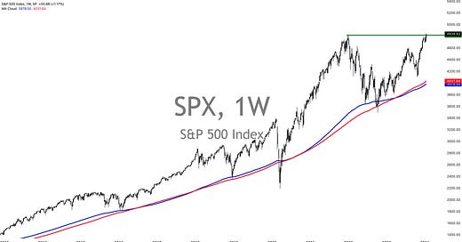
After 513 trading days (or 746 calendar days), the S&P 500 has made new all-time highs.
Despite all of the doubt. Despite all of the shouting about Magnificent 7. Despite all of the shouting about geopolitics. Despite all of the shouting about the Fed. Despite all of the shouting about commodity prices. Despite all of the shouting about Treasury auctions. Despite all of the shouting about inflation. Despite all of the shouting about the labor market. Despite all of the shouting about the U.S. consumer. Despite all of the shouting about fiscal policy. Despite all of the…
I think you get the point.
Folks have made desperate efforts to convince investors that everything is fucked.
The S&P 500 has never been higher than it is right now, officially matching the achievements that the Dow Jones and the Nasdaq-100 made in December 2023.
Clearly, things aren’t as bad as many investors were led to believe…
The three major U.S. stock market indexes are trading at new all-time highs.
While this achievement is certainly worth celebrating, it’s also a reminder that far too many investors were under-allocated or left on the sidelines over the past 18 months. It’s a sobering reminder of why we should always be a net-buyer of assets and the cliche phrase “time in the market beats timing the market”.
Theoretically, an investor in the S&P 500 who fell into a coma on January 4th, 2022 and woke up on January 20th, 2024 has never been wealthier. They might have even outperformed many of the investors who are reading this.
I think there’s a lesson in that.
Over the course of the past year, I’m confident that Cubic Analytics has kept investors on the right side of the market & provided a degree of confidence that everything is going to be alright, from the perspective of both macro and markets.
In fact, better than just alright.
At the very least, I’ve objectively reviewed the data, price structure, and statistics, which have pointed to positive conclusions that I’ve communicated to this group of investors week after week. There have been moments of doubt, coupled with red flags that I’ve highlighted when appropriate, but the feedback that I’ve received gives me confidence that investors have benefited tremendously from these reports.
With that said, let’s take a look at what the data is showing us today…
Macroeconomics:
I want to focus on four things:
Manufacturing data.
Inflation implications.
Labor market data.
GDP growth estimates.
Regarding manufacturing, we received two important reports this week: the Empire State Manufacturing Survey & the Philadelphia Federal Reserve Manufacturing Survey.
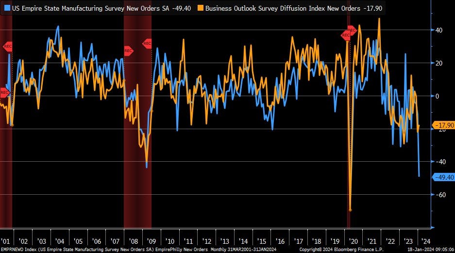
There was a massive divergence in these two regions, causing many investors to scratch their head given the long-standing correlation between both datapoints. What we know for sure is that manufacturing activity remains in negative territory and continues to look weak; however, it’s vital to recognize that the service sector is substantially larger & more important to the U.S. economy. Overall, this continues to fit within my “resilient, but softening” outlook for the U.S. economy.
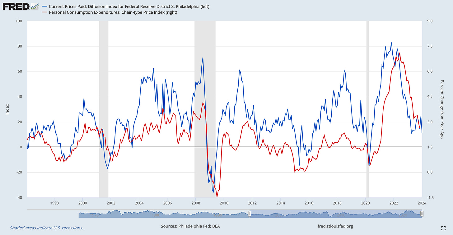
One aspect that really stood out to me was the continued decline in the Prices Paid Diffusion Index in the Philadelphia data, notably because of the direct correlation that I’ve previously highlighted with inflation dynamics. The chart below tracks the evolution of the Prices Paid Diffusion Index vs. the YoY inflation rate for Personal Consumption Expenditures (PCE):
While these two variables don’t have a close correlation month-over-month, the long-term correlation clearly indicates that we’d prefer to see the Prices Paid Index falling if we also want to see a decline in the rate of inflation. As such, I firmly believe that the trajectory of the Prices Paid Diffusion Index is telling us that more disinflation is coming and that CPI & PCE will continue to normalize towards the Fed’s target.
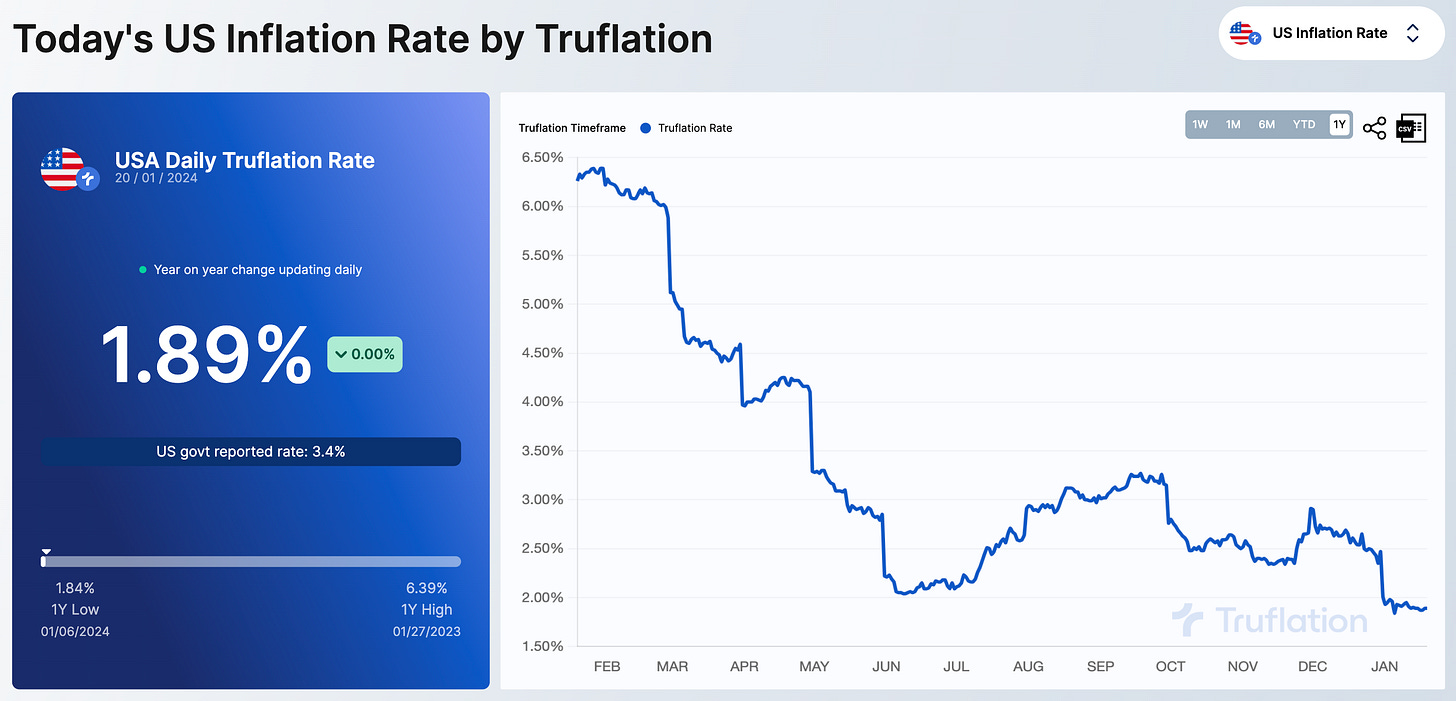
Thankfully, private market solutions for tracking inflation, like Truflation, continue to indicate that the rate of inflation is indeed decelerating, the definition of disinflation.
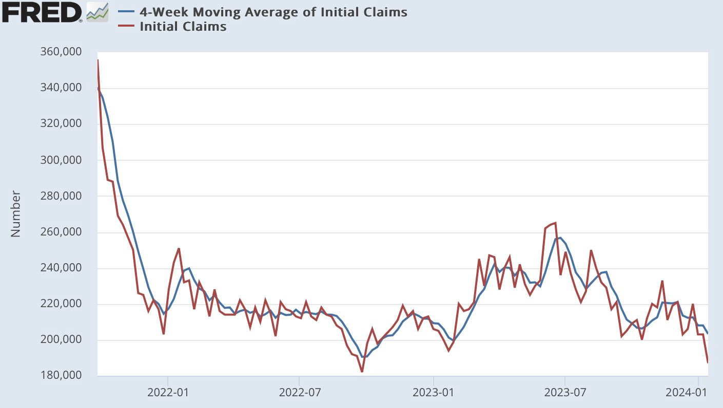
Regarding the labor market, initial weekly unemployment claims fell to their lowest levels since September 2022, reaching 187,000 initial claims.
This metric and its 4-week moving average have been declining since mid-2023, but can generally be described as trending sideways for the past 2 years. As always, the labor market will ebb & flow; however, this is why I’ve been describing the labor market as “resilient & dynamic” rather than “strong”. The labor market has done an outstanding job of absorbing shocks and moving forwards, which is certainly a healthy trend. While that may change in the months/quarters ahead (not my base case), the ongoing data gives us a clear indication that the labor market isn’t deteriorating by a substantial degree yet. In fact, one could vehemently argue that it’s just getting better and better.
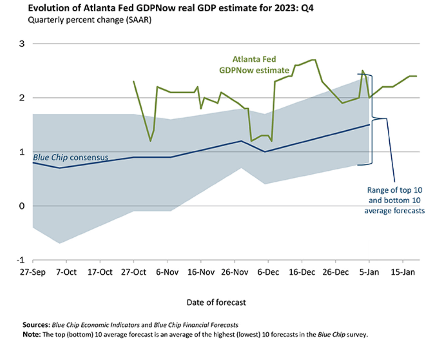
Finally, the Atlanta Federal Reserve published their model-based output forecast for real GDP growth in Q4 2023, which now stands at +2.4% annualized growth.
The closer we get to the publication of the actual GDP data (coming on January 25th), the more accurate these forecasts are expected to become. Importantly, we continue to see the consensus estimate from Blue Chip economists rising gradually since the first Q4’23 forecast was published in September 2023. Considering that the current median estimate from Wall Street is an annualized growth rate of +1.7%, I’m going to take the “over” on that prediction.
All in all, evidence continues to suggest that the soft landing scenario is becoming increasingly likely, a trend that I first started to call out in November 2022:
I haven’t had to eat my words yet…
Stock Market:
Regarding the U.S. stock market, I don’t have any analysis to share in today’s free report, but I’m going to provide full analysis & commentary in tomorrow’s premium edition for paid members, in addition to the weekly investor call for paid members.
If you’re interested in accessing that report and attending the upcoming weekly meeting, consider upgrading your subscription today using the link below and benefit from a 10% discount on annual subscriptions:
Bitcoin:
In order to analyze Bitcoin, sometimes you must analyze something other than BTC.
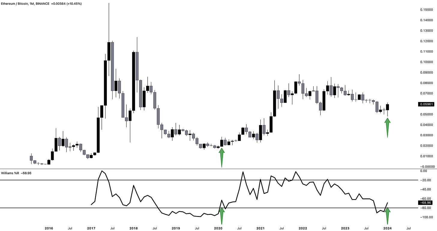
So that’s exactly what I did in the research below, analyzing a long-term signal for the ratio of Ethereum vs. Bitcoin (ETH/BTC). These are the two premiere crypto assets, but ETH is perceived as being riskier than BTC. By analyzing this relationship, we can try to encapsulate how risk appetite is evolving within the crypto market.
To view the original post on X, click here.
Specifically, I’m using the 18-month Williams%R oscillator in the lower-bound as a way to identify “overbought” (upper-bound) and “oversold” (lower-bound) signals.
We’re still nearly two weeks away, but the potential signal for January 2024 is about to leave the oversold threshold for the first time since entering this zone in mid-2023.
As we can see from the past cycle, a departure from the oversold zone marked the beginning of a bullish period that generated massive returns. After this signal flashed in February 2020:
Bitcoin gained nearly +500% within a year.
Ethereum gained nearly +2,300% over the same timeframe.
ETH/BTC gained another +250%.
In other words, this is a massively bullish signal for risk appetite within the cryptocurrency market, highlighting how we might still be on the precipice of a larger (and longer) rally than most investors are willing to accept.
In the chart below, I’ve kept the ETH/BTC chart and the 18-month Williams%R oscillator, but I’ve also overlayed the price of Bitcoin itself in orange:
As I’ve shared in the past, I want to reiterate that statistics don’t operate in a vacuum.
This study, while objectively bullish, is not the be-all end-all and is simply a datapoint to add to our overall diagnosis of market dynamics and potential paths going forward. Unquestionably, it shifts the scale further in favor of the bullish argument and increases the weight of the evidence to support a bull case.
Nonetheless, I want to highlight that I shared the exact same study & signal for the Nasdaq-100 in July 2022, which you can read here. The Nasdaq-100 has gained more than +35% since that study, less than 18 months later.
I also shared the same signal for Bitcoin early in 2023, which you can read here.
Bitcoin has gained more than +150% since I published that work.
While I caution investors to recognize that statistics don’t operate in a vacuum, I’ve always loved the phrase “Men lie. Women lie. Numbers don’t.” Take this study with a grain of salt, but I implore you not to ignore it.
Best,
Caleb Franzen





Great stuff Caleb. Really enjoyed meeting you in Istanbul a while ago! Appreciate the hard work🙏🏻
With a headline like this, how are we supposed to ignore it? 😃