


Hopium

Investors,
Bears have tightened their grip on equities & crypto.
The concerns that I shared last week (notably credit spreads, the performance of stocks vs. Treasuries, and RSPD vs. RSPS) continued to worsen throughout the week.
I find myself struggling to have conviction in either direction right now, recognizing the objective warning signs that I’ve cited vs. the overwhelming strength of the uptrend.
Most analysts seem too afraid to make that admission.
Bulls are digging their heels into the ground.
Bears are shouting louder than ever.
But if someone had a gun to my head and told me to pick, I must remain bullish.
Admittedly, my bullishness on stocks has been wrong over the past week and a half.
And my bullish stance on Bitcoin has been wrong for the past month.
I’ve been wrong — but that happens & it’s part of the game.
Nonetheless, the bullishness that I’ve expressed over the past 22 months has been overwhelmingly correct, allowing myself and other investors to capitalize on this extremely strong bull market. The tools and datapoints that I’ve used to make decisions remain the same, providing an objective vantage point of market conditions in order to stay on the right side of the market, regardless of which direction it’s going.
The purpose of this report is to outline why I continue to remain bullish on stocks & Bitcoin, even in light of recent events.
This post is completely free, so please share it and let me know if you enjoyed it!
1. The Trend Is My Friend:
The fact of the matter is that asset prices are in uptrends. While short-term weakness and deterioration can signal the end of medium & long-term uptrends, we know for a fact that both medium & long-term uptrends are intact.
My preferred way to determine if an asset is in an uptrend is to analyze the price of that asset relative to its moving average, specifically relative to its 200-day moving average cloud (which combines the simple & exponential moving averages).
If the asset’s price is above its 200-day MA cloud, then it’s most likely in an uptrend.
If the asset’s price is below its 200-day MA cloud, then it’s most likely in a downtrend.
It’s that simple.
🔵 200-day EMA
🔴 200-day SMA
In the case of the stock market, the S&P 500 has continued to use this dynamic range as support since breaking above it back in Q1’23, essentially the birth of the uptrend.
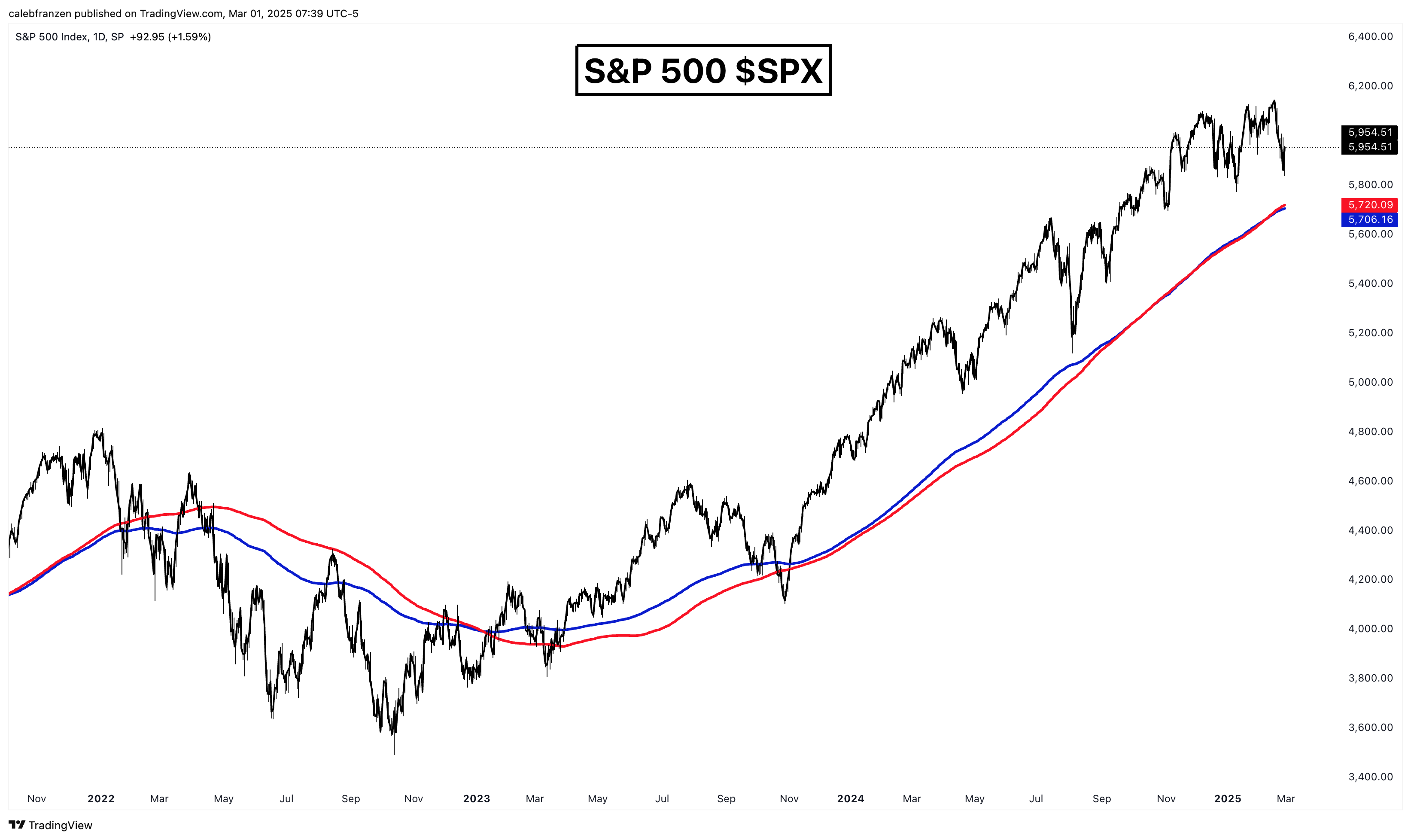
Temporary breakdowns have occurred over the life of this bull market; however, they’ve been short-lived and the market has been able to fight back above the cloud rapidly. In these cases, I think it’s been appropriate to get defensive (if not outright bearish) until there is evidence that the index has gotten back above the cloud and returned to an uptrend regime, statistically.
This is the beauty of dynamic indicators — we can be dynamic as market conditions evolve.
In the case of Bitcoin, price retested its 200-day MA cloud on Thursday/Friday and has been able to rebound, thus far:

Similar to the stock market, Bitcoin has done an extraordinary job of using this cloud as both dynamic support in the bull market and resistance during bear markets.
Some of you might think that the 200-day length is arbitrary…
Why not 50? Why not 100? Why not 237?
This is a fair contention, but I’ve used the 200-day moving average for nearly 10 years and it’s been an effective tool as both a trader and investor.
But I’ll assume that this contention is valid, throw away the 200-day length, and use an objective calendar-based length of a year and half a year, using the 26-week and 52-week moving averages. At the end of the day, if an asset price was in an uptrend, we’d expect to see it trading higher than its average 6-month and 12-month price, right?
If we apply these indicators to the charts, we see the following:
🟢 26-week SMA
🔵 52-week SMA
The S&P 500 just retested the 26/52-week SMA cloud this week & rebounded.

As we can see, the S&P 500 has a long history of using this range as dynamic support and the indicator has been excellent at identifying weak market regimes (like in 2015, Q4 2018, Q1 2020, and 2022).
Given that the index continues to trade above its 26/52-week SMA cloud, I think the bias should continue to remain to the upside so long as price stays above the cloud. If the index falls below the cloud, then we can quantifiably recognize the headwinds in the market and shift our bias to the downside.
And what about Bitcoin?
Same story.

The fact of the matter is that this 26/52-week SMA cloud has worked to perfection for Bitcoin, with clear support & resistance dynamics and trend inflections illustrated by a breakout or breakdown.
As of right now, this latest consolidation for Bitcoin (down -28% peak to trough) has been an opportunity for long-term investors to use the cloud as dynamic support within a broader uptrend.
Maybe that changes next week or next month, at which point we can shift our bias.
Therefore, regardless of whether or not we use my favorite 200-day MA cloud or an objective 6-month and 12-month measurement to determine the trend, the stock market and Bitcoin both remain in decisive medium & long-term uptrends.
2. Bull Market Price Structure Remains Intact:
The fact of the matter is that the S&P 500 hasn’t broken down or made new lows, as the index is still +3.2% above its January 2025 lows after just making new all-time highs on February 19th. Yes, the index is down -3.1% from its all-time highs in a very short period of time, but this simply speaks to the fact that neither bulls nor bears are really winning in this environment.
That’s what makes the trend analysis in the section above so important…
If bulls nor bears are really winning in the short-term, we should naturally default towards the medium and long-term trends!
Factually, the S&P 500 has continued to produce higher highs and higher lows.
Factually, the S&P 500 hasn’t broken below key support structure (blue).
Factually, the S&P 500 remain in medium & long-term uptrends.
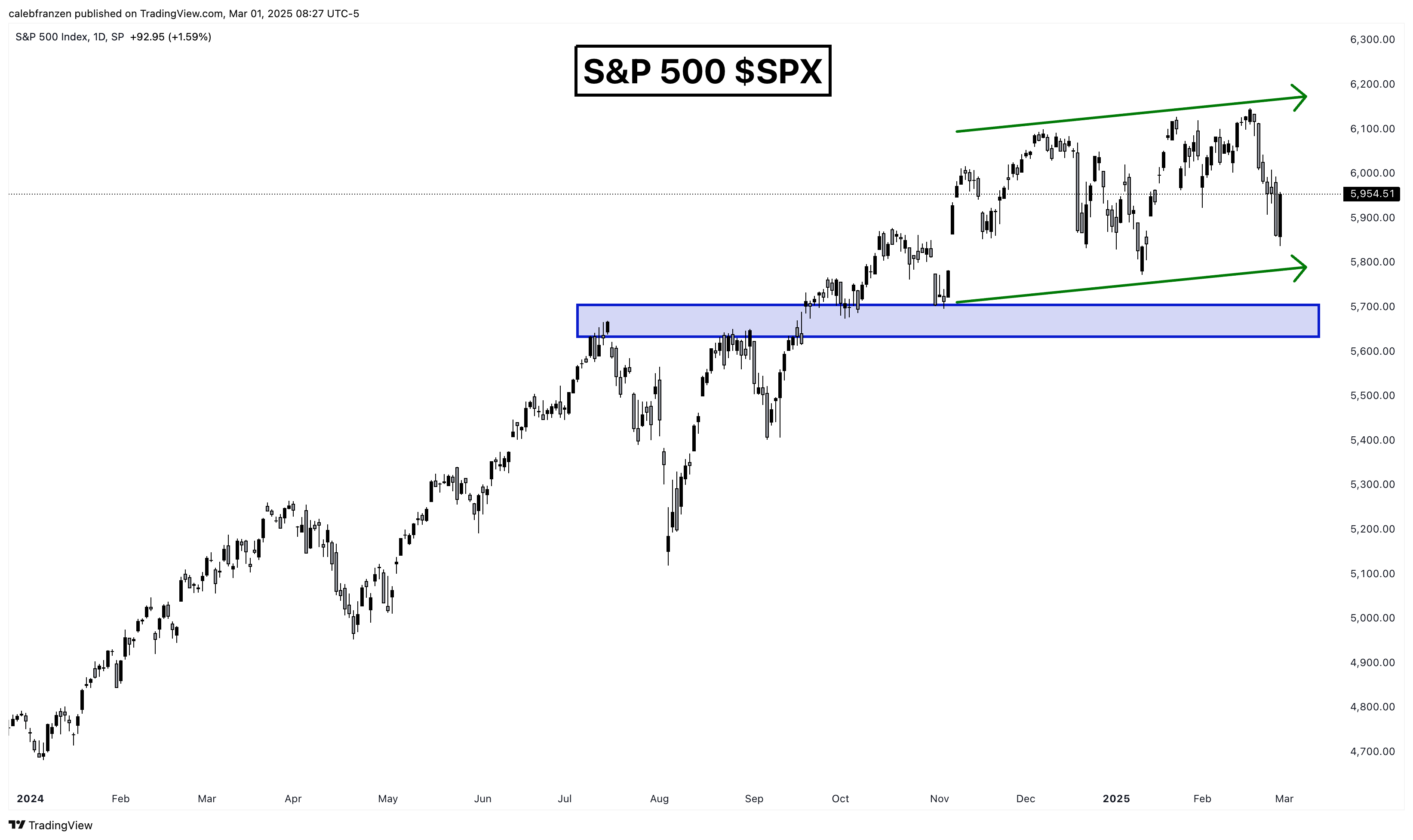
So what would give me cause for concern from a price structure standpoint?
A breakdown below the blue zone, which is a key level that I’ve shared for months.
It’s significant structure due to the magnitude of the decline in July/August 2024, acting as a launchpad in Q3’24 after the breakout and holding it as support in Q4’24.
The same is range is significant & intact for the Nasdaq-100 $NDX:

Admittedly, Bitcoin’s recent decline has invalidated the a big chunk of the bullish support structure with the breakdown below $90k, simultaneously aligning with a breakdown below its short-term holder realized price.
This is a valid & substantive concern.
However, we’ve seen several of these invalidations occur over the course of Bitcoin’s current uptrend, resulting in the production of new highs.

Will this bear trap (a brief breakdown followed by explosive recovery) work just the same as the others?
I don’t have a crystal ball, so I don’t know, but the key step from here would be to recover back above the green zone (above $92.5k) to symbolize the recovery. I’ve often referred to these as “ball underwater” setups, where a failed breakdown results in a fast recovery and explosive move to the upside.
Therefore, I think all Bitcoin (and crypto) investors should watch to see if Bitcoin can achieve this recovery in the short-term in order to regain bullish momentum.
3. Bitcoin Flashes Bullish RSI Divergences:
These divergences can provide phenomenal signal amidst periods of significant selloffs, indicating that bearish momentum is slowing down. One of my favorite technicians who I’ve learned an enormous amount from over the years is J.C. Parets from All Star Charts, and he has a great phrase that I love to refer to.
J.C. says “in order for a stock to go up, it needs to stop going down”.
It’s an obvious statement, but it’s almost so obvious that we dismiss it as being too elementary & basic, when the reality is that it’s one of the most important and critical parts of identifying a potential reversal!
Bullish RSI divergences, particularly across various timeframes, help to provide a statistical way to identify an asset that has stopped going down & suggesting that we are close to forming a local low.
Given that bull markets are long periods of an uptrend and an uptrend is just a continued series of higher highs and higher lows, I think it’s powerful to identify when strong assets in strong uptrends are potentially forming a higher low, because the implication is that we can profit from them making a higher high!
On Friday, I shared how Bitcoin has produced bullish RSI divergences on all of the following timeframes:
1-hour candles
2-hour candles
4-hour candles
6-hour candles (1/4 of a day)
8-hour candles (1/3 of a day)
12-hour candles (1/2 of a day)
Additionally, Bitcoins daily RSI is the most oversold since August 2023, when BTC was trading at $26k.
In particular, I find the 12-hour bullish RSI divergence to be the most significant because it’s the longest timeframe where we have a valid bullish RSI divergence and due to the fact that it’s the most rare.

The current bullish RSI divergence is the first divergence after becoming oversold going back to August-September 2023 and only the 4th divergence since Q4’22.
Each of these divergences marked pivotal local lows before making higher highs.
Call me crazy, but I think that’s relevant.
4. Sentiment Is Historically Negative:
Sentiment data, in my opinion, is only useful at extremes and particularly when it’s extremely negative. Sentiment has been poor for quite some time now, particularly within the crypto ecosystem due to the damage in altcoins; however, sentiment got even more negative this week.
In fact, these are literally some of the worst sentiment readings of all-time.
The American Association of Individual Investors (AAII) tracks sentiment data on a weekly basis, with the latest reading of 60.6% bearish respondents being the 7th most bearish result of all-time.
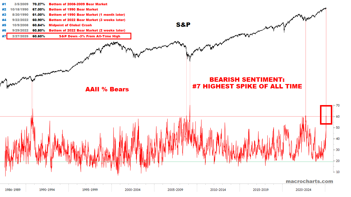
It’s the highest amount of bearish responses since September 2022 and October 2008, both of which essentially marked the key lows of the market.
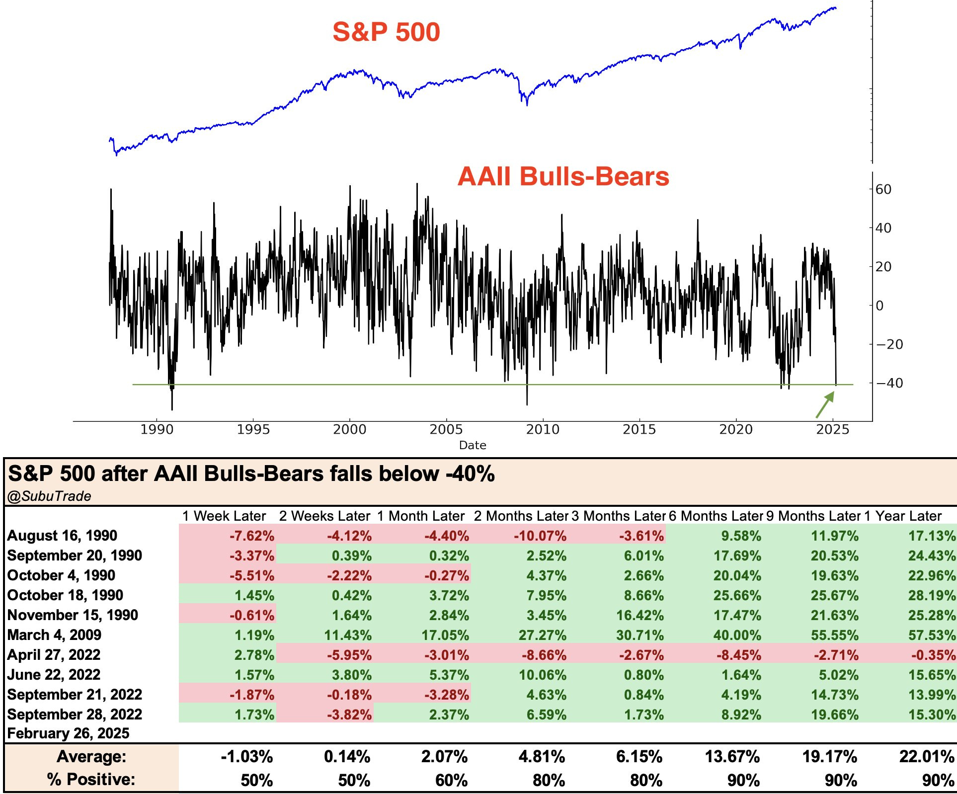
We can also look at this same datapoint with a specific criteria of tracking the instances when AAII % Bears increased from below 20% to above 60%, as shown by the information below from SentimenTrader:
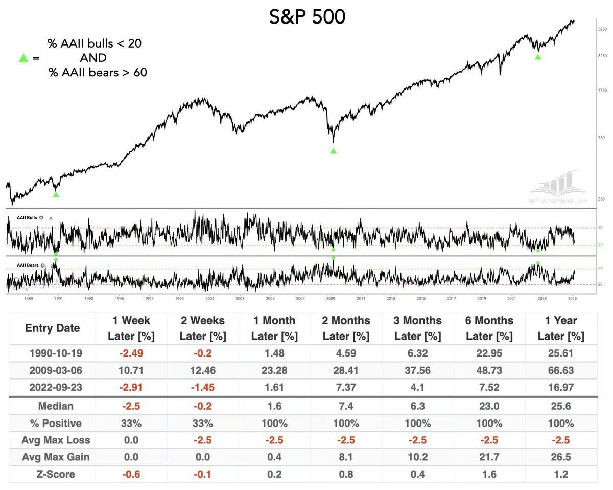
Given that this signal just occurred for only the 4th time since 1990, wouldn’t it be significant to track the performance of the S&P 500 in the 3 prior cases?
Yes, the sample is small… but that’s the reality of extremes.
Either way, the index is up 100% of the time 1, 2, 3, 6, and 12 months later, with an average 1-year return of +25.6% (with nearly all of those gains occurring in the first 6 months).
If that sample size is too small for you, we can reduce the criteria to every time the AAII bull/bear spread crossed above 40!
With 10 signals since 1990, the sample is small, but more robust than the first study.
While short-term volatility and incremental downside has still occurred within the first 4 weeks of the signal date, it’s clear that this short-term pain produced a tremendous amount of long-term gains.
As investors, these are the risks that we inherently must accept.
Uncertainty is the price of admission!
But with a result of +22% average returns in a year and a 90% positivity rate, I think this tells us to be patient, pay the price, buckle up, and enjoy the ride.
Best,
Caleb Franzen,
Founder of Cubic Analytics
This was a free edition of Cubic Analytics, a publication that I write independently and send out to 12,850+ investors every Saturday. Feel free to share this post!
To support my work as an independent analyst and access even more exclusive & in-depth research on the markets, consider upgrading to a premium membership with either a monthly or annual plan using the link below:
There are currently 1,000+ investors who are on a premium plan, accessing the exclusive alpha and benefits that I share with them regarding the stock market, Bitcoin, and my own personal portfolio.
DISCLAIMER:
This report expresses the views of the author as of the date it was published, and are subject to change without notice. The author believes that the information, data, and charts contained within this report are accurate, but cannot guarantee the accuracy of such information.
The investment thesis, security analysis, risk appetite, and time frames expressed above are strictly those of the author and are not intended to be interpreted as financial advice. As such, market views covered in this publication are not to be considered investment advice and should be regarded as information only. The mention, discussion, and/or analysis of individual securities is not a solicitation or recommendation to buy, sell, or hold said security.
Each investor is responsible to conduct their own due diligence and to understand the risks associated with any information that is reviewed. The information contained herein does not constitute and shouldn’t be construed as a solicitation of advisory services. Consult a registered financial advisor and/or certified financial planner before making any investment decisions.
Each investor is responsible to understand the investment risks of the market & individual securities, which is subjective and will also vary in terms of magnitude and duration.
I appreciate you sharing my chart Caleb. Have a great weekend!
I think your analysis is correct. That said, the challenge with sentimentrader is that you ALWAYS find a compelling study that supports your view- whether bullish or bearish. The fact that they have expanded their efforts in recent years only magnifies the problem.