Edition #90
Central Bank Liquidity, Bitcoin Price Model & Correlation, Case-Shiller National Home Index Booms
Economy:
Towards the end of this past week, I saw some informative data regarding global central bank data & trends. I wanted to share each of those charts & mention a few takeaways and conclusions.
I often point out the historic actions taken by the Federal Reserve, but it could be argued that monetary policy abroad is more aggressive than in the United States. Surely, the Fed has the largest balance sheet in terms of dollar value, but we can also measure the size of central bank’s balance sheets vs. the size of the region’s GDP. On this measure, the ECB’s balance sheet is more than twice the size of the Fed’s when compared to each region’s GDP (79.6% vs. 36.6%).
Although it’s not pictured, the Bank of Japan has a balance sheet/GDP ratio of 132%! This is the most invasive form of monetary policy we’ve seen so far, highlighting what central banks can capable of. Essentially, while the Federal Reserve has provided extremely accommodative financial conditions via low interest rates & a high rate of asset purchases, they could technically be conducting much higher levels of monetary stimulus. Should they? I can’t say for certain, but it’s worth noting that the Fed really does have more tools up its sleeve to conduct more aggressive monetary policy. It’s odd to think that the Fed can do even more than they already have, but based on other dynamics in foreign economies, those levels of monetary stimulus can be easily achieved.
I’ve shown charts similar to this one before, but I like this one because it shows how global liquidity is closely correlated with the S&P 500. Quite simply, newly printed global currency & reserve assets are competing for U.S. financial assets. In an environment of an expanding monetary base, assets prices will continue to have wind in their sails.
Finally, this graph does a fantastic job of showing just how historical the magnitude of monetary policy was in 2020. This was a massive acceleration in central banks provide subsidized demand for financial assets and securities. Forecasts indicate that there will be a slow-down in the increase of central bank assets, but still rising faster than the historical data. This is essentially the taper-process visualized.
Stock Market:
No update. I’ll be giving a my analysis on my
Cryptocurrency:
Now that the month of August is officially over, we can see where Bitcoin’s price is trading relative to the stock-to-flow (S2F) model. Based on data from S2F Model, the monthly closing price of $47,219 is currently lagging the S2F model price of $102,281.
On this metric, Bitcoin is undervalued relative to its programmatic value. In prior cycles, price will reach the second standard deviation of the S2F line. Considering that it hasn’t happened during the current cycle, I remain optimistic that price still has much more to rise. At the time of writing, BTC is trading at $50,200 & I remain optimistic that we’ll see new ATH’s in the near future.
Another interesting chart that I saw showed the correlation between Bitcoin and some of the industrial commodities, specifically uranium, copper, and silver. The chart below analyzes this correlation over the course of the past 20 months, courtesy of @alphacharts on Twitter.
As we can see, these assets have moved in lockstep since 2020. It’s possible the correlation goes back further, but I just haven’t seen data to validate that. I was definitely surprised to see this, so I’ll be curious to follow the relationship and see if the correlation continues. Perhaps investing in $URA, $COPX, and/or $SLX could produce returns that are congruent with the path of Bitcoin, just on a different scale.
Real Estate:
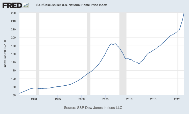
The Case-Shiller U.S. National Home Prices Index was released with updates for June 2021, showing that the U.S. housing market remains strong. We last covered this data when the updates were released for May 2021, which reflected a year-over-year increase of +16.6%. At the time, this was the largest YoY increase in the Case-Shiller National Home Index. For June 2021, the data reflects a +18.6% increase and the prior month’s data was revised to +16.8%. This graph below tracks the YoY changes to the Case-Shiller Index, helping to illustrate just how historic this housing market has been.
The actual index, which tracks the nominal value of national home prices in the U.S. reflects that the housing market has historically grinded higher at a consistent pace:
Several cities set new record YoY gains, including Boston, Charlotte, Cleveland, Dallas, Denver, and Seattle. However, the cities which saw the largest gains over the trailing twelve months are Phoenix, San Diego, and Seattle which saw increases of +29.3%, +27.1% and +25%, respectively.
Talk soon,
Caleb Franzen


