Edition #80
Baltic Dry Index Breakout, Strongest Bull Market Ever, BTC/Gold Analysis
Economy:
While the most significant economic news from yesterday was the release of the FOMC policy meeting minutes, I still need time to dive into that report and create the key takeaways. My plan is to make that analysis exclusive for premium subscribers, of which I want to welcome the new members who used the promotional discount. The special offer will be available for a few more days, so be on the lookout for new premium posts coming out this weekend.
One data point that I’ve been paying very close attention to has been data regarding shipping & container costs for oceanic supply chains. The last time I shared data on this topic was in Edition #46 dated July 13, which included the following chart of various shipping routes & the cost associated with a 40ft container:
In that edition, I highlighted the fact that Shanghai related routes were increasing at the most significant rate, and all routes had increased in cost relative to the prior data from June 24th. The amazing thing is that these rates have continued to accelerate higher. Here’s the most recent data:
Over the last month & change, the cost of the Shanghai —> New York route increased by +15.4%. If we take the sum of the costs of each shipping route from the July 13th data vs. the current data, the aggregate cost increased by more than +13% in a little more than one month. Supply chain issues continue to remain complex, pushing up the cost of shipping. Within the last week, China shut down the world’s third busiest port, the Ningbo-Zhoushan port, due to COVID concerns. This should continue to help keep costs high.
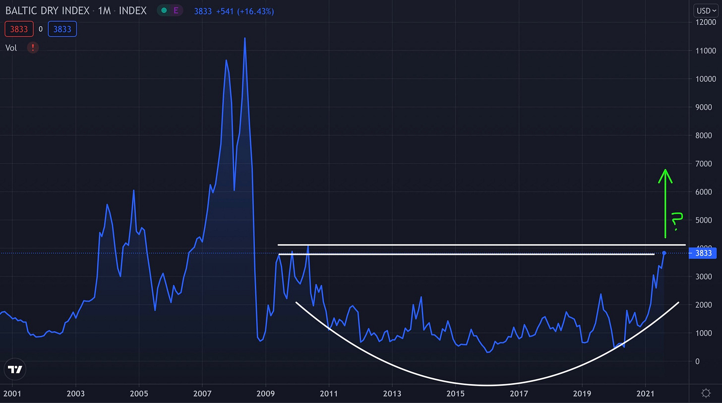
If we take a more long-term view, analyzing the Baltic Dry Index since 2001, we can see just how significant this recent price acceleration is. In fact, prices haven’t been this high since 2009, only after they fell from record highs after an amazing extension from 2006-2008.
Based on the structure of how price is developing relative to its historical levels, I drew the various white lines & green arrow to illustrate that we might be heading for an even more significant breakout move. This looks like a classic base & breakout setup from my perspective, but still remains in question until we see a final extension above the top white line. The takeaway is that the increases we’ve seen in dry bulk shipping costs could just be getting started. I doubt we’ll return to the peak levels we witnessed in 2008, but perhaps we should be prepared to see 7000 or higher, nearly doubling vs. the current level of 3,833. The fundamental factors are there, as well as the technical analysis. I’ve started to rotate my portfolio into some new dry bulk shipping companies over the past week based on this potential breakout move in prices. Be sure to upgrade to a premium subscription if you’re interested in seeing which companies those are and why I chose them.
Stock Market:
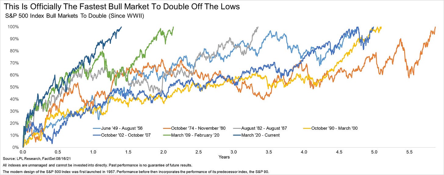
I’ll keep this brief, considering that I shared some of this analysis on July 26 when I noted how the S&P 500 had officially doubled from the COVID lows in March 2020. For some reason, mainstream financial news got the memo about this on Monday, at which point the S&P 500 had grown by +105% from the COVID lows. Anyways, I saw some interesting data to frame the performance of the current bull market in a historical context. Courtesy of LPL Research, the chart below does exactly that:
The dark blue line at the far left is the current bull market, doubling in less than 18 months from the bear market lows. This is by far the fastest rebound ever in equity prices over a sustained period, highlighting just how unique of a buying opportunity we were in last March & April. In terms of the quickness of the recovery & doubling speed, no other market even compares.
Cryptocurrency:
In yesterday’s crypto update, I showed the relative performance of BTC/S&P500 as a way to outline my expectations that Bitcoin will outperform the S&P 500 over the short term. Within traditional finance, stocks as an asset class are considered to be “risk assets”. They historically can have volatile returns, experience significant drawdowns, and investors are willing to accept said risk under the pretense that they’ll achieve higher returns. There’s no doubt about this. As a refresher, here is the chart that I shared yesterday:
Considering that Bitcoin is one of the highest risk assets in the world today based on any traditional metric, it was interesting to see the relative performance of an ultra risky asset vs. a risky asset.
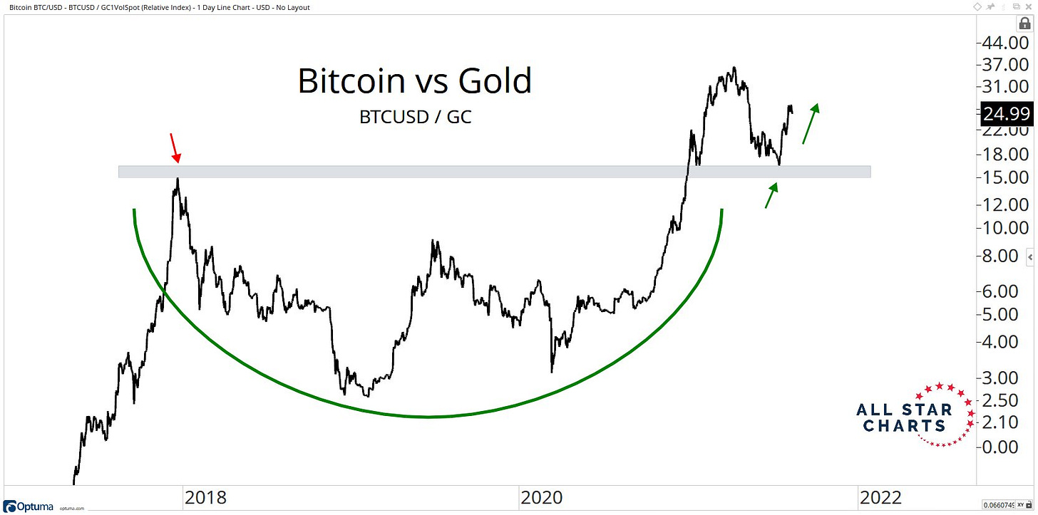
On the other hand, assets like Treasuries and gold are often considered to be safe haven assets, with negligible risk relative to stocks. So what happens when we compare the relative performance of BTC/gold?
It might seem somewhat surprising, but the structure of BTC/gold is identical to the structure of BTC/S&P500. But if gold and the S&P 500 are such substantially different types of assets with different risk/return profiles, how could the relative performance of BTC be identical in each case? Mathematically, if a numerator grows by such a significant amount, the denominator can almost become irrelevant!
1,000,000,000,000/15 is practically the same as 1,000,000,000,000/12. Quite simply, Bitcoin is growing at such a substantial rate that it’s gobbling up the performance of every other asset class on a relative basis. Realistically, you could probably compare Bitcoin to any other asset class or even sector ETF’s in the healthcare, technology, and communication sectors and see virtually identical structure. That just makes me even more optimistic about Bitcoin going forward.
Until tomorrow,
Caleb


