Edition #69
Analysis of Historical Stock Returns, Investor Psychology & Market Euphoria
Hey everyone,
I thought I’d do something slightly different today as a way to celebrate the stock market being at all-time highs. Rather than doing a breakdown of economic, stock market, and crypto data/news/charts/etc., I wanted to give some historical analysis & commentary on the stock market. Being that we’re currently at ATH’s, it’s amazing to think of where market sentiment was 18 months ago and even to zoom out and see the journey the market has taken going back to the Great Recession. The market feels euphoric. Is that a reason for further optimism or should it give us a higher level of concern? This is the question that I want to address.
As of 8/5/2021, the S&P 500, Nasdaq-100 and Nasdaq Composite are trading at all-time highs, with the Dow Jones trading just shy of all-time highs. The stock market continues to roar as I’ve been predicting it would since the start of the year. For new subscribers, I highly encourage you to read the report that I published at the beginning of the year, outlining the fundamental reasons for my positive outlook on U.S. equities in 2021 and the top investment themes I chose for the year. The link to that paper can be found here.
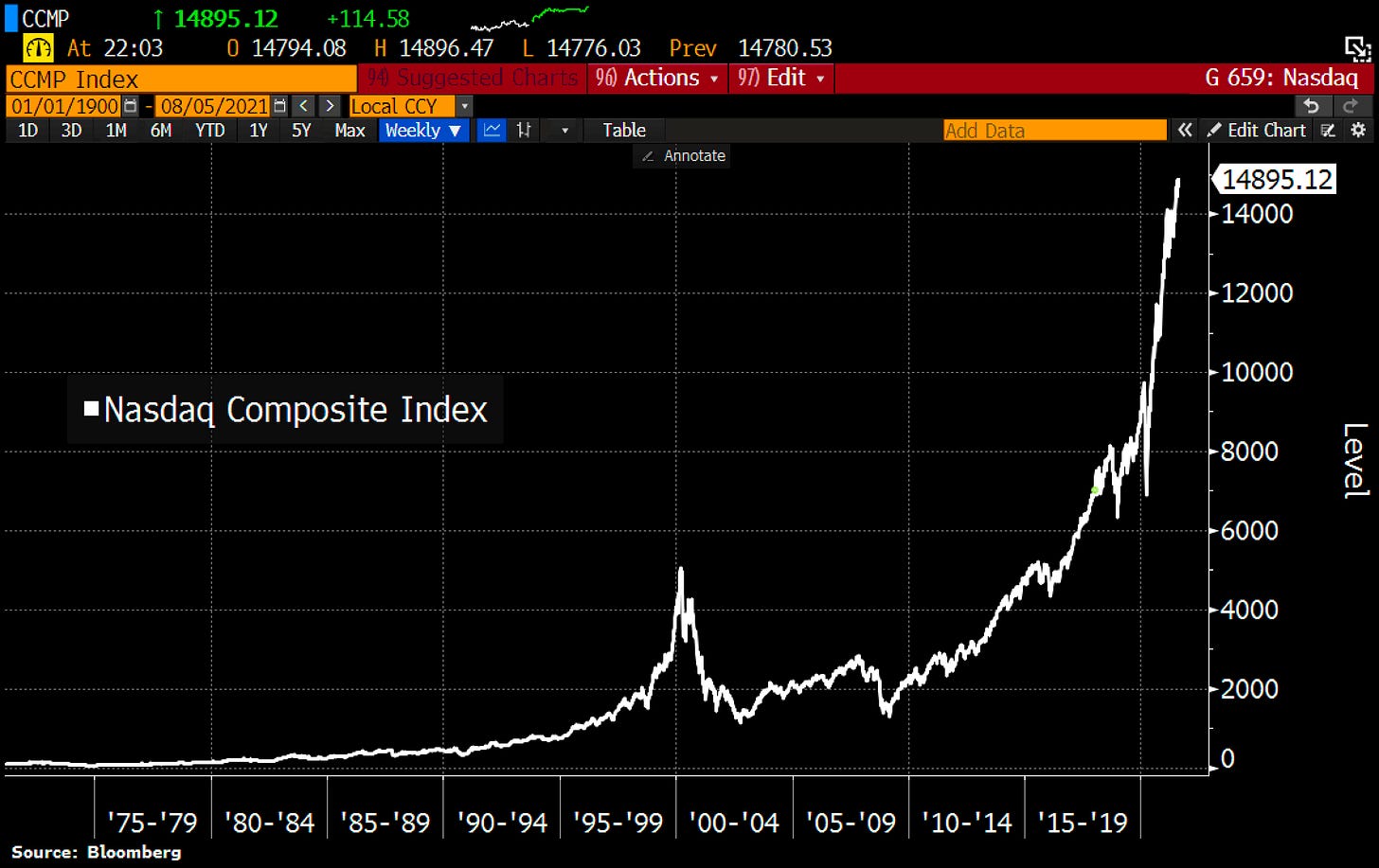
Despite the choppiness of individual tech stocks in February - May 2021, the market has been able to shrug off any concerns about rising yields, potential tax hikes, tighter government regulation, and now the potential resurgence of COVID via the delta variant. After the extensive gains we’ve seen since the COVID crash, as well as the significant gains the market has made since the Great Recession, it’s been easy for the Chicken Little investors to scream that the end is near. Instead of shouting “the sky is falling!”, these investors are screaming that “the stock market is a bubble ready to pop!”. One of the biggest pieces of evidence that they use to support their claim is how the stock market is growing similar to an exponential curve. To their point, it is growing at an exponential pace! Here is an example of a chart of the Nasdaq that I saw posted on Twitter yesterday:
However, how does the fact that it’s growing at an exponential pace indicate that the market is going to collapse? In my opinion, it doesn’t! Their argument makes a compelling case when you view a chart like the one above. You’re forced to ask the question: “How much longer can this continue?” or “This has to end at some point soon, right?”
One of my favorite quotes in finance & investing is: “The market can stay irrational longer than you can stay solvent”, implying that investor psychology is often not rational & trying to solve the puzzle of the market with a rational approach can be an exercise in futility. It’s also a reminder that when things are feeling a little crazy, it’s likely just getting started. Let’s examine…
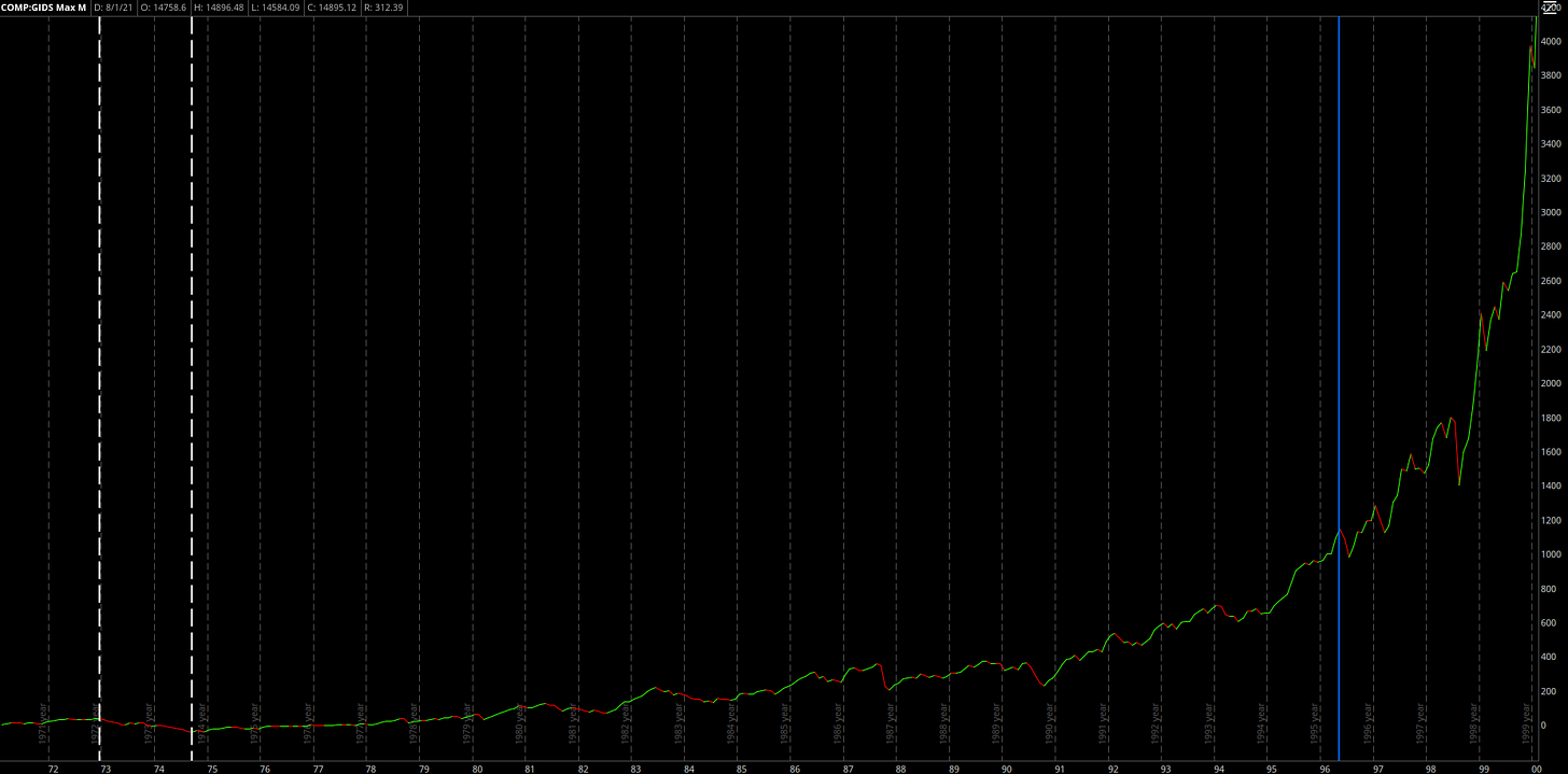
Below is the chart of the Nasdaq Composite, an index that tracks the performance of 3,000 stocks, from February 1971 - May 1996:
Let’s break this down a bit just to give some greater detail & significance of what we’re analyzing. At the time, this was one of the most significant bull markets the U.S. stock market had ever seen. The market was accelerating so quickly that the market decline in between the dotted white lines looks like a speed bump, when in fact the market fell by -59% during that period. That’s more of a decline than the market collapse during the Great Recession (-55%) and the COVID Crash (-32%). After the market suffered that correction from 1973-1974, the Nasdaq Composite went on to gain +2,230% over the subsequent 22 years to the end of this chart. That means that a $1,000 investment in September 1974 turned into more than $23,000, despite experiencing 4 drawdowns of -30% or worse over those 22 years.
An investor in 1996 was likely to look back over the last 20+ years of stock market returns & reasonably conclude that the market was in a state of euphoria. The market was growing at an exponential rate as gains compounded on each other to produce massive returns. Going back to the initial point, did the market collapse thereafter? It most certainly did not.
The blue line represents the end of the chart above, indicating that the market was just getting started despite the exponential growth that had already occurred. While the first chart certainly felt exponential in the moment, it proves that the market psychology at the time led to further gains and further exponential behavior. In fact, over the subsequent four years after the blue line, the market gained an additional +312% (more than 4x return) until the peak of the dot com bubble. This additional +312% in those final four years would have increased our initial +2,230% return to +9,200% & turned our initial $1,000 investment in 1974 into $93,000 over the course of 26 years. This brings me back to my favorite quote that the market can stay irrational longer than you can stay solvent.
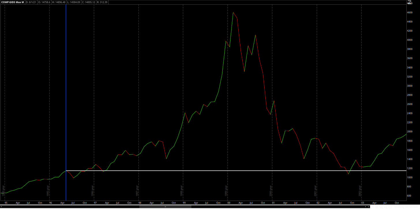
We all know how this story ended, with the dot com bubble bursting in 2000 and declining -78% from peak to trough. It would take 15 years, to June 2015, for the Nasdaq to recover and hit new ATH’s. But here’s the thing: if an investor bought into the Nasdaq in May 1996 (vertical blue line), they practically avoided any losses on their investment.
Specifically, we can see a tiny blip in 2002 in which the hypothetical investor’s portfolio fell by a total of -7% from their initial entry point. Their portfolio was negative for less than one month before it continued to rise again. The pain was certainly felt when their unrealized gains of +312% evaporated to a -7% unrealized loss, but in the end they were in great shape. Ten years after their initial hypothetical investment in 1996, they had a net return of +89% assuming that they held their investment the entire time.
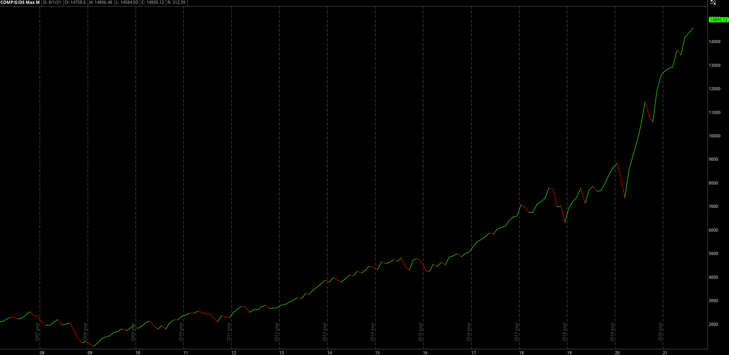
So where does this leave us today? If we examine the performance of the Nasdaq Composite from 2007 - Present, we see the following:
Since the lows following the Great Recession, the Nasdaq has gained over +1,070% and appears to just be entering the “exponential” phase. In my opinion, this looks like we’re in the 5th or 6th inning of the game and there’s still plenty of time left on the clock. Over the last 12 years, the Nasdaq has only had 1 drawdown that exceeded -30% (COVID Crash). Once again, I feel that the market is actually just warming up. Most people think this opinion is ludicrous, particularly after we’ve had such a strong market since the Great Recession. History shows us that the euphoria is likely just getting started.
When we analyze stock returns over extended periods of time, it’s easy to become a prisoner of the moment & to think that things can’t possibly go higher from here. During these moments of market euphoria, those who believe the market is in a bubble start to scream even louder. They shout that the bubble that they predicted a year ago is only bigger now than it was then. They predict that the market is due to collapse for reason X, Y and Z, however they will continue to be wrong.
Markets will always have corrections & consolidations, which have historically provided excellent buying opportunities for long-term investors. In fact, one of the signs of a healthy stock market is a drawdown — it allows valuations to reset and gives investors the chance to re-evaluate their risk profiles & allocations. Drawdowns allow capital to flow to where it is most productive & where it yields the best risk/reward. As I pointed out earlier, the period from 1974-1996 saw four drawdowns of at least -30% en route to a cumulative gain of +2,230%. In order to achieve a 23x return on investment, an investor had to be willing to sit through tough times.
This lesson is very reminiscent of the -32% drawdown in February 2020. Suppose an investor entered the stock market & invested their entire capital into the Nasdaq Composite on February 19, 2020 (the peak before the crash). Today, that investor would have gained +52% on their investment in 18 months. In order to achieve that return, they had to sit through the entire -32% drawdown, and also two drawdowns of roughly -12% in September 2020 and February 2021.
Like any other good or service in a market economy, stock prices are simply a function of supply & demand. When there are more buyers than sellers, demand exceeds supply and prices rise as a function of bidders raising their offers to outcompete other bidders. Conversely, when supply is saturated and sellers are competing amongst each other to convert their asset into cash, potential buyers are able to bid prices lower. When you start to view financial assets like any other good or service, you can view the stock market in a clearer frame of mind. For example, when my favorite clothing company offers 25% off storewide, I don’t doubt the quality of their clothes. Instead, I take advantage of the discount and perhaps buy an extra shirt or additional pair of shoes. I’m not fearful of a storewide sale, I welcome it!
The market has historically shown us that it has an amazing ability to appreciate in value over time. While the market experiences significant corrections, flash crashes, and headline upon headline of negative news, it is resilient. The last thing I want to do as an investor is bet against financial assets within the American economy & I hope this newsletter helps to reflect why I hold these beliefs. Life is easier & more fun as an optimist anyways.
Talk soon,
Caleb Franzen


