Edition #41 - 7.7.2021
Global Semiconductor Sales, S&P 500 Makes Historic Achievement, Large-Cap Technology Outperformance
Economics:
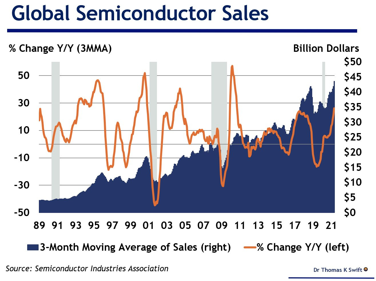
Very quick graph & commentary, because I think it adds color to some of the recent “Stock Market” commentary that I’ve provided on the semiconductor industry. As I’ve mentioned, the semiconductors were one of my top-six investment themes for 2021 & is outperforming the broader market so far this year. Fundamentally, I was very bullish on semis, but I just saw this chart yesterday which makes me even more optimistic going forward:
The trajectory is actually fairly linear, whereas I was expecting to some signs of an exponential growth. In my opinion, that just means that the exponential curve is around the corner, which I think is a matter if “when” rather than “if”. I remain very optimistic on the semiconductor industry going forward. Some of my favorite individual names are $NVDA, $LRCX, $KLAC, $AMAT, $AVGO, $TSM, $TXN, & MU.
Stock Market:
I wanted to cover two primary topics here, as I think both are enormously relevant to where we are in the broader equity market. The first is a broad market statistic, considering that the S&P 500 just completed a historically-significant accomplishment. To be specific, the S&P 500 closed at a new all-time high for 7 consecutive trading sessions. The last time the index was able to achieve this was back in 1997 & it’s only happened a total of 8 times since 1950. Unfortunately, the streak ended yesterday, as the S&P 500 closed the session at -0.2% on Tuesday.
Considering that it’s a rare event, it might be useful to find out how the S&P 500 following those prior occasions so that we can begin to set a range of expectations for how the index MIGHT perform going forward. Here is a great chart provided by LPL Research that does exactly that:
The data is extremely encouraging. In the prior 8 occasions, the S&P 500 was higher 12 months later 100% of the time, with an average gain of +11.1%. The 3-month returns are also very strong, with each of the prior occasions resulting in a gain. This is only one data point to consider within a basket of market-related data, so this should certainly be taken with a grain of salt.
The second stock market topic I wanted to cover was additional color to the tech/growth > value rotation. In the world of technical analysis, there is a common pattern structure called a “bull flag”. These occur after a particular stock/asset has experienced strong gains, then proceeds to go through a period of sideways/downward consolidation in the following structure:
This simple drawing makes the structure very easy & simple to recognize, but it can often look much less clear in a practical example. Here is a stock that I’ve been highlighting & covering on Twitter since March 2021 called Celsius Holdings ($CELH), which just recently completed a breakout of the bull flag pattern:
After gaining +258% from October 30, 2020 through January 20, 2021, shares of $CELH experienced a considerable consolidation. From the January peak to the March 2021 lows, shares fell -41%. This decline was very choppy, with discernible highs & lows. By identifying these “lower highs” & “lower lows”, I was able to fit the descending purple channel as strong guidelines for price action to move within. Eventually, shares were able to breakout from the flag & continue higher. From the initial breakout to the new YTD peak, shares gained an additional +52%.
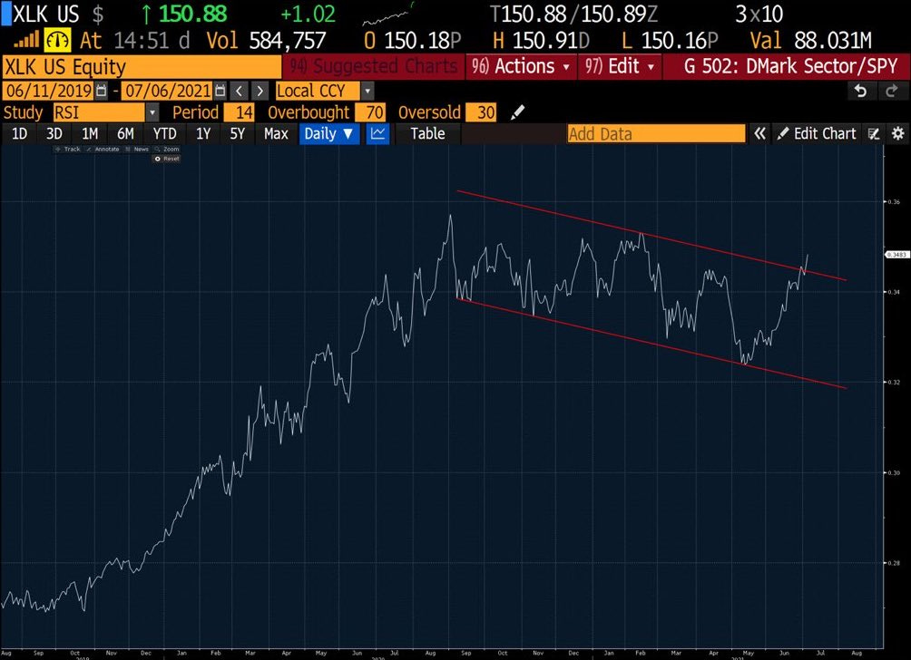
Now that we have an understanding of how substantial a bull flag pattern can be, we can analyze the primary chart I wanted to share:
This chart is comparing the technology sector vs. the S&P 500 by calculating the relative value of XLK/SPY. XLK is an extremely popular technology fund in which the top holdings are Apple, Microsoft, NVIDIA, Visa, Mastercard, PayPal, Adobe, Intel, Cisco, and Salesforce. Essentially, these are the tech giants & these top 10 holdings comprise 66% of the allocation. By comparing the performance of XLK vs. SPY, we can analyze how technology is performing relative to the broader market. Just as the bull flag can be accurate when analyzing a specific stock, we can apply the same fundamental principles to this chart as well. Clearly, we can see a bull flag pattern has developed (which started in September 2020), and is just beginning to breakout to the upside over the last week. Will we see a strong continuation move higher, indicating further technology sector outperformance? My best guess is yes.
Cryptocurrency:
No update.
Until tomorrow,
Caleb Franzen


