Edition #28 - 6.18.2021
Initial Unemployment Claims Rise, Inflation Expectations Drop, Growth > Value Rotation, Alt-Coins Breaking Out?
Economics:
Very quickly, I wanted to review the data for weekly unemployment claims, as the result for the week ending June 12, 2021 was a surprise increase. The data showed a +37,000 increase to 412,000 seasonally adjusted claims for the week. Although the prior week’s numbers were revised down -1,000 to 375,000, the 4-week moving average is currently at 395,000. I still have no hesitation that the downward trend will persist, but these sudden & unexpected spikes should, coincidentally, be expected.
The main point I want to cover is related to inflation, which continues to be a common theme in the economic arena. Particularly now that we have the FOMC policy decision & press conference in the rear-view mirror. Specifically, I wanted to point to a chart that show the break-even inflation rate over the next 10 years. The break-even inflation rate is the average inflation expectation from market participants over a specific time period, in this case over the next 10 years. After rising fairly consistently over the last 12 months, the expectation of future inflation has seemingly fallen off a cliff.
I checked additional data for the 2-year and 5-year break-even inflation rate, both of which have also seen significant declines over the last two days and are well-off their mid-May 2021 highs. As I’ve highlighted previously, as inflation expectations develop in a specific direction, actual inflation tends to move in that same direction. For example, if a consumer believes that prices will be 8% higher next year, they have a built-in incentive to purchase today. If all consumers have this perception, future consumption expenditures may move forward to the present, which actually causes prices to rise due to the higher levels of demand and same supply. Conversely, if consumers believe that prices will be 8% lower the next year, they may pause purchasing certain items that aren’t necessary expenditures. This could lower current demand, causing prices to fall in the short-run. In either cases, concerns around future inflation/deflation become self-fulfilling prophecies. Obviously this is only one small influence on the factors that impact inflation, but it’s one that’s been written about at length.
This is why the Fed’s increased transparency and rhetoric has become so important over the last 13 years, in which they try to set and align inflation expectations. Therefore, it seems that the Fed’s rhetoric during this week’s policy meeting has been effective in terms of tempering inflation expectations. This could be an important first step in actually reducing future inflation, which seems to have also been reflected in terms of a decrease in nominal yields.
Earlier this week, I highlighted how yields on junk bonds have hit fresh all-time lows. We’ve started to see a substantial move lower in 5, 10, and 30-year Treasury yields. I fully expect that inflation expectations, inflation, and nominal treasury yields will continue to move in synchrony. With that said, my expectation is for inflation to continue to rise over the next few months, with the 12-month CPI inflation reaching 7%-ish before normalizing back towards the long-term trend near 2%. It’s very possible that under these circumstances, yields will continue to rise in the short-run, but the market has been known to do strange things. Time will tell!
Stock Market:
In the wake of the FOMC’s policy announcement on Wednesday, we saw an initial spike in yields due to the perceived increase in the Fed’s hawkishness. However, it appears that the initial move was perhaps a head-fake, as yesterday’s session saw a steep decline in nominal Treasury yields. The reality is that yields have been steadily declining since they peaked around April 5, 2021; however, the market has seemingly been slow to react to this in light of rising inflationary pressures & optimism around the economy. With that said, I’ve started to highlight some of the key arguments to be made for why these inflationary concerns are beginning to subside, and I honestly felt that the FOMC policy day rhetoric was a big success in terms of calming those fears & setting expectations more clearly on the trajectory of the federal funds rate and the taper talks.
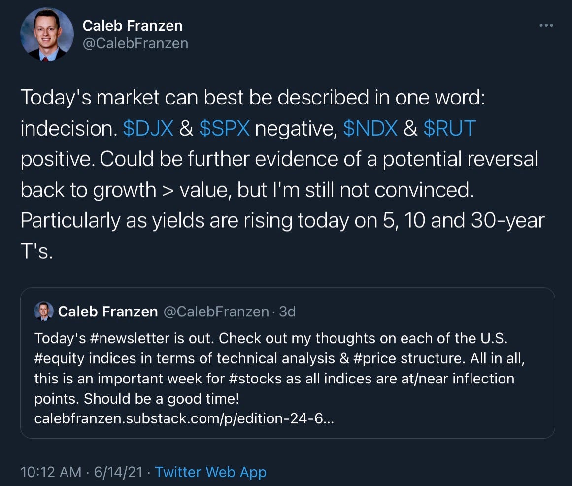
As such, we’ve seen a slow rotation back into tech/growth and out of value over the last 6 weeks, which has really started to gain momentum over the last 2 weeks. This is actually something I started to see in mid-May, which I highlighted in Edition #5 of this newsletter. At the time, I stated that I wasn’t convinced of the rotation & wasn’t willing to accept the elevated level of risk. Even earlier this week, I posted the following on Twitter:
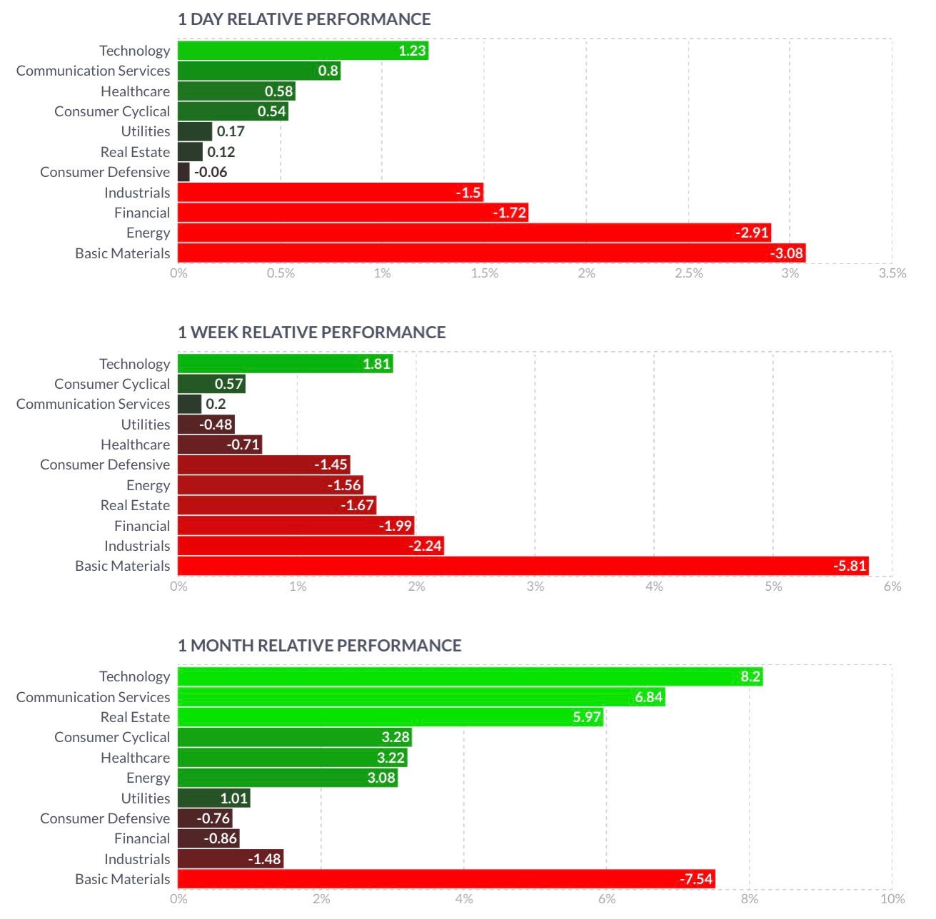
I’ve been out of tech/growth since April, and even after spotting early signs of a potential rotation back into tech/growth, It’s taken nearly 1 month for me to get comfortable with the trend & accept the risks associated with getting involved. As such, I’ve begun to dabble back into the sector, exiting my positions in oil & energy services & companies that have benefitted from the value tailwinds. I will be willing to accept if I am wrong and quickly exit these positions if it becomes evident that this rotation is not valid. Based on the data, the trend appears to be favorable:
So why are investors rotating out of companies with strong profitability, dividend growth, and considered to be “high value” for companies that may operate at a net loss, don’t pay a dividend, and are dependent on high growth metrics to support their current valuations? It’s all dependent on yields!
As yields decline, the present value of future cash flows increases. Because growth stocks need to price in future growth more than companies with consistent/stable profits & revenues, they benefit more than value stocks. Because the present value of future cash flows are being discounted by a lower interest rate, companies with high future growth expectations have those revenues pushed closer to the present based on the net present value formula! The decline in yields has allowed investors to move out further on the risk curve, insinuating that we’re in a “risk-on” market environment. The very fact that I’ve become comfortable with the risks due to a decline in yields and brief evidence of a rotation back into tech/growth shows that I’m moving out further onto the risk curve! As yields fall, the market places less importance on stable earnings & shifts the allure towards companies with high growth.
Cryptocurrency:
Here’s a great chart I saw on Thursday afternoon, giving some strong insights into the overall conditions within the cryptocurrency market right now. Considering that BTC is the top-dog in terms of market-cap, currently valued at $708Bn, it can be interesting to compare the performance of “alt-coins” relative to the price of BTC. This chart below gives that insight by showing the price of the Altcoin Index, then evaluating the ratio of Altcoin/BTC:
This is a beautiful way to analyze price structure & relative strength, actually setting up into one of my favorite patterns in terms of the ALT/BTC chart in the subgraph. I refer to this as a breakout, retest & potential continuation, in which price breaks out of a significant resistance area (grey zone), extends to new highs, then consolidates back to the same prior resistance level aka the breakout zone. When shares retest this grey zone, the prior resistance level can become new support, leading to a new acceleration in price back to new ATH’s. In this particular case, we aren’t necessarily talking about price, we’re talking about relative performance. Therefore if this pattern is valid, I’d expect to see alt-coins outperform BTC in the short-term.
Here’s an example of this same exact setup, as shown by the stock Shopify ($SHOP) in a similar but slightly different setup. The chart begins in Q4 2019:
Here we can see the price extend to new ATH’s in mid-2020 after an amazing run that saw the share price increase by +261% from the COVID lows to the grey resistance level. At some ambiguous level, shares hit resistance, then continued to hit resistance along the same level several more times! This is what I refer to as the consolidation period, in which price continues to fluctuate in a sideways manner, essentially coiling up for the next move. After 5 months of this consolidation period, shares finally broke out to new ATH’s in December 2020. While it’s easy to get caught in the euphoria of that breakout, many traders (like myself) will almost always wait for price to retest the breakout zone (aka prior resistance area in grey) before entering a position. As we can see, after that December breakout, shares consolidated back to retest the breakout zone, and then made a continuation move to create new ATH’s. In fact, this happened several times where price retested the grey zone & it acted as support! As I mentioned previously, what was once prior resistance can become future support. This is actually a stock that I’ve been buying at these support levels, and shares are now rapidly picking up again to retest the ATH’s from February 2021. You’ll notice, as price moves up to this white zone, we may get another breakout & retest setup, but only if price can break above $1,500/share.
With the knowledge of how breakout, retest & continuation setups work, we can refer back to the ALT/BTC chart & recognize that a very similar pattern is in play! I don’t own any alt-coins, and my entire crypto portfolio is 100% allocated to BTC, so I’ll sit this one out. With all of this being said, it will be interesting to see if the market adheres to this structure and if alt-coins do indeed outperform BTC in the near-term.


