Investors,
First & foremost, I wanted to offer readers an opportunity to subscribe to this premium research at a discount. If you’ve been on the fence about subscribing, I hope this 20% discount sways you in the right direction:
There’s no way around it — 2022 has been a difficult year for financial markets. Whether we’re talking about stocks, bonds, or crypto, each of these markets have been tumultuous, putting investors on an emotional roller coaster. We’re starting to see cracks in the real estate market as well, indicating that the most resilient market is showing signs of weakness. The traditional forms of safety, most notably U.S. Treasuries and gold, have performed terribly in 2022, offering no reprieve to investors:
20+ Year U.S. Treasury ETF ($TLT) -23.7%
Gold Futures ($GC) -3.8%
These “safe haven” financial assets have been the exact opposite of safe in 2022, particularly when we consider that the S&P 500 is only down -11.2% this year. The equity risk premium (i.e. the excess risk that stock investors accept relative to a risk-free rate of return, like short-term Treasuries) has actually been attractive in this environment because of how poorly “risk-free” assets have performed.
Quite simply, they haven’t been risk-free.
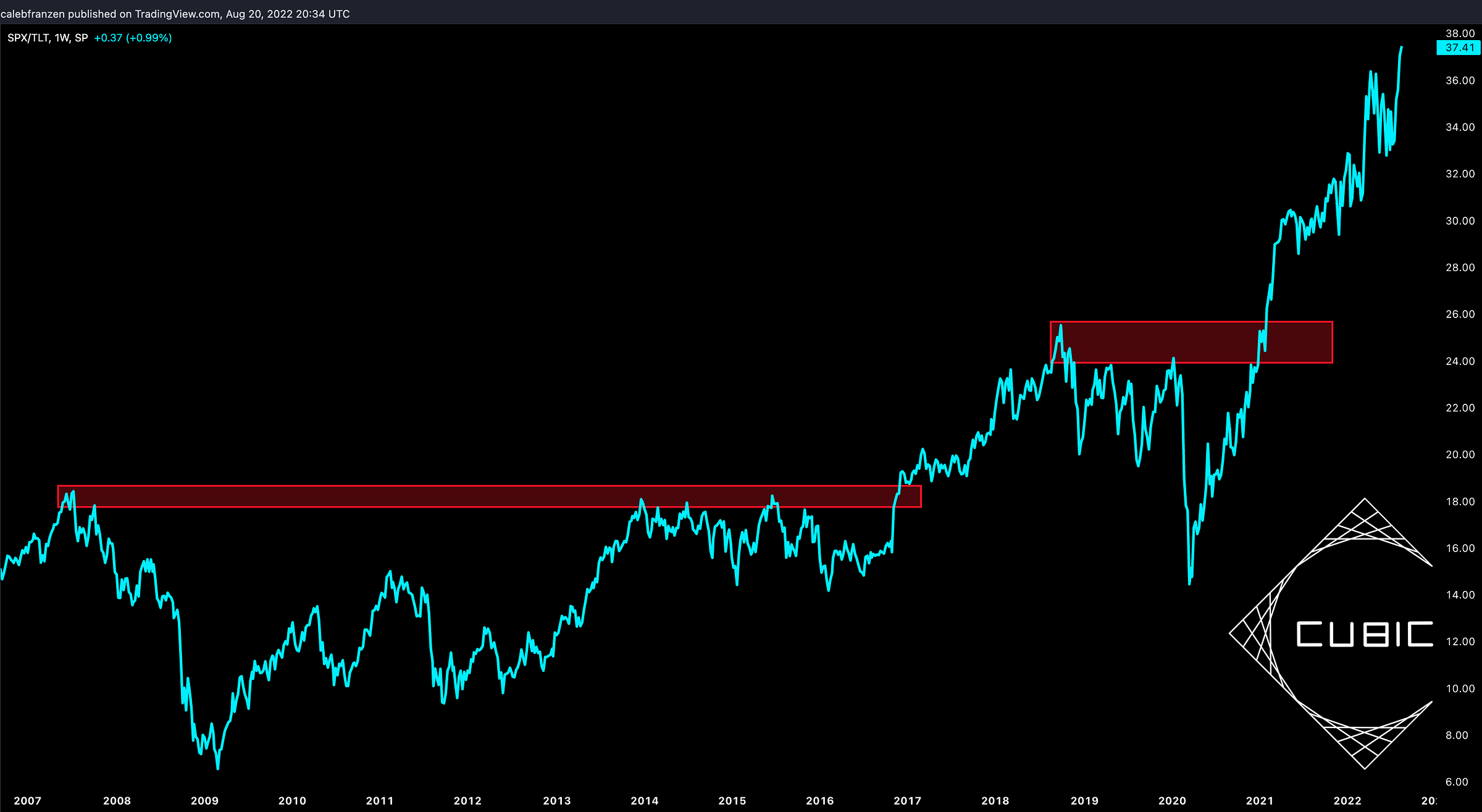
This perspective is most appropriately visualized by the following chart, where we denominate the S&P 500 ($SPY) by U.S. Treasuries ($TLT):
While the S&P 500 and U.S. Treasuries are both negative YTD, it’s important to note that U.S. Treasuries (safe-haven asset) are more negative. Therefore, the S&P 500 has a positive return relative to U.S. Treasuries YTD! Amazingly, the S&P 500 just made a new all-time high relative to U.S. Treasuries on Friday. The purpose of this chart is to illustrate the strength of U.S. stocks by measuring the S&P 500’s performance in something different than U.S. Dollars! In this lens (relative to risk-free assets), the performance of the S&P 500 has never been stronger. It also contextualizes performance and indicates that stock investors are actually better off than they thought.
In the remainder of this Premium analysis, I’ll be sharing more relative analysis like the chart above in order to highlight outperformance & risk appetite. I also have an interesting study that I wanted to share pertaining to Bitcoin. Regardless of whether you’re invested/interested in crypto, the signals that we get in the Bitcoin market are useful indicators for how risk appetite is evolving and perhaps foreshadowing what may happen in traditional markets.
I’ll also be analyzing other key relative performance charts, comparing one asset vs. another in order to derive a sense of market direction and investor psychology. Finally, I’ll share key data for the S&P 500 which helps to reaffirm bullish market dynamics from a statistical perspective!


