Edition #185
Economic Data Driving Financial Markets or Financial Markets Leading Economic Data?
Investors,
Before diving into the traditional format of this newsletter, I wanted to provide some overall commentary on broader market dynamics that are impacting the three main components of Cubic Analytics: the economy, the stock market, and Bitcoin. Specifically, I want to discuss inflation dynamics and the key signs that I’m seeing in the market. Quite simply, I think the market is telling us that inflation is peaking.
Here’s why:
We’re seeing yields fall dramatically since the Federal Reserve’s +0.75% rate hike on 6/15/22, the largest singe rate hike since 1994. Remember, yields have been rising rapidly because of the market’s impression that inflationary pressures were growing and that the Fed would need to tighten monetary policy aggressively. Essentially, the bond market has been forecasting inflation & monetary policy. In response, bonds, stocks, and crypto are rallying as economic data softens and inflation expectations decline. Based on the response we’ve seen over the past week & a half, the market is potentially suggesting that inflation has peaked.
However, we know that most of the inflation dynamics have been caused by two things:
Historic levels of monetary & fiscal stimulus.
Demand > supply, due to shortages, bottlenecks, and a strong consumer.
The former components have been withdrawn substantially relative to their 2020 & 2021 peaks, meanwhile the latter is being exacerbated by the geopolitical conflict in Ukraine. The Federal Reserve is attempting to fight inflation with higher interest rates (a demand-side tool) in order to cure a supply-side problem. Because the Federal Reserve can’t increase the supply of goods & services in the economy, they are attempting to engineer a soft recession in order to re-equilibrate demand and supply at a lower equilibrium price. This is referred to as “demand destruction”.
By the Fed’s own admission, a “soft-landing” is becoming less & less probable. Market dynamics are confirming that a recession is imminent, which should reduce aggregate demand and therefore suppress inflation. If this scenario occurs, the Federal Reserve will be able to take their foot off the gas pedal and reverse policy. I expect this transition to take time, as the Fed will need to rely on material evidence of inflation moving back towards their long-term target of 2%. However, the question remains whether or not they will simply pause rate hikes or outright lower the federal funds rate.
Either way, the suppression of yields will cause asset prices to rise (all else being equal). Financial markets are forward-looking mechanisms, adjusting in a real-time basis to new information, data, and expectations about the future. It appears that the recent rally in bonds (risk-less assets) and stocks & crypto (risk assets) is signaling:
Softer/contractionary economic conditions.
Peaking inflation.
In May, I stated four primary reasons why inflation hadn’t peaked:
Supply chains/bottlenecks
High commodity prices
Wage-price spiral
Credit creation
Over the past few weeks, we’ve started to see data to suggest that the first two are improving. However, the final two don’t seem to be improving (yet). Regardless, we’re starting to see concrete proof of a contracting economy:
Q1 2022 real GDP growth was negative.
The Atlanta Fed GDPNow estimate is projecting real GDP growth of +0.0% for Q2 2022.
Retail sales for May 2022 was negative.
ISM manufacturing & services data continues to decelerate, though both are still expanding.
PMI data is decelerating.
Consumer confidence is at all-time lows.
Business confidence is rapidly decreasing.
In order to fight inflation, the Fed is unequivocally tightening into a slowdown in economic activity, something I warned about in October 2021. Inflation & monetary policy are controlling the market narrative; however, there’s an increasing concern around slowing economic activity. Despite the Federal Reserve’s +0.75% rate hike, yields on 5, 10, and 30-year Treasuries have fallen substantially. To me, this implies that the bond market (“smart money”) believes two things:
Inflation is peaking.
Economic growth expectations are falling dramatically.
Alongside the rapid decline in Treasury yields, we’ve seen 5-year breakeven inflation rates plummet in recent weeks. This signals that the “smart money” believes inflation is going to decline. With the ongoing decline in yields, we’re seeing bonds, stocks, and crypto rally higher. This means that risk & risk-less assets are celebrating. While it’s still too early to tell with any degree of certainty, I think it’s appropriate to be on alert for more signs that inflation is peaking. This doesn’t necessarily mean that inflation will fall dramatically henceforth, but rather that we may see a gradual & sustained decline in the YoY percent increase in the Consumer Price Index (CPI) and Personal Consumption Expenditures (PCE).
With this broader thesis at our disposal, let’s dive into the newest edition of Cubic Analytics.
Macroeconomics:
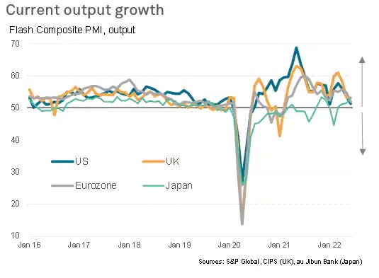
The key data release this week was the PMI data for June. With PMI data, it’s important to remember that a result above 50 is expansionary while a result below 50 is contractionary. Analyst estimates were predicting a result of 56 for the manufacturing sector, representing a brief decline from the May’s 57 figure. The result for June was 52.4, a rapid deceleration. In addition, the service sector decreased from 53.4 to 51.6.
On the aggregate, the composite index fell to 51.2. This data reflected the first contraction in new orders since July 2020, the slowest pace of input price inflation in five months, the slowest employment gains since February 2022, and the lowest business confidence since September 2020.
These results help to confirm the introductory comments above, indicating that growth, inflation, and the labor market are starting to slow down.
On a global scale, we’re seeing a significant deceleration in current output growth, although all major economic zones are still in expansionary territory for now.

I wanted to briefly highlight an extremely important correlation between the copper/gold ratio and 10-year Treasury yields. The copper/gold ratio is extremely important because it reflects a dichotomy between an expansionary economic asset (copper) vs. a risk-off, defensive asset (gold). Consider that copper is used in manufacturing and industrial processes, implying that an economic expansion would generate high demand for the industrial metal. Conversely, gold demand rises in a defensive market when investors shift towards risk-off sentiment. It has almost zero use in manufacturing or construction. Therefore the ratio of copper/gold is indicative of economic cycles:
When copper/gold rises, it implies that the price of copper is rising faster than the price of gold, indicating that the manufacturing and industrial sectors are expanding. This is a signal of an economic expansion.
When copper/gold rises, it implies that the price of gold is rising faster than the price of copper, indicating that market participants are becoming defensive. This is a signal of an economic contraction.
Now let’s consider 10-year Treasury yields. Yields rise based on several things, including: insufficient demand for Treasuries, high inflation and/or high inflation expectations, and rising economic growth expectations. Yields fall for the opposite reasons: excess demand for Treasuries, low inflation and/or low inflation expectations, and low economic growth expectations.
Based on these dynamics, we would generally expect to see a strong correlation between the copper/gold ratio and 10-year Treasury yields. Does the data prove that?
The data absolutely proves this to be true! As we can see, the copper/gold ratio moves in near-perfect lockstep with the 10-year Treasury yield. However, we’re starting to see a recent deviation in the data in which the copper/gold ratio is plummeting, but 10-year Treasury yields are still elevated. Which market is correct? It’s still too early to tell, but this helps to confirm the introductory remarks that I provided at the beginning of this newsletter: that inflation is possibly peaking and that economic activity is contracting. All we need to confirm this is a sustained decrease in yields.
Stock Market:
Last week, I highlighted key structure for the Dow Jones Industrial Average and shared that we were retesting the “line in the sand for bulls and bears”. Thankfully, the stock market rebounded perfectly on this level and has been able to produce a substantial rally this week:
The Dow Jones generated a return of +5.4% this past week, a holiday-shortened week of only four trading sessions. This was a massive rally, which aligned perfectly with the retest & rebound on the critical support level I shared in grey. With the strength of this rebound, I’ve added the red channel as a potential guideline for price action going forward.
This channel is important because it helps to visualize the trend of lower lows and lower highs, a defining characteristic of a bear market trend. If the market is able to produce a sustained rally in the coming weeks, it’s possible that the upper-bound of the channel will continue to act as resistance. That’s still a big “if”, so time will tell.
Either way, these are the key levels I’m watching for the Dow Jones.
Bitcoin:
There weren’t any major developments in the Bitcoin or cryptocurrency markets this past week, though we have seen a significant rally since last weekend’s carnage. At the time of writing, Bitcoin has increased from YTD lows of $17.6k to $21.2k, an increase of +21% in less than five days. Similarly, Ethereum has rallied more than +37% off the YTD lows last weekend and is currently sitting at $1,210.
I continue to reiterate the importance of monitoring inflation dynamics in order to determine the most likely path of monetary policy and yields. With Bitcoin and crypto being on the far end of the risk-curve, digital assets will continue to be hypersensitive to changes in yields. With the recent decline in yields that we’ve seen since last week, it’s no surprise that cryptocurrencies have rebounded higher.
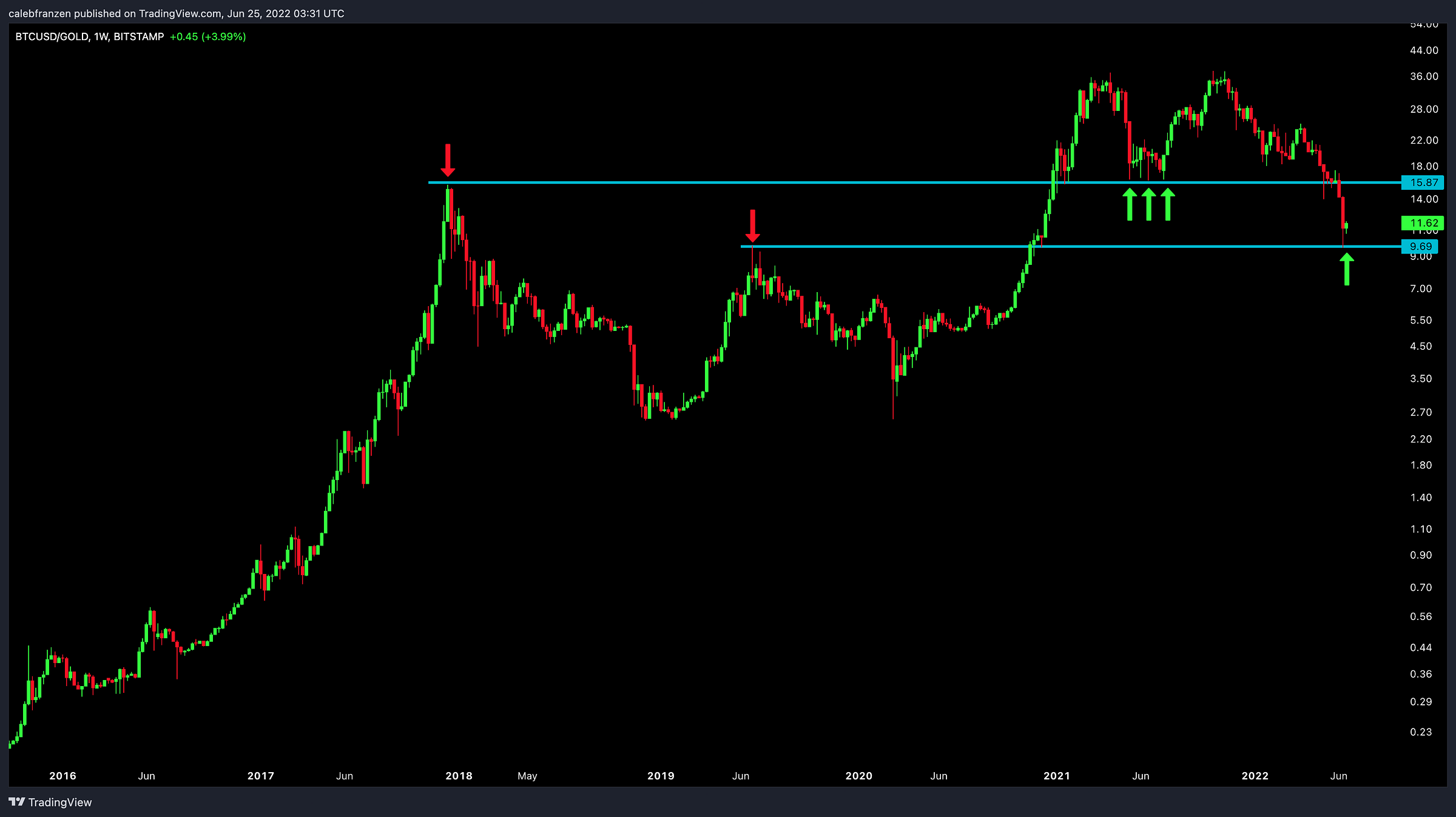
If we evaluate the price of Bitcoin denominated in gold rather than in dollars, we can view the long-term price chart of BTC/GLD:
BTC/GLD is trading at a very interesting level, currently retesting a wide support zone below the 2017 peak and 2019 peak. As we can see, the 2017 peak (former resistance) acted as support in 2021 until it failed in 2022. Similarly, the 2019 peak (former resistance) is now attempting to act as support.
This is a critical chart to watch in the coming weeks, representing a comparison of risk-on vs. risk-off assets. Should we continue to see a rebound and ascension, that would be indicative of strong investor appetite for risk assets over defensive assets. Should we see a breakdown below the 2019 peak, roughly below 9.7, that would be indicative of less demand for risk assets relative to defensive assets. Bitcoin investors are hoping for the former.
Best,
Caleb Franzen
DISCLAIMER:
My investment thesis, risk appetite, and time frames are strictly my own and are significantly different than that of my readership. As such, the investments & stocks covered in this publication are not to be considered investment advice and should be regarded as information only. I encourage everyone to conduct their own due diligence, understand the risks associated with any information that is reviewed, and to recognize that my investment approach is not necessarily suitable for your specific portfolio & investing needs. Please consult a registered & licensed financial advisor for any topics related to your portfolio, exercise strong risk controls, and understand that I have no responsibility for any gains or losses incurred in your portfolio.


Should I interpret market is going to accept more risk on assets? Have a nice weekend!