Investors,
I wanted to share an important milestone for Cubic Analytics, officially crossing 700 subscribers this week!
If you’re interested in reading more of my research, I’d encourage you to sign up for a premium membership, where you’ll receive additional insights, deep-dives, and analysis on markets.
Macroeconomics: U.S. Households, Stagflation, and Economic Activity
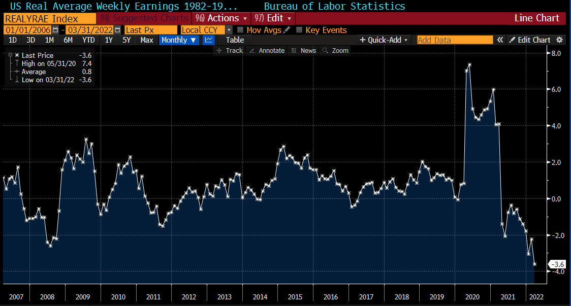
Despite all of the talk we’ve been hearing about a pending recession, U.S. households appear to be in an extremely strong position. The labor market has been historically tight, reflecting the ability for skilled labor to command top-dollar salaries, wages, and benefits. To be clear, rising wages have been entirely offset by inflation. This chart from Lisa Abramowicz tracks real average weekly earnings, highlighting the impact of inflation on nominal earnings:
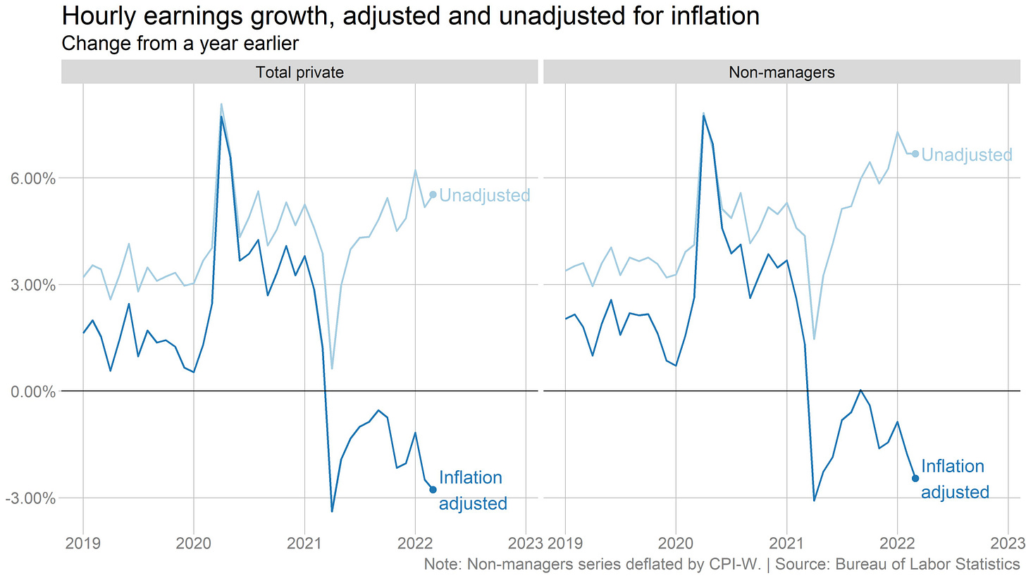
This chart below from Ben Casselman does an excellent job of visualizing the impact of inflation on nominal wages:
Still, American pocketbooks appear historically strong based on recent data from Deutsche Bank:

Assuming this data is accurate, cash held by U.S. households exceeds debt for the first time since the early 1990’s. We’re not entirely sure how this data was calculated, perhaps blurring the lines between cash and liquid assets; however, the implications are quite positive. The data would imply that households are well-prepared in the event that we do witness a material slowdown in economic activity.
Conversations about the economy are increasingly revolving around a looming recession. In the face of historic inflation and an unequivocal slowdown of economic growth, U.S. search activity for the term “stagflation” is steadily increasing. Here are the Google Trends results from January 2020 - Present, indicating a peak in March 2022:
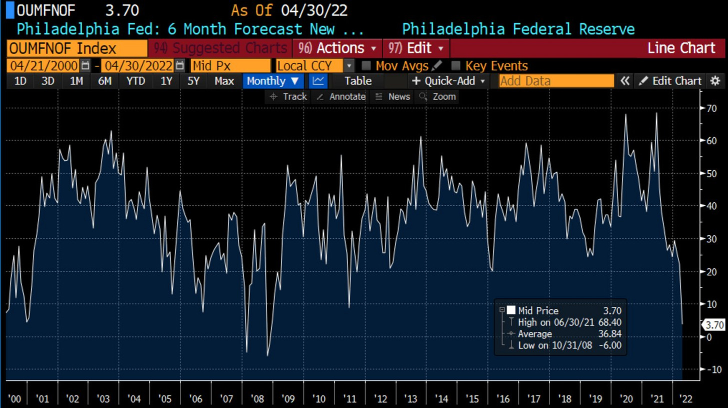
Unfortunately, recent economic data appears to verify a downturn in economic activity. This week, the Philadelphia Federal Reserve published their Manufacturing Business Outlook Survey, which generally fell short of expectations. Here were the most important charts & data points from the report:
1. New future orders fell to a 10+ year low, matching levels we saw during the Great Recession:
2. General conditions for businesses in the Philadelphia area continue to trend lower since the peak in Q1 2021:
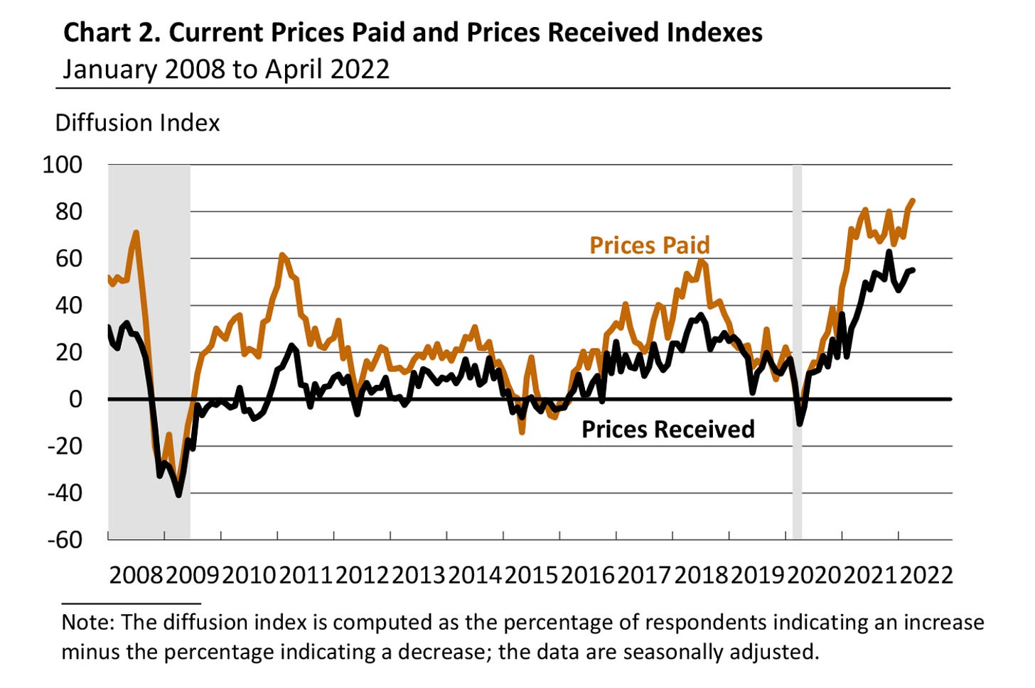
3. Prices paid by businesses in the Philadelphia area are historically elevated, continuing to trend higher:
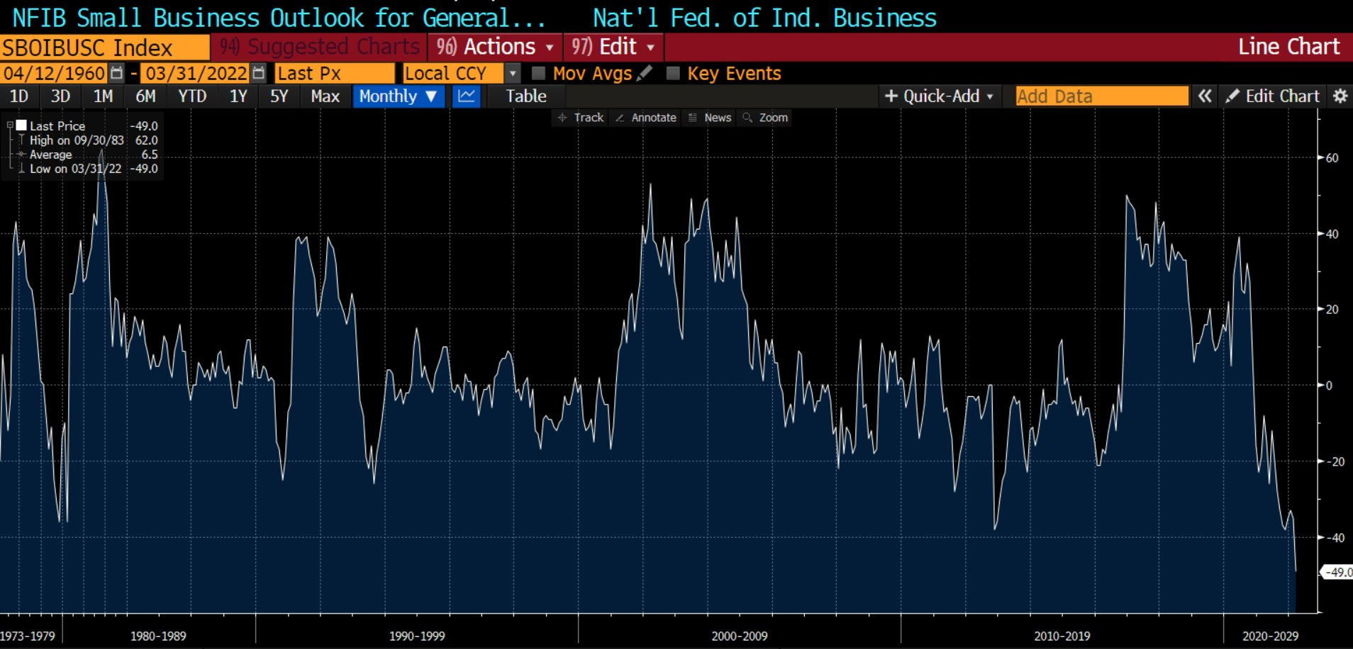
On the aggregate, the data from the Philly Fed reaffirms concerns of stagflation: a simultaneous occurrence of a persistent rise in consumer prices and stagnating economic activity. In addition to this data from the Philly Fed, the March 2022 data from the NFIB Small Business Optimism Index reflected a material downturn in business sentiment. Historically, the outlook from small businesses has never been worse:
The report generally painted a disconcerting scene, described by rising prices, difficulty finding skilled labor, a contraction in capital spending (investment), continued disruptions of supply chains, and a lack of demand for new debt. I’d encourage you to read the full report here.
Stock Market: New Lows Rising
Market pressure has been relentless after a mid-March rally that made many investors regain their bullish tone. I shared several data points during that period which increased bullish probabilities; however, I thought it was prudent to remain cautious and not let greed overtake fear. I shared with subscribers how I was de-risking portfolios by securing gains and increasing cash positions. I also shared a trade two weeks ago when I outlined my newest investment in $YANG, the triple leveraged inverse China ETF. So far, that $YANG trade has generated a return of +29%.
Since the March 29th highs, each of the major U.S. indexes has rolled over substantially. Their returns over this period are:
Dow Jones Industrial Average $DJX: -4.4%
S&P 500 $SPX: -7.75%
Nasdaq-100 $NDX: -12.3%
Russell 2000 $RUT: -9%
In tomorrow’s Premium Market Analysis, I’ll be covering the key technicals & price structure I’m focused on for each of these four indexes. Generally speaking, these charts aren’t very optimistic, so I think it’s vital for investors to prioritize risk management during this period. Don’t miss that analysis, which you’ll receive as a paid member of Cubic Analytics:
In fact, it’s been prudent for investors to prioritize risk management since November 2021, when the Federal Reserve officially announced the tapering of their asset purchases! This is why my “Investment Outlook for 2022” called for an 80% chance of below-average returns this year as a result of waning monetary stimulus. In my March 13th note to premium members, Edition #159, I published analysis that led me to the following conclusion:
“Therefore, I reasonably think the S&P 500 could fall an additional -10% to -13% over the next 4-20 weeks.
We are officially within the time range that I outlined, although the S&P 500 is up +1.6% since that publication. Nonetheless, I still think this scenario is in the cards, implying a correction below 3,800 for the S&P 500 vs. the current level of 4,271.
Recent data from Stage Analysis provides quantifiable evidence of the recent market pressure. The data below, calculating the number of stocks making new highs minus new lows since February 2020, shows the magnitude of the pressure:
New lows exceeded new highs in January 2022 and haven’t looked back since. This reflects continued deterioration below the surface of the market, reaffirming risk-off sentiment. In order to regain bullish sentiment, it would be encouraging to see this datapoint reestablish a positive slope (less new lows vs. new highs). Simple? Yes. Effective? Just look at April/May 2020… Yes.
Bitcoin: Correlation to Stocks
With market pressure impacting all assets in 2022, many analysts and commentators are discussing how Bitcoin is correlated to the Nasdaq and/or the S&P 500. I’ve been impartial to this perspective because I think it’s actually inaccurate, despite being correct. Instead, I think it’s more appropriate to say that Bitcoin and stocks are both inversely correlated to yields!
Why this specific language? Simply because there is no causal relationship between Bitcoin and stocks! There isn’t a mathematical explanation for why stocks impact the price of Bitcoin; however, there is a mathematical explanation for why yields impact the price of stocks, Bitcoin, and all asset prices!
This is the present value formula that students learn in entry-level finance courses, where the present value (PV) of an asset is a function of the future cash flows (FV), discounted by the interest rate (i), at the time they are received (n).
As interest rates rise, the denominator of the function increases, therefore causing the present value of the asset to decrease!
Similarly, saying that Bitcoin and “the stock market” are correlated is intellectually lazy. By comparing BTC vs. the Nasdaq-100, we can identify enough correlation to acknowledge the relationship, but we can find other relationships that are even better, which is what I was able to discover below through my own research…
The iShares Expanded Technology ETF, $IGV, is an extremely popular fund that has traded since 2001. The top 10 holdings of the fund are large-cap internet, software, and technology companies (all of which are profitable). Specifically, they are: Microsoft, Adobe, Salesforce, Intuit, Oracle, ServiceNow, Palo Alto Networks, Activision Blizzard, Crowdstrike, and Synopsys.
Since October 2021, $IGV and Bitcoin have been moving in near-perfect lockstep:
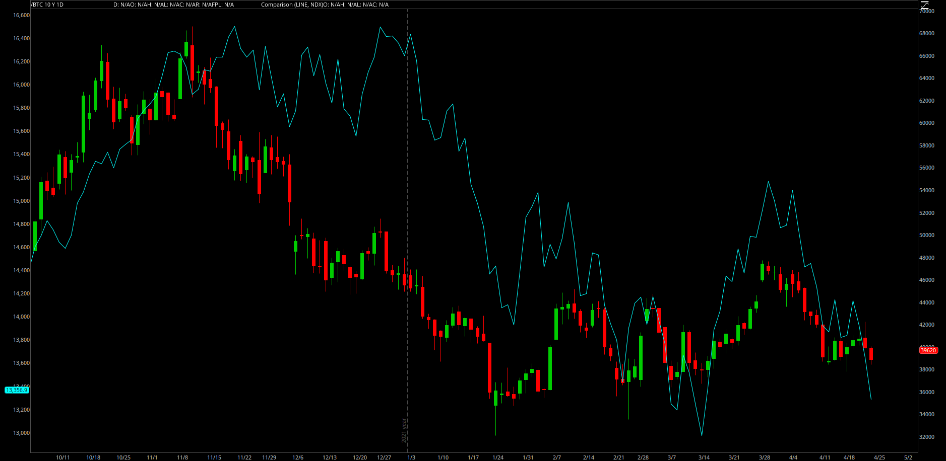
For comparison, here’s the comparison of Bitcoin vs. the Nasdaq-100 $NDX:
One is clearly a better fit than the other, which led me to further prove this point. There have been approximately 200 days between October 5th - April 22nd, when this relationship between Bitcoin & stocks became noticeable. Therefore, I calculated the correlation coefficient of various assets vs. Bitcoin over a 200-day period. Here’s the outcome for each correlation coefficient:
Bitcoin & S&P 500: 0.5 (not meaningfully correlated)
Bitcoin & Nasdaq-100: 0.68 (again, good but not great)
Bitcoin & Ethereum: 0.9 (very strong correlation, as we’d expect to see amongst crypto assets)
Bitcoin & iShares Expanded Tech ETF $IGV: 0.93 (extremely strong correlation)
Therefore, if we want to look for clues about how Bitcoin will perform, it will be beneficial to monitor the evolution of $IGV. While the Nasdaq is a decent metric for gauging Bitcoin, $IGV is superior. Until proven otherwise, I will continue to analyze the relationship between $BTC & $IGV in order to derive meaningful data about Bitcoin’s direction, investor sentiment, and overall market risk.
Best,
Caleb Franzen
DISCLAIMER:
My investment thesis, risk appetite, and time frames are strictly my own and are significantly different than that of my readership. As such, the investments & stocks covered in this publication are not to be considered investment advice and should be regarded as information only. I encourage everyone to conduct their own due diligence, understand the risks associated with any information that is reviewed, and to recognize that my investment approach is not necessarily suitable for your specific portfolio & investing needs. Please consult a registered & licensed financial advisor for any topics related to your portfolio, exercise strong risk controls, and understand that I have no responsibility for any gains or losses incurred in your portfolio.


