Edition #165
U.S. Economic Recovery, S&P 500 Returns, Bitcoin's 19M Milestone
Investors,
The core topics of today’s newsletter are in the header, but the full extent of topics covered below are:
A status update on the USA’s economic recovery, which I was pleasantly surprised with relative to prior economic recoveries.
How a specific metric is hinting how the Federal Reserve may be even more aggressive in monetary tightening.
Expanding on the famous investing quote, “Time in the market beats timing the market”. I’ve never seen the data presented quite like this before.
Bitcoin miners officially mined the nineteen-millionth BTC on Friday, meaning that only 2M BTC will be mined over the next 118 years. Of the 21M in total maximum supply, 90.476% BTC are currently in circulation.
Macroeconomics:
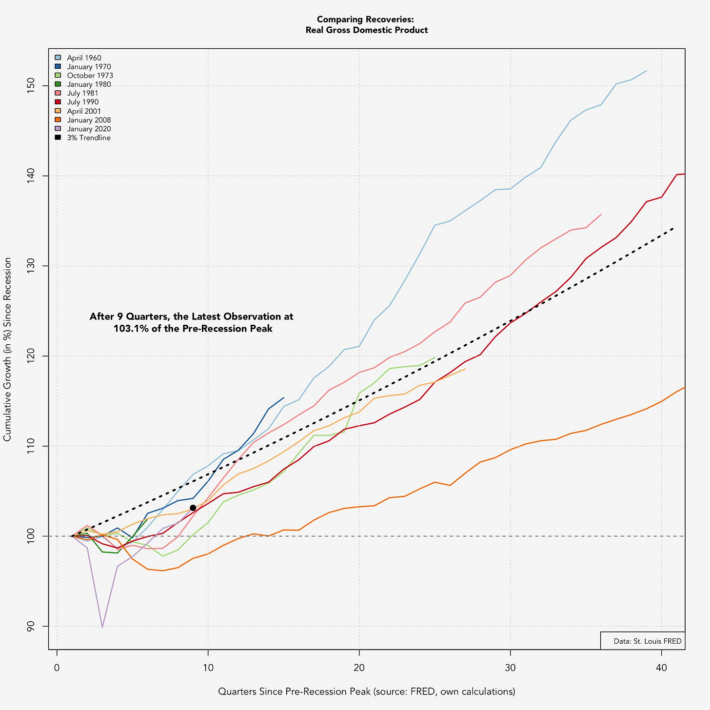
Phillipp Maier posts phenomenal data on Twitter, cutting through the B.S. and merely posting interesting macroeconomic data. One of his recent posts this past week showed the current economic recovery in the U.S. relative to prior economic recoveries. While I was operating with the idea that the current recovery has been in-line with prior post-recession periods, I was pleasantly surprised to see the following data:
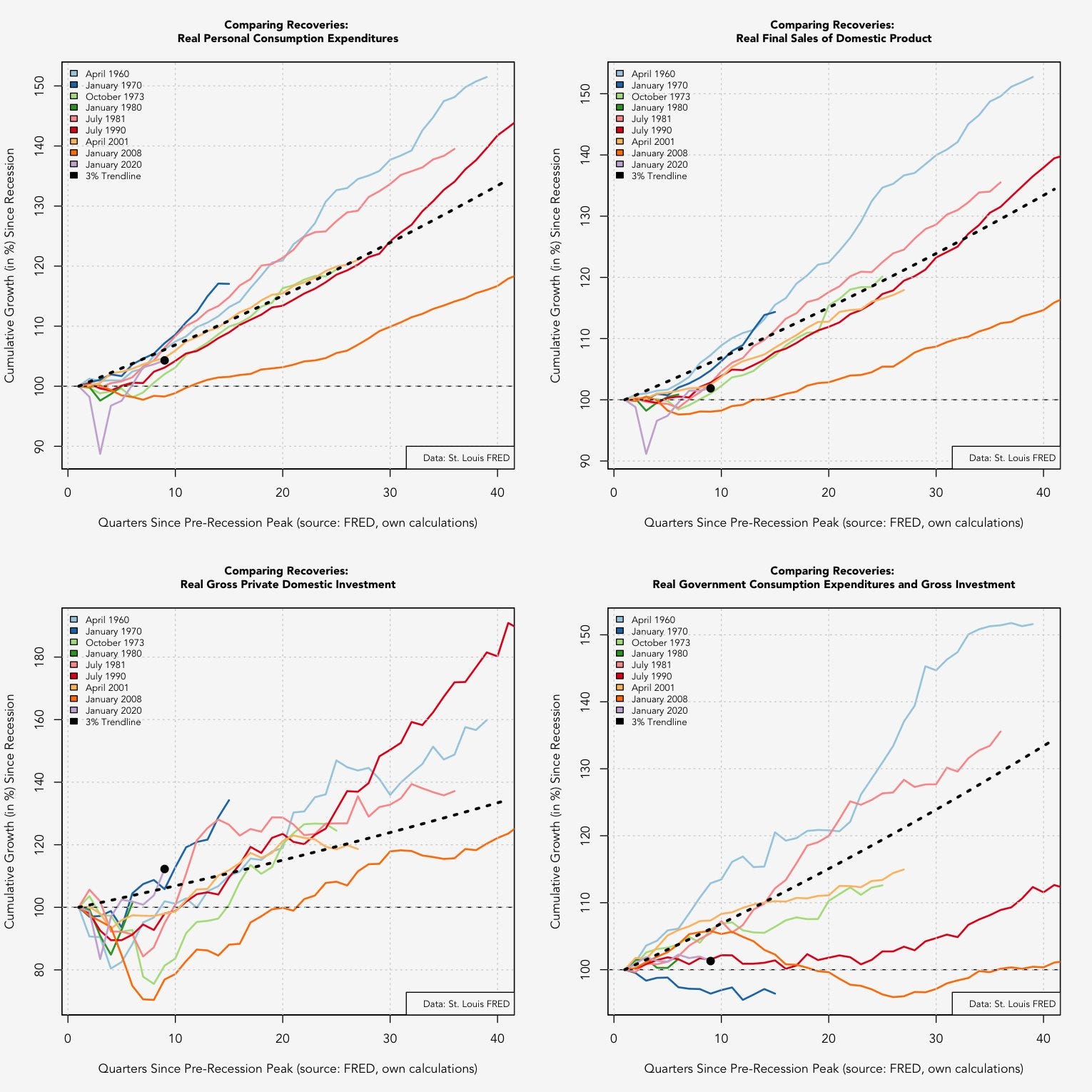
When the economy was first responding to the COVID pandemic, economists were positing whether or not we’d see a V-shape recovery or a W-shape recovery. With the benefit of hindsight, we can clearly see the V-shape dynamic that has taken place in response to COVID. Interestingly, the current recovery in the U.S. is stronger than any of the other post-recession periods, accelerating faster than any other recovery. Clearly GDP is a broad and simple metric for measuring economic growth, comprised of multiple components that help to paint a clearer picture. Thankfully, Maier shared the following:
Overall, this paints a rather encouraging picture about the recovery. We see strong levels of private investment, above-trend levels of real final sales, and high levels of real personal consumption expenditures. I’m encouraged by this data because each of the metrics above are inflation adjusted, therefore, we can’t explain the high levels of personal consumption on rising prices because the data is already adjusted for increased prices.
Prior to seeing the data in this graphic, I assumed that the current economic recovery was likely aided by massive government spending; however, the data in the bottom right corner suggests that real government consumption expenditures and gross investment have contracted since pre-Pandemic. I’m not entirely sure how this could be the case, but I do recall seeing weak government contributions to GDP growth in Q4 2021. In the graphic below, note that Federal Government spending contracted by -0.04%.
Considering how the economic recovery has been strong relative to historical results, it’s amazing to realize the magnitude of the Federal Reserve’s monetary stimulus over the past 24 months. While economic activity appears to be decelerating after a strong start, it’s easy to be attracted to the United States’ economy vs. foreign economies. To put it simply, we’re the cleanest and most desirable car on the lot.
For example, Germany is the largest economy in Europe and just recently shared some terrible economic data this past week. For March 2022, the German CPI was +7.3% on a year-over-year basis. While the U.S. has a higher level of inflation, most recently at +7.9% in February 2022, our GDP growth is significantly stronger. For contrast, Germany’s Q4 GDP contracted by -0.7% in Q4 2021 relative to Q3 2021 while the U.S. economy grew by roughly +1.7% in the same quarter (annualized rate = +6.9%). Other important economies in Europe, such as the United Kingdom, France and Italy, also had abysmal growth of +1.0%, +0.7% and +0.6% respectively.
The Federal Reserve could be using this strong relative performance as a reason to raise rates more aggressively, particularly in light of nominal wage growth. Interestingly, wage growth has been a strong determinant of the federal funds rate, which is logical considering how closely the Fed monitors the labor market in order to achieve full employment.

With how closely these two variables have followed each other historically, the rapid rise in wages & salaries suggests that the Federal Reserve has ample room to raise rates aggressively; or perhaps faster than the market is currently anticipating. I don’t think the Federal Reserve is capable of raising rates to 8%, but I have publicly stated that a single 3% rate hike might be appropriate to properly combat inflation and to shock markets. At the very least, this would close the gap between the federal funds rate and the two year Treasury yield (currently at 2.462%), while converging closer to where inflation and wages are.
Stock Market:
The famous quote, “time in the market beats timing the market”, is meant to serve as a reminder to simplify the investment process and attempt to avoid market-timing strategies. Considering how it’s impossible to accurately predict market tops and bottoms (without false signals), practically all investors will benefit from long-term buy & hold strategies. While this seems like a simple adage to follow, almost all investors attempt to chase some form of alpha (excess market returns) through market-timing strategies.
Unsurprisingly, those efforts are mostly in vain. In fact, most hedge funds underperform the S&P 500 on an annual basis:
While these annual differences may seem minimal, they make a significant impact over the long term:
Based on these graphics, it seems clear that patience rewards investors who simply tether themselves to the broader market. The following graph from Ark Invest was extremely insightful to show how long-term investors are rewarded for time in the market (NOTE - the image below is very large, so I recommend opening it in a new tab in order to zoom in):
What this graph shows is that the S&P 500 has been a master of producing strong real returns over the long-term at almost every single starting point in the past 150 years. Quite simply, it’s one of the best wealth-creation mechanisms ever created. This should serve as a healthy reminder that the market volatility in 2022 is a gift for long-term investors who are able to maintain convictions and be patient. Be sure to check out tomorrow’s Premium Market Update for my weekly deep-dive on stock market conditions, the key charts I’m watching, and the underlying market dynamics I’m monitoring the closest:
Bitcoin:
Friday was a monumental day for the Bitcoin network, in which decentralized miners who secure the network officially minted the nineteen-millionth BTC. Considering that Bitcoin’s maximum total supply is capped at 21M BTC, this means that roughly 90.5% of all Bitcoin to ever exist have already been mined. Amazingly, Bitcoin’s creator(s) recognized the importance of increasingly programmable scarcity, setting a monetary policy with open-source code. While Bitcoin’s blockchain was launched on January 3, 2009, it will take another 118 years for the final 2M BTC to be mined. This is largely due to the halving cycle and programmed money supply that is minted on a fixed schedule at a decelerating rate.
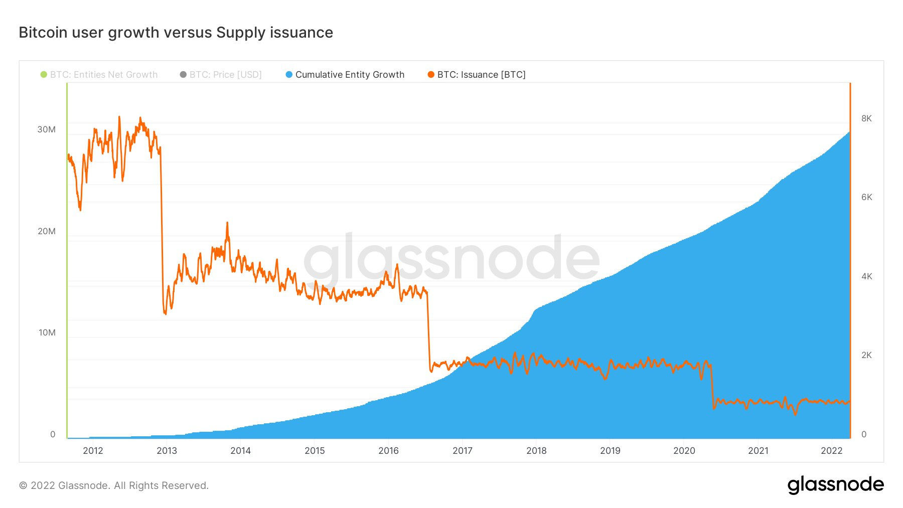
Will Clemente III shared a fantastic graph of Bitcoin’s supply function, combining Bitcoin’s issuance with the number of users on the Bitcoin network:
When you have a deceleration of incoming supply and an acceleration of adoption/users, basic economics teaches us that price should rise over time. Recall, this was the basis for the 1-pager that I published on 2/4/2022.
While the chart above analyzes supply by measuring the rate of newly minted BTC, On-Chain College shared a different perspective by tracking total supply over time (similar to my 1-pager):
In the chart above, we’re able to identify each of the halving cycles (vertical lines), in which the issuance rate is cut in half every four years. This is what creates the dynamic of increasing scarcity over time, reflecting by the flattening of the supply curve over time. As a basic premise for investing in Bitcoin, the supply curve has provided a strong guideline for the direction of Bitcoin’s price.
I continue to believe that Bitcoin is providing the most asymmetric investment opportunity in the market right now, and it remains as the largest position in my portfolio by a massive margin. If you’re interested to know what else I’m invested in, please check out yesterday’s premium newsletter:
Talk soon,
Caleb Franzen
DISCLAIMER:
My investment thesis, risk appetite, and time frames are strictly my own and are significantly different than that of my readership. As such, the investments & stocks covered in this publication are not to be considered investment advice and should be regarded as information only. I encourage everyone to conduct their own due diligence, understand the risks associated with any information that is reviewed, and to recognize that my investment approach is not necessarily suitable for your specific portfolio & investing needs. Please consult a registered & licensed financial advisor for any topics related to your portfolio, exercise strong risk controls, and understand that I have no responsibility for any gains or losses incurred in your portfolio.


