Economy:
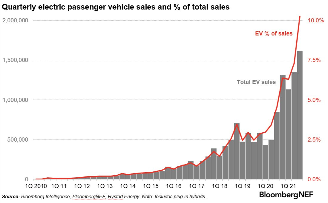
If you’re a fan of data surrounding clean energy & renewables, this chart will definitely resonate with you. If it doesn’t resonate, it will at least give you some interesting food for thought, perhaps even about the dynamics of capitalism & market dynamics. The chart below visualizes the adoption of electric vehicles on a quarterly basis, and as a percentage of total vehicle sales.
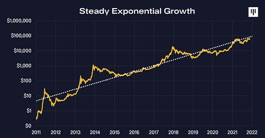
While exponential growth functions and adoption curves have largely been a focus in my section on cryptocurrencies, we can clearly see that electric vehicles are moving in a similar fashion. The irony about exponential adoption curves is that if we took this same snapshot in Q1 2017, we’d see an extremely similar curve in terms of the general shape and structure. Here we are four and a half years later, and the adoption of EV’s has continued to increase at an exponential pace.
I fully expect that this trend will continue to accelerate, easily reaching 20% of total vehicle sales within the next 5 years. Why? EV’s also benefit from network effects and will continue to benefit from Metcalfe’s Law. Quite simply, as EV’s continue to make up a greater and greater portion of the car market, investment in charging stations will similarly increase. As more charging stations get built around the country, particularly in places with thin availability at the present moment, consumers will have an increased incentive to get an EV. With consumers having a greater level of confidence that they’ll be able to recharge their battery in more convenient locations and long-distance drives, adoption will only continue to accelerate, particularly as technological advancements and battery improvements increase natural range.
One interesting thought that I had while looking at this chart is that we’re finally starting to see the results of the competitive dynamics that Tesla brought to this market. Prior to Tesla, EV’s were an afterthought and were almost exclusively an unattractive option. With the technological capabilities and aesthetic improvements that Tesla brought into the industry, even if they had to start in the luxury car market, they essentially forced Ford, GM, and legacy car companies to aggressively pursue their own EV technology and models. While the EV trend might be viewed as a matter of “when” not “if”, Tesla’s competitive presence most certainly brought adoption into the “now” because legacy automakers had to get involved ASAP once they saw Tesla’s success. The market does an amazing job of forcing producers to adapt/compete or die.
Stock Market:
Over the past three weeks, U.S. stocks have continued to chop around slightly beneath their all-time highs. Over the course of these three weeks, Treasury yields have been rising on all maturity levels, but notably on the 5, 10, and 30-year securities. Normally, we’d expect the relationship between yields and equity prices to have an inverse relationship, so it’s an encouraging sign to see that most stocks have held up well during this period. Additionally, the U.S. dollar has been remarkably strong over the past three weeks, rising nearly +3% over that time. While that doesn’t seem like much at face value, it’s actually an impressive run for the world’s reserve currency.
These dynamics, on the aggregate, should be putting pressure on U.S. stocks; however, we remain right at ATH’s. I don’t want to speculate why this has been the case, because my guess is as good as anyone’s, but I did want to point out that this resilience could be taken as a positive dynamic. Another bullish dynamic worth paying attention to is that the net flow into equities has continued to remain positive and is accelerating higher.
In particular, the graph above shows that net inflows into U.S. equities via mutual funds and ETF’s has been positive since June 2021 after roughly two years of net outflows. The rapid switch from net outflows at the start of 2021 to net inflows as of September 2021 is a remarkable acceleration, unique to any other instance we’ve seen over the last 18 years. In the past, we’ve typically seen net inflows maintain for several years at a time, which could give us confidence that we’ll continue to see net inflows going forward. Of course, past behavior is not necessarily indicative of future behavior, but it can certainly gives us clues to derive possible outcomes.
While it might seem odd considering the phenomenal run in the S&P 500 since the March 23, 2020 lows (up +115% in that time), I think that the most likely outcome for U.S. stocks is that they continue to grind higher.
Cryptocurrency:
One of the main themes of my crypto analysis has been focused on the supply shortage in the Bitcoin market. Fundamental economics teaches us that decreasing supply of a scarce asset will cause the price of that asset to rise, all else being equal. This basic principle is why I’ve remained so focused on this metric, along with adoption, institutional involvement, and price structure.
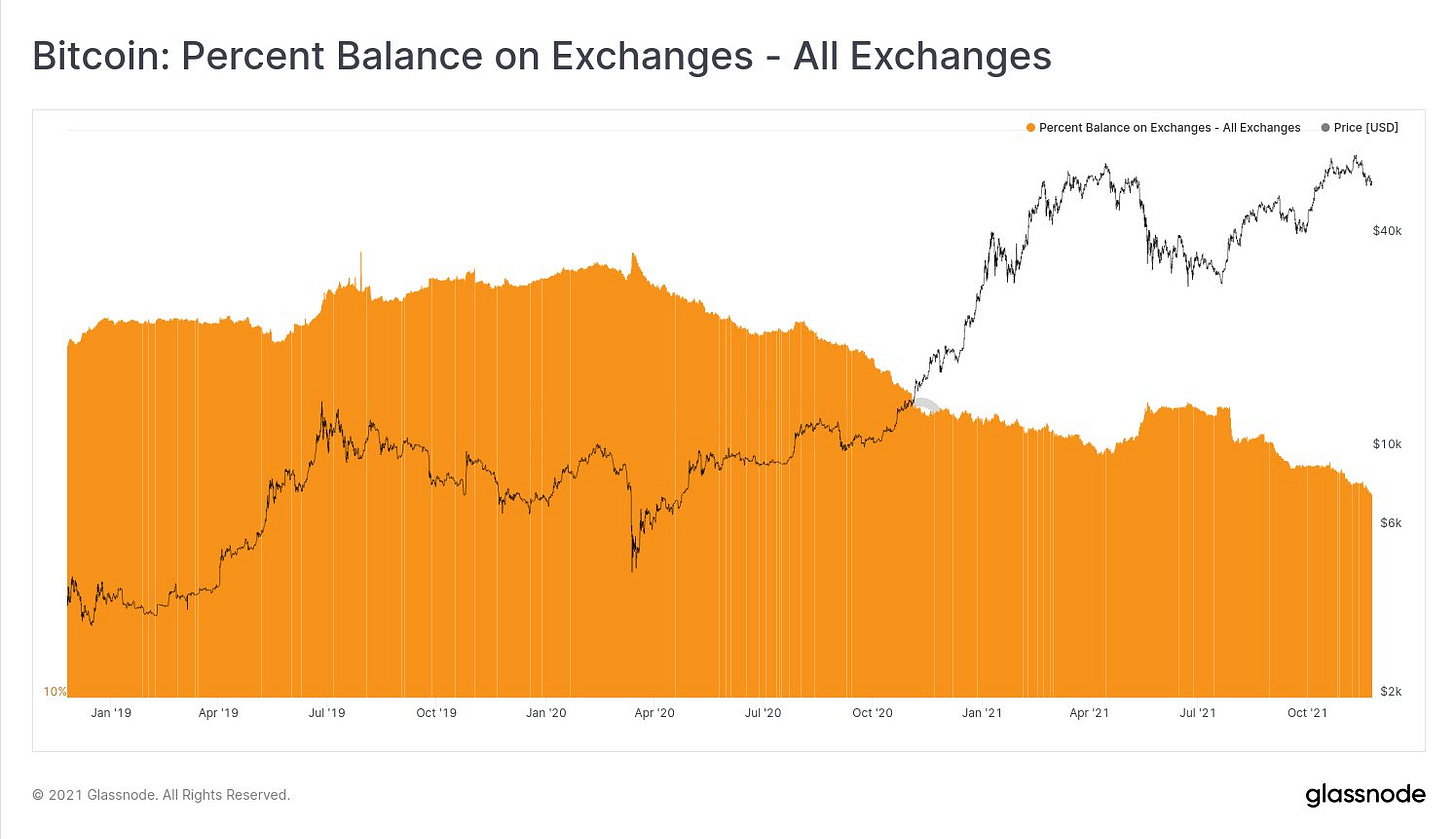
As it pertains to balance on exchange, the on-chain market dynamics are extremely clear: Bitcoins continue to be transferred out of the exchange wallets and into self-custody or off-exchange wallets.
This is a great way to measure the conviction of Bitcoin owners, as they aren’t able to sell or liquidate their BTC in these self-custody or off-exchange wallets (unless they transfer them back to the exchange). The BTC that get transferred out of the exchange are referred to as “illiquid supply” because of the fact that they’re not readily available to be sold.
In the chart above, we can see that the general trend since March 2020 has been a steady decrease in balance on exchange. Said in a different way, there’s been a steady increase in illiquid supply. One period where this changed was in April - June 2021, where Bitcoins were transferred back onto the exchange, as a sign of a weakened level of conviction for BTC holders. We can see that the uptick in balance on exchange happened while price was at ATH’s, which actually foreshadowed the -50% decline that we experienced in May - July 2021.
As we can see, the dynamics in April - June 2021 are completely different than the present moment, where the balance on exchange is currently at less than 13% of total current supply. This means that of the 18.88M Bitcoin in total current supply, less than 2.42M are currently held on the exchange wallets. Therefore, at the present moment, a person wanting to buy Bitcoin is only able to purchase from the pool of 2.42M. Clearly this can change if/when Bitcoin holders decide to transfer their Bitcoin back onto their exchange wallets, but these are the current dynamics right now. From my perspective, this only continues to reinforce my bullish outlook on Bitcoin. A scarce and finite asset with decreasing availability, in a world where central banks continue to print money and government spends exorbitant amounts of money, is likely to rise in the long-run. It’s already proven to do so.

Zoom out and enjoy the ride.
Happy Thanksgiving to all!
Caleb Franzen


