Economy:
Nothing caught my eye this week in terms of pure economic data, other than a simple chart of central bank balance sheets. This continues to be a core aspect of my research process, helping to monitor the evolution of monetary policy over time. With continuous and exorbitant levels of monetary stimulus and liquidity being injected into the market, it’s a clear sign for investors to move further out on the risk curve in order to compensate for historically low real yields.
While the data is accurate as of 9/30/21, this is an amazing reminder of the simple fact that central banks are likely to continue printing money and injecting liquidity into the financial markets for the foreseeable future? Do we really think they’re going to attempt to reverse and unwind the current state of affairs? I certainly don’t.
While the Fed (orange) may attempt to tighten monetary policy as they did in 2015-2018, it seems apparent that other central banks like the Bank of Japan and the European Central Bank aren’t likely to stop anytime soon. If we see a circumstance where the Fed takes their foot off the pedal while other central banks continue to maintain the current monetary policy regime, this should create increased demand for the U.S. dollar relative to global currencies.
This is why I don’t foresee a collapse in the U.S. dollar despite the historically high levels of monetary stimulus & money printing that we’ve experienced over the past 19 months. With demand for the USD likely to remain elevated under these circumstances, this will also likely provide strong demand for dollar-denominated assets, such as Treasuries, real estate, U.S. equities, and even crypto. The macro thesis remain intact and I continue to reiterate my bullish outlook on dollar-denominated assets.
Stock Market:
I wanted to share two counter-acting forces that are currently developing in the equity markets. Starting with the positive first, the chart below shows an equal-weight basket of FANGAM relative to the overall S&P 500. We can use this comparative value to find high momentum groups that are outperforming or underperforming the market.

As we can see from the data since 2018, going through a period of lengthy consolidation is absolutely normal and even a sign of good things to come. Following an extensive phase of sideways choppiness, mega-cap tech stocks took a clear lead over the market beginning in September 2019 and haven’t looked back. That clear breakout formation out of a consolidation period is exactly what we’re experiencing right now. Could this be the start of the next period where the tech giants outperform the market again? If so, this could provide strong undercurrents for the market as a whole, although I’d expect the broad market to underperform if we get the follow-through.
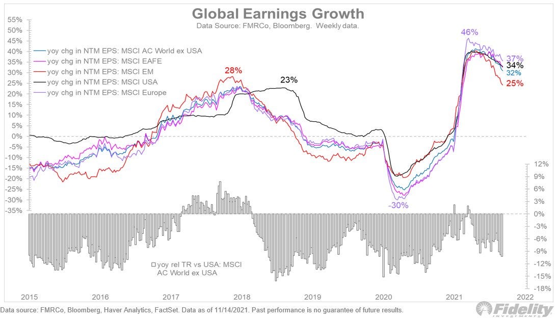
In terms of the negative news, we have some fantastic visualization from Jurrien Timmer, Director of Global Macro at Fidelity, regarding global earnings data.
After a steep incline since Q2 2020, we can see that the earnings growth data has started to substantially rollover. This isn’t specific to the United States, as we can see this dynamic manifesting in each of the major markets. While the trend is now losing a significant amount of momentum, it’s worth noting that earnings growth is still very elevated relative to the historical trends over the last 6+ years. Ideally, investors want to see stocks produce strong earnings, reflecting a high level of demand for a company’s products/services and the success of management to control costs and smart decisions. When earnings growth is high, investors have an easier time substantiating why they own specific companies that are trading at relatively high valuations.
If earnings growth continues to decline, albeit remaining positive, this could reduce the wind in the market’s sails from a fundamental perspective, causing investors to reconsider their investment thesis. Warren Buffett has a great saying that goes, “when the tied goes out, you see who’s swimming naked”. If earnings continue to rollover in a sustained way, a lot of investors will be forced to reconcile and adjust their exposure to certain stocks that aren’t delivering.
In my opinion, this reinforces the need to be overweight stocks that have a proven track-record of being able to deliver on earnings and revenue growth expectations. Being far out on the risk curve by owning stocks like $NNOX or $RIVN that have zero revenue will likely end poorly. Similarly, in an environment where global earnings are declining, I see almost zero incentive to own global stocks. I already believe that emerging markets are an unattractive space to deploy capital, but this only adds to that sentiment.
Combining these two graphs confirms the key point: being invested in U.S. stocks is likely going to yield better results than world ex-U.S. & we want to own the best of the best by owning mega-cap tech. Boring? Yes. Lucrative? Likely. In the world of investing, you don’t get brownie points for creativity or fancy tricks.
Cryptocurrency:
Over the course of the week, the crypto market experienced a mediocre consolidation that saw the price of Bitcoin break below $56,000 briefly. Considering BTC started the week around $65k, this represented a pullback of nearly -14%. First of all, I had zero panic about the price action, viewing this as a normal & healthy consolidation after digesting new ATH’s. It’s important to keep a level-head, remember the long-term thesis, and understand where we are in the cycle.
I shared the following update on Friday morning, covering the same price structure I’ve been highlighting for over a month:
With the chart beginning in February 2019, we can see uncanny similarities between the price action from Q2’2019-Q3’2020 and what we’re currently experiencing right now. The shape of the base is identical, particularly as we prepare to retest some of the critical moving averages.
Again, I think we’ll see a cycle peak between $135k to $290k as the most likely case scenario, but I have covered other models that produce a price-target that exceeds $300k for this cycle. Particularly as liquid supply continues to decline at rapid levels, this will only provide further tailwinds for price to rise. Basic economics teaches us that a reduction in supply leads to an increase in price, all else being equal. So what happens when we continue to see a reduction in available supply followed by an increase in demand? Price should rise even more.
In fact, according to data from Yassine Elmandjra from Ark Invest, the 30-day net change in liquid supply has reached it’s lowest level since August 2017!
This means that Bitcoin owners are transferring their BTC out of their exchange wallets and into non-exchange wallets or cold-storage wallets. They are simply holding with no intention of selling. With roughly 77% of Bitcoins current total supply being illiquid, it’s quite obvious that we’re geared up for a massive supply shortage.
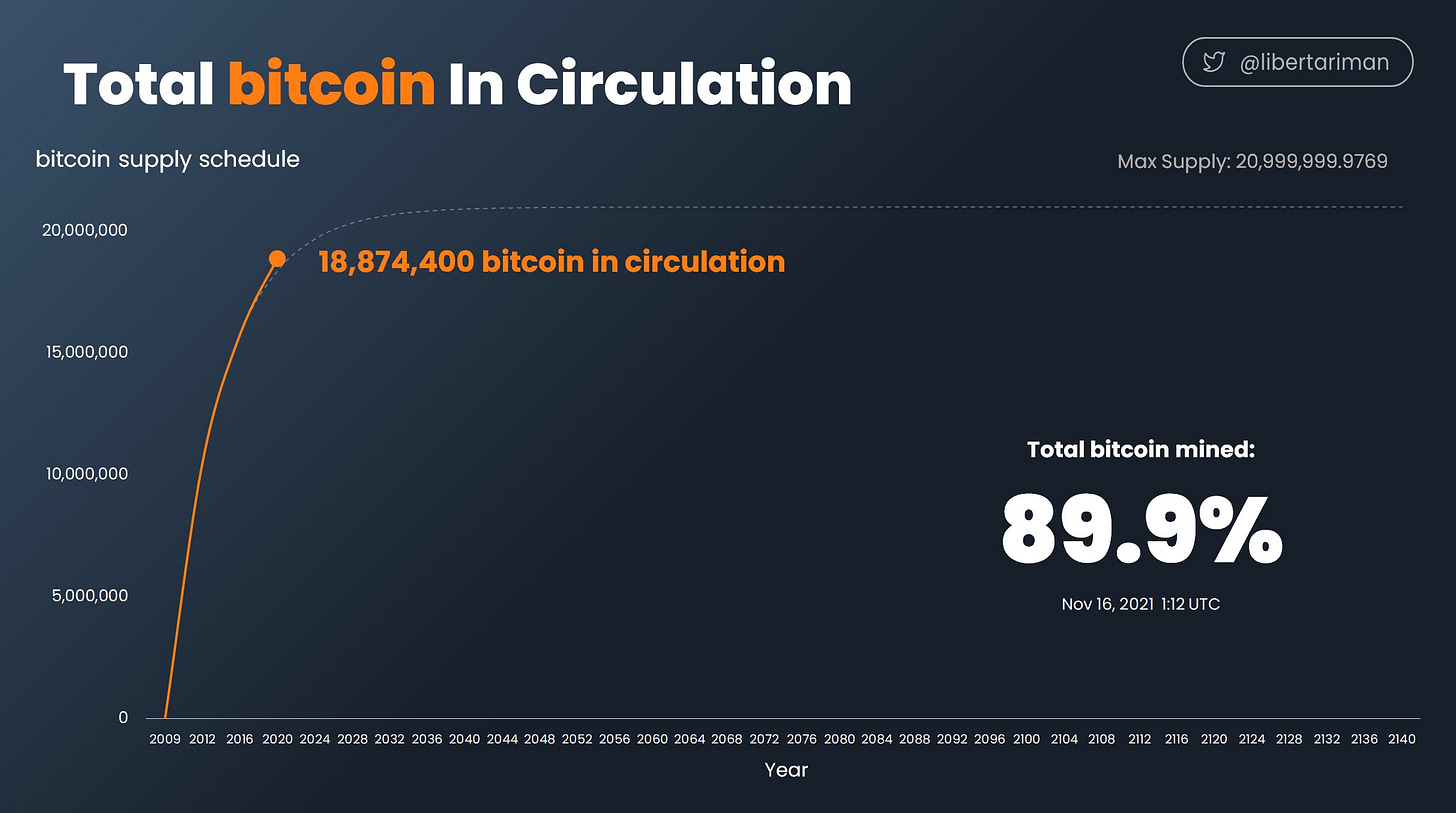
As a final note, Bitcoin is naturally designed & programmed to experience supply shortages. While we’re only 11-12 years into Bitcoin’s life, nearly 90% of all Bitcoin that will ever exist have already been mined.
Because supply is programmed and hard-coded, we are easily able to forecast out the path of future supply, which determines that Bitcoin’s maximum supply of 21,000,000 will be achieved in 2140. It is literally designed to become increasingly more scarce over time. In a world where fiat money supply is essentially infinite, an asset with fixed, programmatic and immutable supply will continuously appreciate and win.
Talk soon,
Caleb Franzen


