Edition #100
A Counter-Argument Against a Double-Dip Recession, S&P 500's Top 10 Over Time, Bitcoin's Illiquid Supply Grows
Before I dive into the key data & charts that we’ll be covering, I wanted to take a quick second to thank everyone for being apart of this journey so far. After starting this newsletter in May 2021, this is officially the 100th publication and I’m so happy with the current state of affairs. The outreach & readership continues to grow and the quality of those of you in the audience has kept me striving to deliver top-notch research and analysis.
I want to thank those of you who have been consistent readers, supporters, and soundboards. Your support has meant a great deal to me & I look forward to seeing how this path continues to develop. Enough of the sappy shit, let’s get after it.
Economy:
There are two things in particular that I want to cover as it pertains to the U.S. economy, as each of these inputs create conflicting information that I wanted to reconcile. First, the following graph was provided by Charles Schwab’s Chief Global Investment Strategist, Jeffrey Kleintop, highlighting the relationship between the unemployment rate and year-over-year CPI change (aka the annual inflation rate):
I’ve had some back-and-forth with Mr. Kleintop on Twitter recently, and he provides excellent value & information on that platform. I highly recommend you give him a follow. In this post, Kleintop states that “bad things (bear markets, recessions) tend to happen around the world when this gap closes”.
Let’s break this down: in a booming economy, modern/Keynesian economics teaches us that we should expect to see the unemployment rate decline & inflation rise. The first aspect is extremely reasonable, considering that a labor market operating at/near full capacity would be a sign that an economy is doing well. The second aspect is purely Keynesian, explaining that inflation (as defined by rising consumer prices) is a consequence of excess consumer demand. All else being equal, a rising demand for consumer products would cause consumer prices to rise, thus creating CPI inflation.
In combination, this chart shows the spread between both the unemployment rate & the inflation rate, insinuating that the economy is overheating at the lower-bound. The current level, just shy of 0%, has historically been a level where things have gotten a little choppy. We can clearly identify each major recession over the past 30 years based on this chart alone, notably 1989, 2001, and 2008. I wouldn’t necessarily include the 2020 recession because it was entirely caused by an exogenous factor, health & safety measures, and government mandates and was therefore NOT a result of issues intrinsic to the global economic system.
Faced with this chart, we’re forced to ask if there’s cause for concern that another recession is on the horizon (within 12 months)? Personally, I don’t think so considering that we’re still in the first 12-15 months of an economic recovery. A “double-dip” recession is possible, but remains highly unlikely in my opinion, particularly as consumer behavior & household/business balance sheets remain in great shape.
This brings us to the second part of our reconciliation. In regards to consumer strength, commercial banks & depository institutions are an excellent resource to get data. This past week, the CEO of Bank of America, Brian Moynihan, said the following about consumers:
“Consumers have a lot of money still to spend in the United States, so the checking account balances of people who, before the pandemic, ran a balance of, say, $1,500 of average collective balance, or $2,000 type of range, think of that, are now sitting with $6,000 and $7,000 in their checking accounts.”
Essentially, Moynihan is noting that the checking account balance of those living close to paycheck-to-paycheck in 2019 has increased by roughly 4x in mid-2021. With more funds readily available, households are better prepared to stave off adverse economic impacts & are better able to sustain strong consumer behavior.
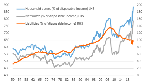
Additionally, the graph below from ING does an excellent job of representing the dynamics of household balance sheets as of Q2 2021:
Relative to the size of their disposable income, household assets are substantially higher and liabilities are substantially lower in comparison to recent years & pre-pandemic. As such, net worth, measured by assets - liabilities, has risen dramatically as a percent of disposable income. The article from ING specifically states that household net worth totaled $141.7Tn, or 624% of U.S. GDP and 786% of annual disposable income. On the aggregate, household wealth in the U.S. has increased by $26Tn relative to the end of 2019! This is an astonishingly positive development.
Encouragingly, low income households are also in substantially better financial shape! There is a solid trend in income growth via higher wages, and the median recipient of unemployment benefits received 134% of their previous after-tax compensation. Stunningly, nearly 70% of unemployment recipients made more money from unemployment than from their prior wages/salaries.
With this knowledge at the front of our minds, it’s very difficult for me to be negative about the U.S. consumer barring a massive supply-side shock or exogenous factors.
Stock Market:
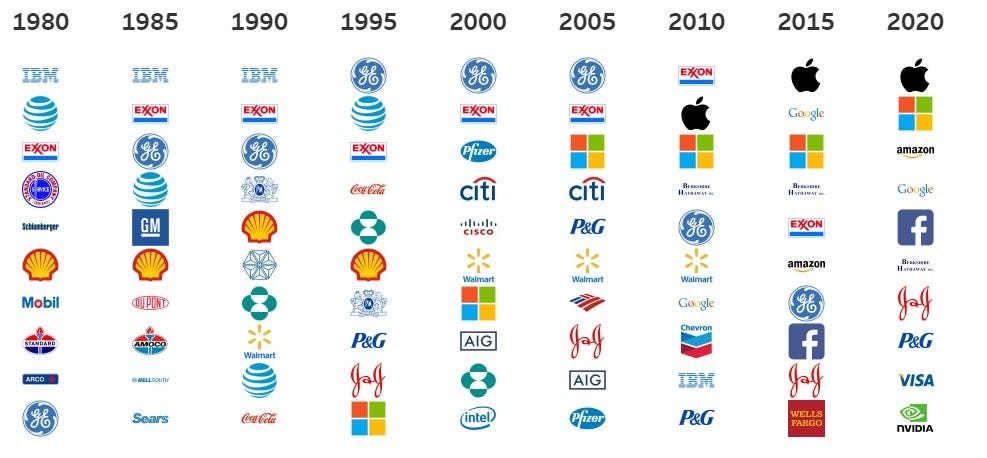
Tableau published some great data earlier this week regarding the S&P 500 and the top 10 stocks that comprise the index on a 5-year basis. It’s always interesting to think that there will be companies not yet born who will dethrone the sitting royalty, but it’s a guarantee that we’ll see many fresh faces soon.
Per Tableau’s data, 29% of the value of the S&P 500 is attributable to these 10 companies:
Apple (6.7%)
Microsoft (5.7%)
Amazon (4.8%)
Alphabet/Google (3.1%)
Facebook (2.3%)
Berkshire Hathaway (1.5%)
Johnson & Johnson (1.4%)
Proctor & Gamble (1.2%)
Visa (1.2%)
NVIDIA (1.2%)
Going back to 1980, we can see how drastic the change in leadership has been. In fact, not a single company that was in the top 10 in 1990 is currently in the top 10 today! Microsoft is the longest-reigning incumbent, while NVIDIA, Visa, and Facebook just joined the group in the most recent 5-year period.
In the near future, I’m planning to put some thoughts together as to which companies I think are best-positioned to enter this exclusive group; however, that newsletter will be for premium members only. At the moment, I’m offering a 10% discount on the monthly & annual memberships, which provides readers with weekly insights on my equity market updates, the top 10 holdings in my portfolio, cryptocurrency exposure & research, and watch lists for the top stocks that are on my radar. I’m also conducting deep-dives on unique topics just like this one that I’ll be working on.
I’ve decided to extend the discount for another week, ending on October 7th, so make sure to reach out if you have any questions you’d like me to address!
Cryptocurrency:
In the past, I’ve discussed the significance of illiquid supply as it relates to Bitcoin. Illiquid supply is simply the supply of Bitcoin that has been transferred out of exchanges to be stored in cold-storage wallets. In these cold-storage wallets, the BTC is untouchable (except by the owner of the wallet) & is therefore much more sticky in terms of being sold. Conversely, Bitcoin held “on-exchange” by companies like Coinbase, Kraken, Gemini, Binance, etc., are highly liquid & can rapidly be converted to cash if the owner decides to sell their position & convert to USD.
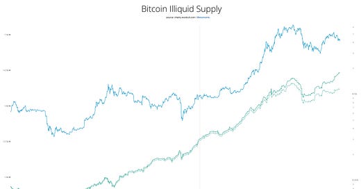
On September 27th, on-chain analyst Lex Moskovski shared the following chart on Twitter, highlighting the trends of illiquid supply so for year to date:
Typically, the price of Bitcoin & the quantity of illiquid supply move in accordance with one another. However, that isn’t the case right now as illiquid supply (the amount held off-exchange) is continuing to increase despite the recent dip in BTC’s price. So what exactly does this mean from my perspective? It means that Bitcoin owners have an extremely high level of conviction at the present moment & are continuing to retain their Bitcoin despite the the decline in price. In layman’s terms, holders aren’t worried in the slightest.
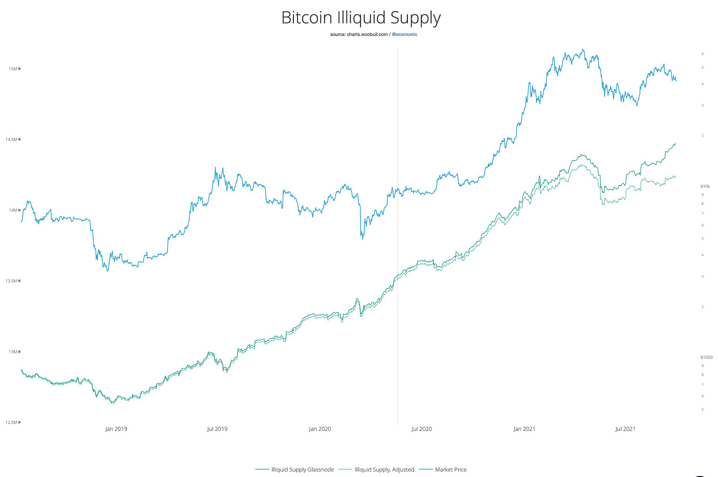
On a longer term scale, dating back to 2018, here’s the relationship between the price of Bitcoin (top) and illiquid supply (bottom):
In June/July 2019, we can easily identify that illiquid supply dramatically decreased despite price reaching 16+ month highs. This represents high-conviction holders losing conviction & liquidating their positions. The price of Bitcoin was able to still rally during this period, but not for long. Subsequently, the price of BTC fell from ~$12k to $4k as a result.
In the present moment, holders continue to build higher & higher levels of conviction, and new holders (both retail & institutional investors, and governments like El Salvador) are coming into the market on a daily basis. I’ve never been more optimistic, particularly in light of conversations around the U.S. debt ceiling, fiscal policy, tax regime changes, etc.
Talk soon,
Caleb Franzen


